
ROLE
Designer
Photographer
Researcher
TIMEFRAME
May 2017 - Aug. 2017
May 2018 - Aug. 2018
TOOLS
Illustrator
InDesign
Lightroom
Photoshop
Canon EOS 70D
TEAM
One Designer (Me)
Head of Marketing
Primary Photographer
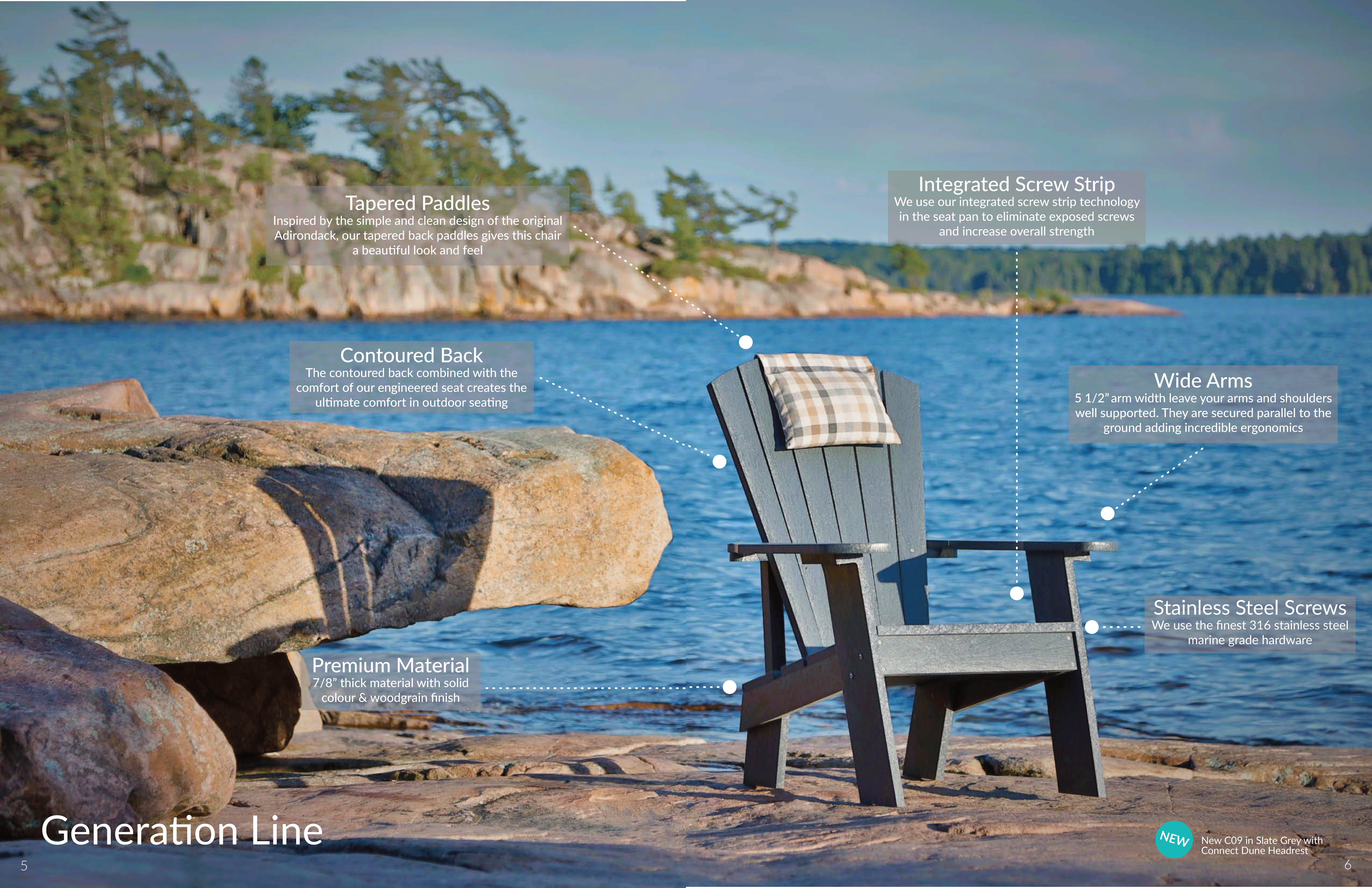
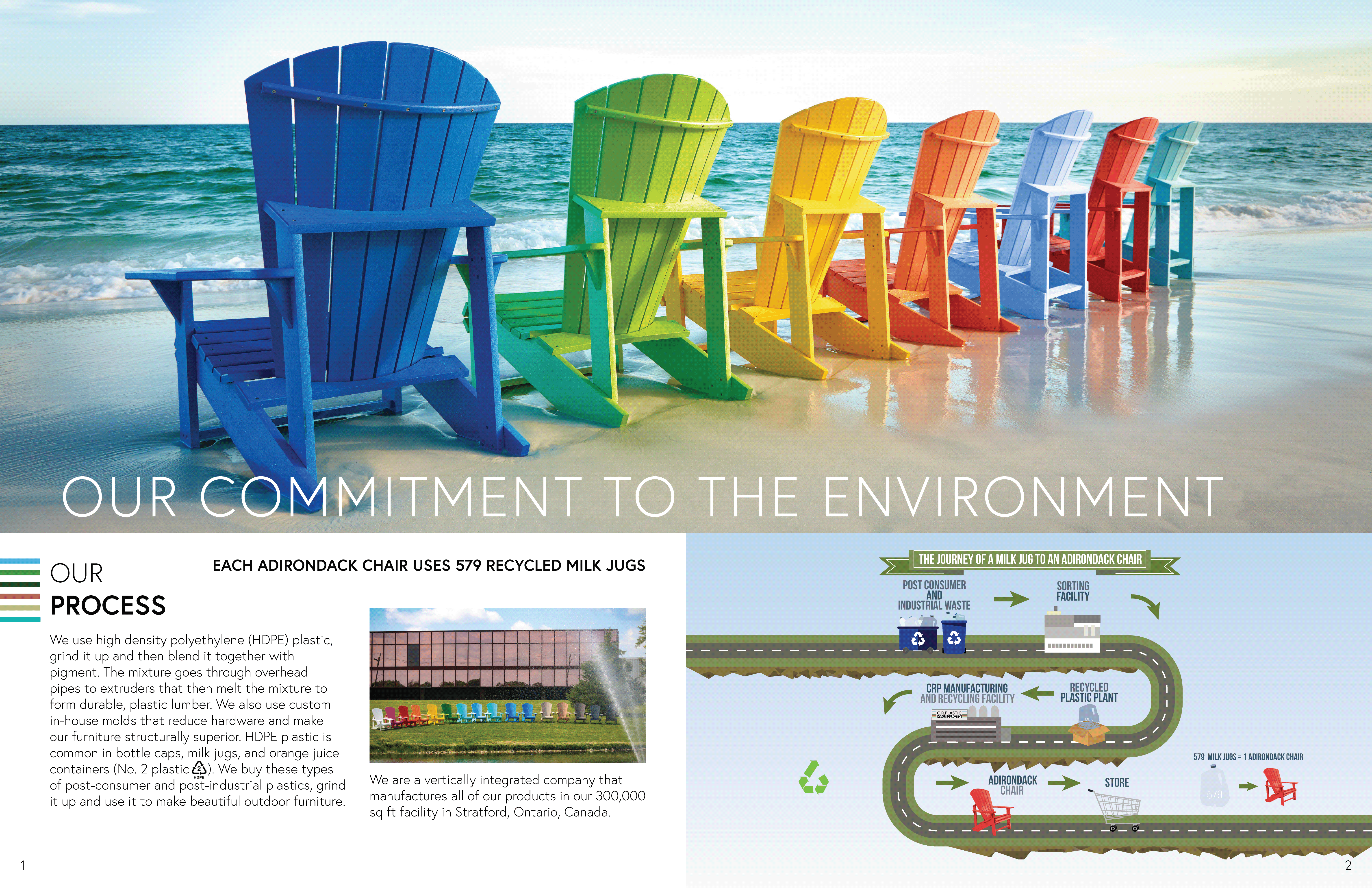
C.R. Plastic Products is a recycled furniture manufacturer based in Stratford, Ontario. They distribute outdoor furniture throughout North America and Europe with a goal to reduce plastic waste in both oceans and landfills. In fact, each Adirondack chair uses 579 recycled milk jugs.
BACKGROUND
As the company's only designer, I was tasked to recreate C.R. Plastic's catalogue from the ground up; and to understand the status quo for the outdoor furniture market. In addition to learning about the industry, I had the opportunity to oversee this project from start to finish, being a part of everything from the photoshoots in Muskoka and Killbear to handling the final prints.
CHALLENGE
C.R. Plastics puts themselves in a niche industry, and their products reflect that by targeting the environmentally conscious that can afford upwards of $400 a chair. The company wanted the catalogue to embody that position while still setting itself apart from the competition.
SOLUTION
To create a new catalogue with updated styling that aligns with both the brand and its audience. The new catalogue must include all its previous elements while still being scalable for future iterations.
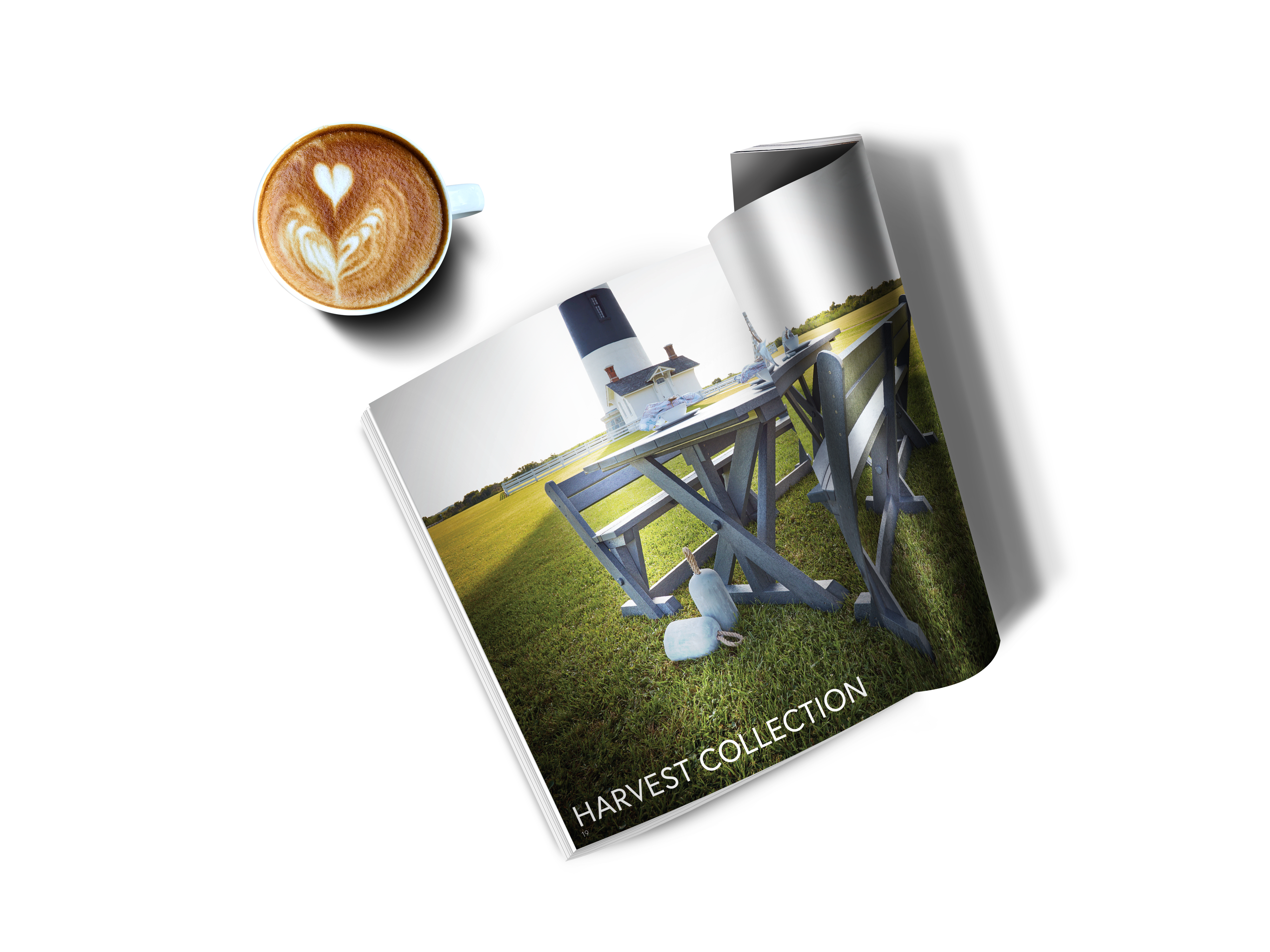
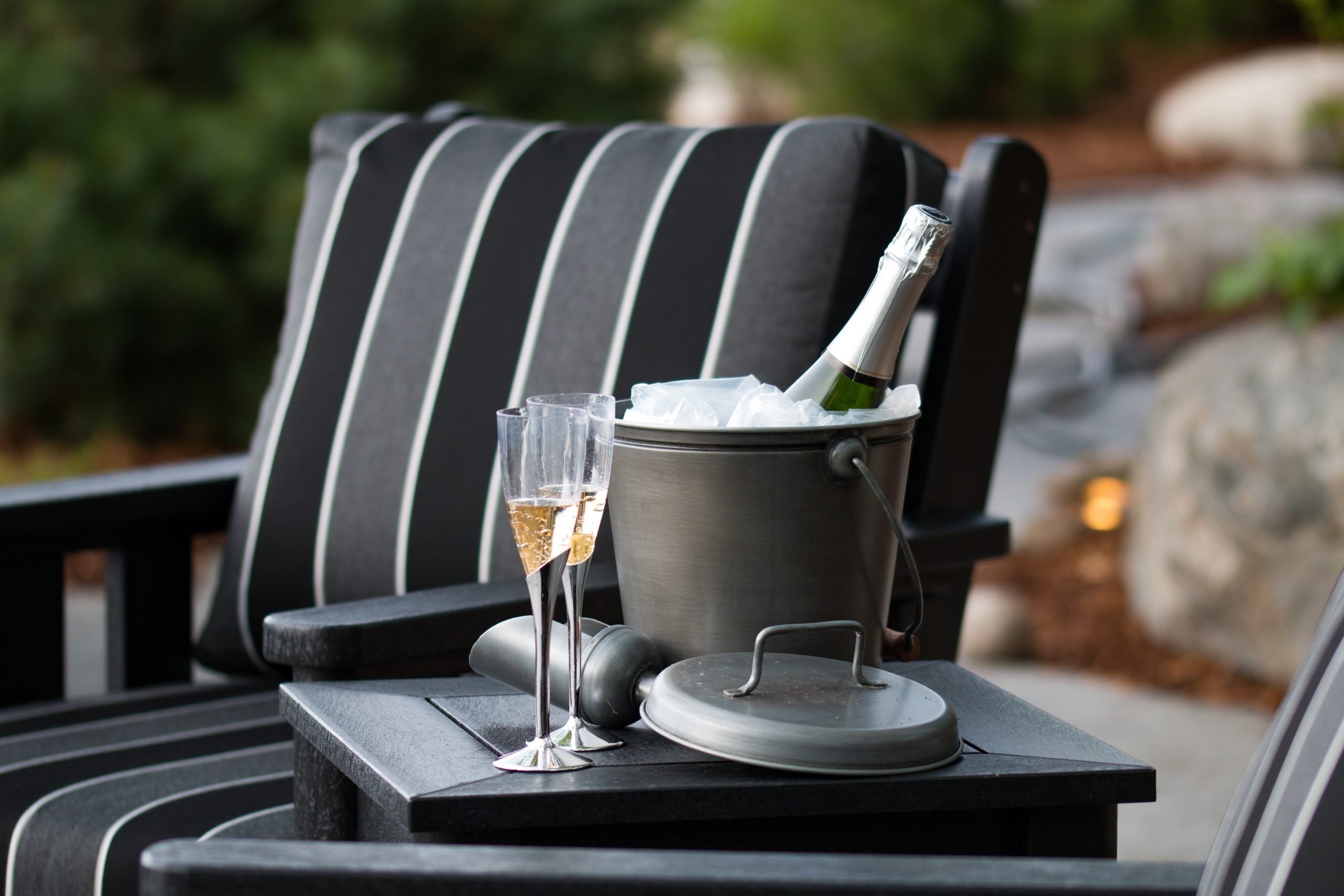
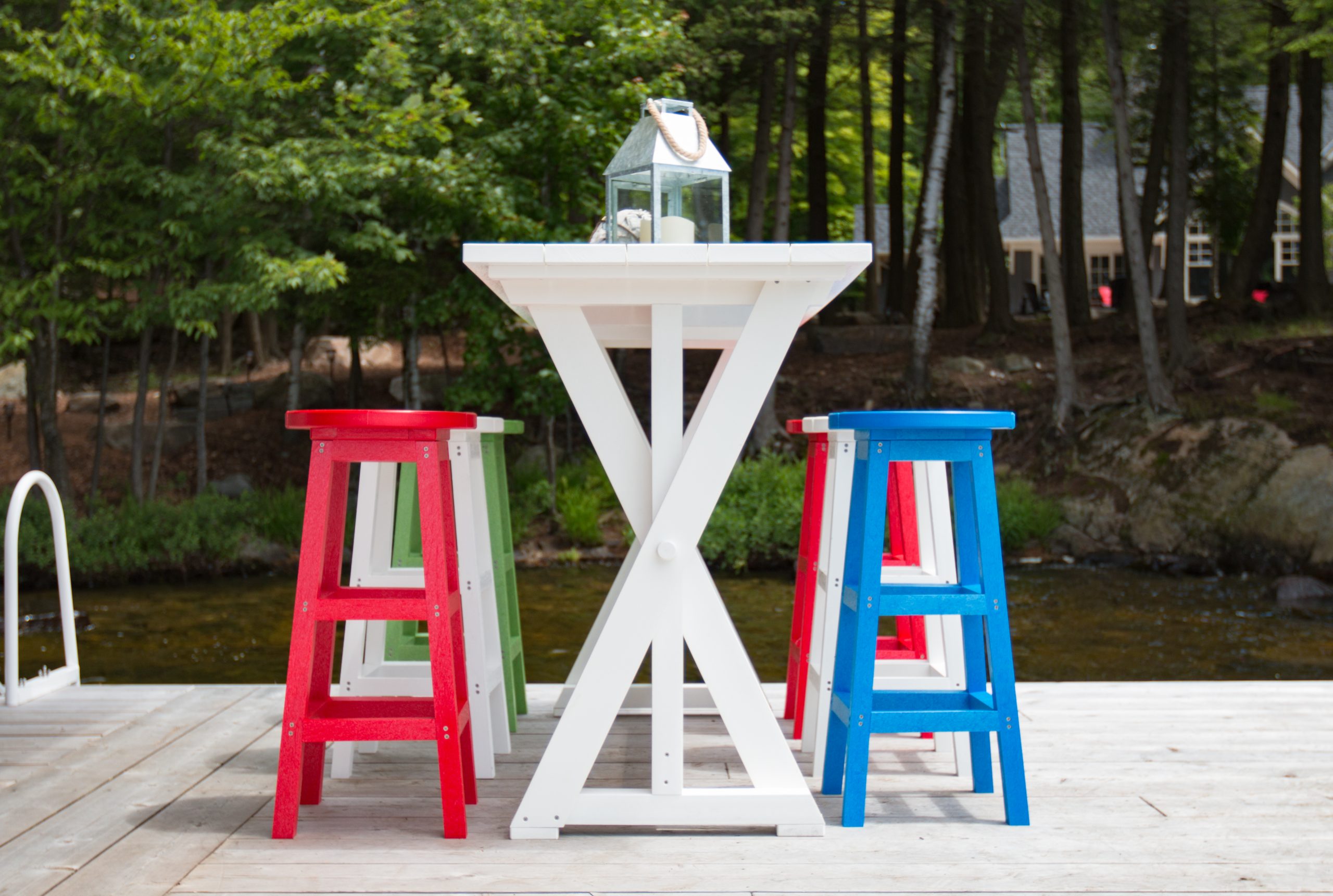
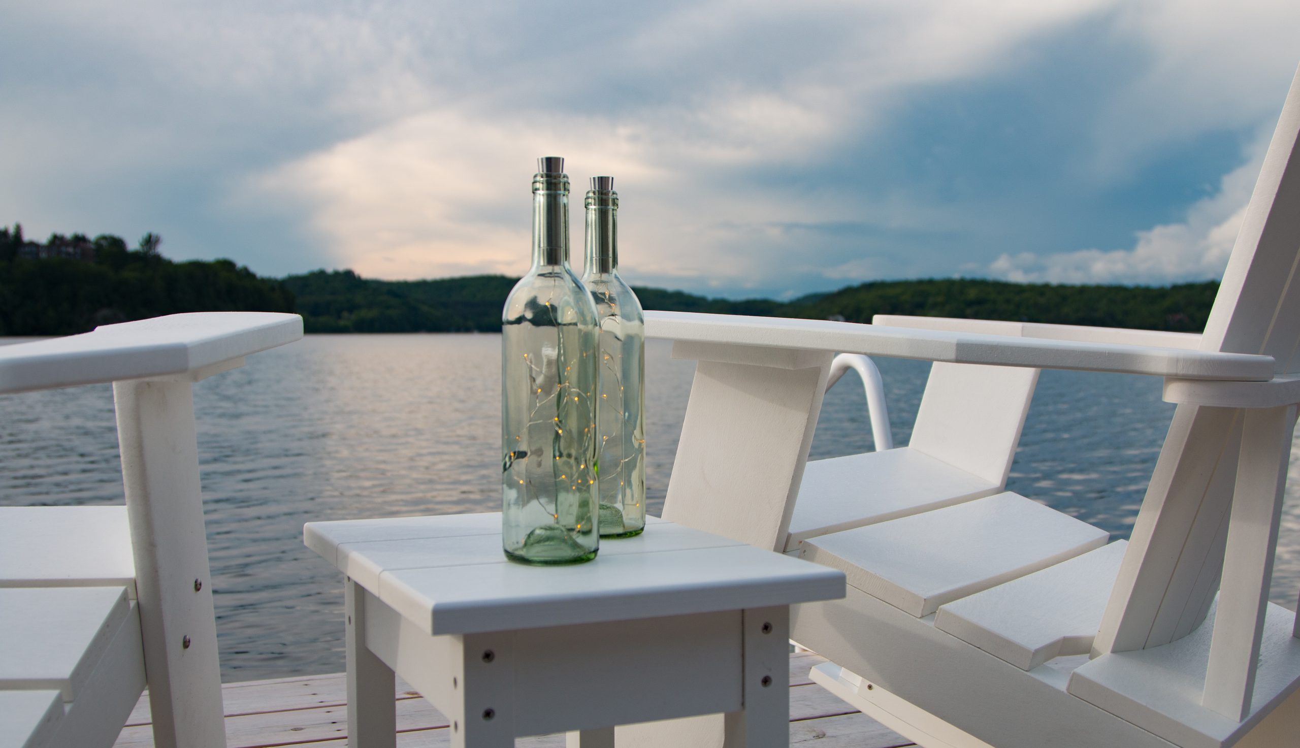
PHOTOSHOOT IMAGES

RESEARCH
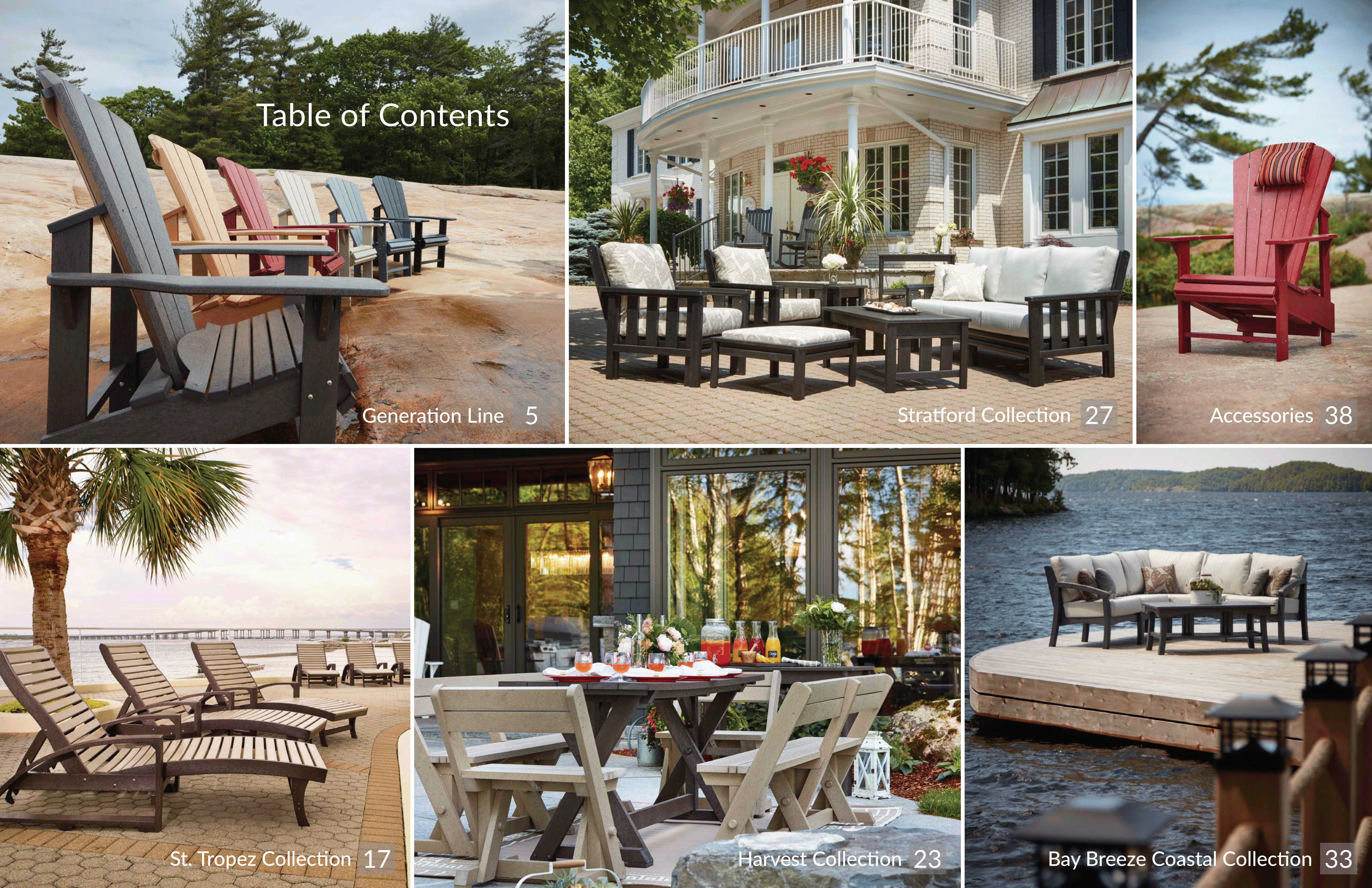
My first approach was to understand the company and its competitive space. C.R. Plastics positions itself as a premium outdoor furniture company and competes with three other companies in the North American market. These companies are Berlin Gardens, Seaside Casual, and Polywood. Before designing C.R. Plastics' catalogue, I wanted to see if I could learn from other companies in this space and understand how they approached this challenge.
COMPETITOR CATALOGUE SAMPLES
ANALYSIS
- All catalogues were created in portrait mode (the original C.R. Plastics catalogue was in landscape)
- All silo photography was taken in a single tone and the photos depicted the items on the page
- Each catalogue started with an outline of its mission and values
- The general formatting was the same across all companies
ADDITIONAL RESEARCH
After deciphering each catalogue, my goal was to expand my research and understand what makes a good catalogue. I moved from reading furniture catalogues to any type of product catalogue to get a sense of what makes a layout aesthetically pleasing and intuitive. At the same time, I interpreted the unique features of each catalogue.
SEASIDE CASUAL
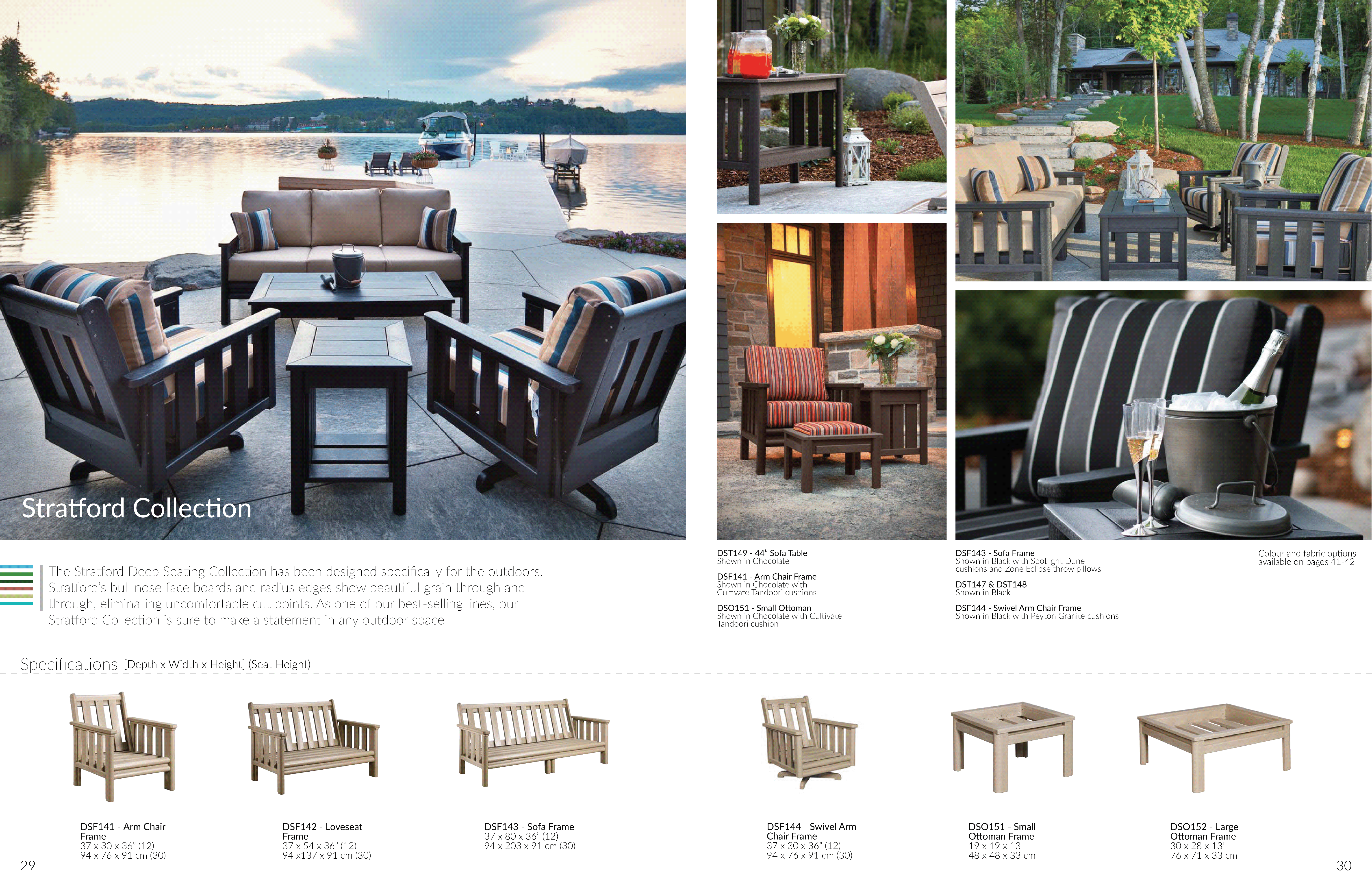
Seaside Casual possesses a highly visual catalogue and uses a themed approach to depict each collection in a two-page spread.
POLYWOOD
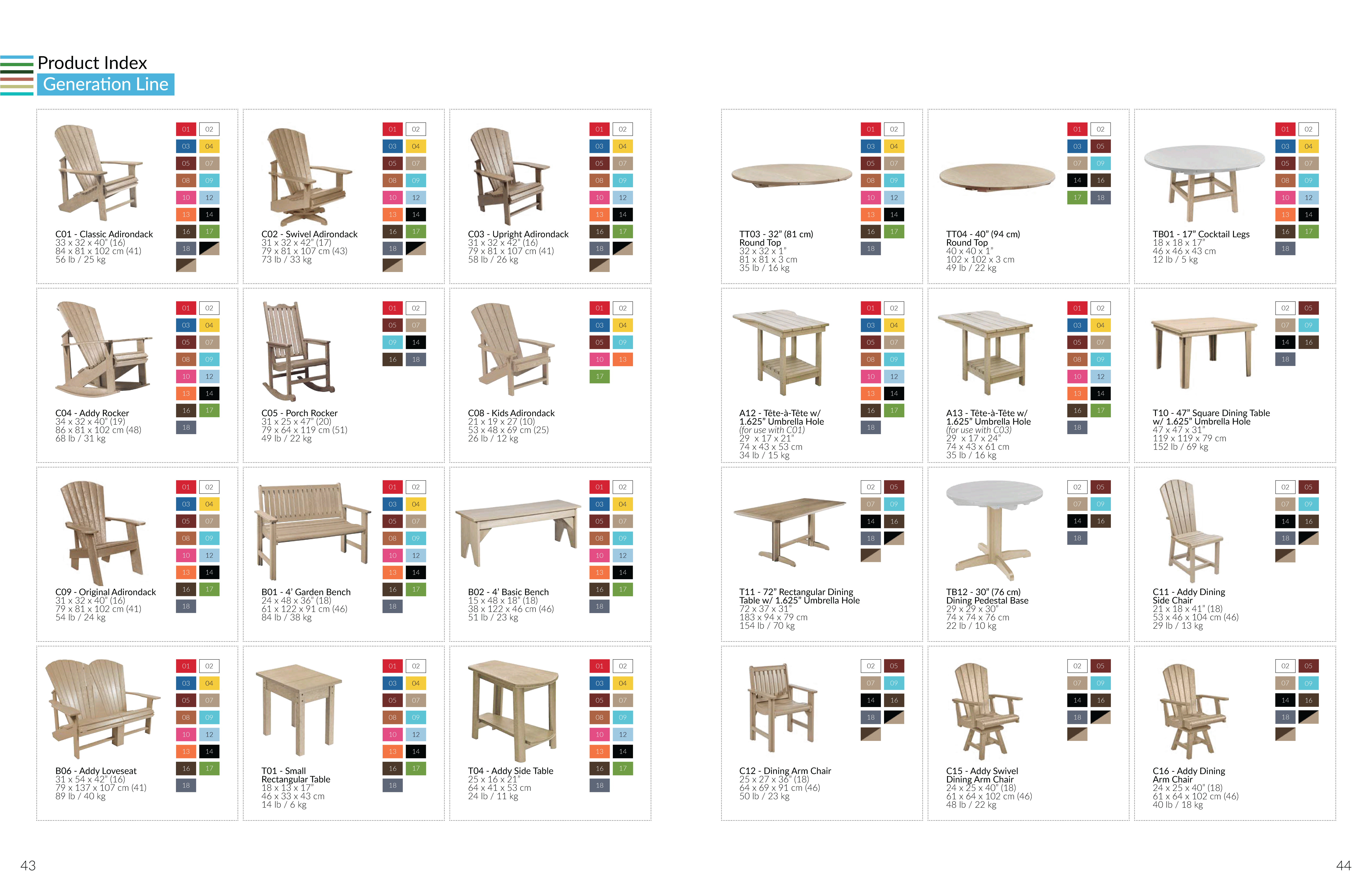
Polywood has a structured layout, categorizing colour options for each item along with full dimensions.
BERLIN GARDENS
Berlin Gardens uses a menu tab with a split format which includes both the items in that collection along with their colour options.
KEY TAKEAWAYS
- The products on each page should match the lifestyle photography surrounding the item
- Dimensions of each product can help users better visualize the products
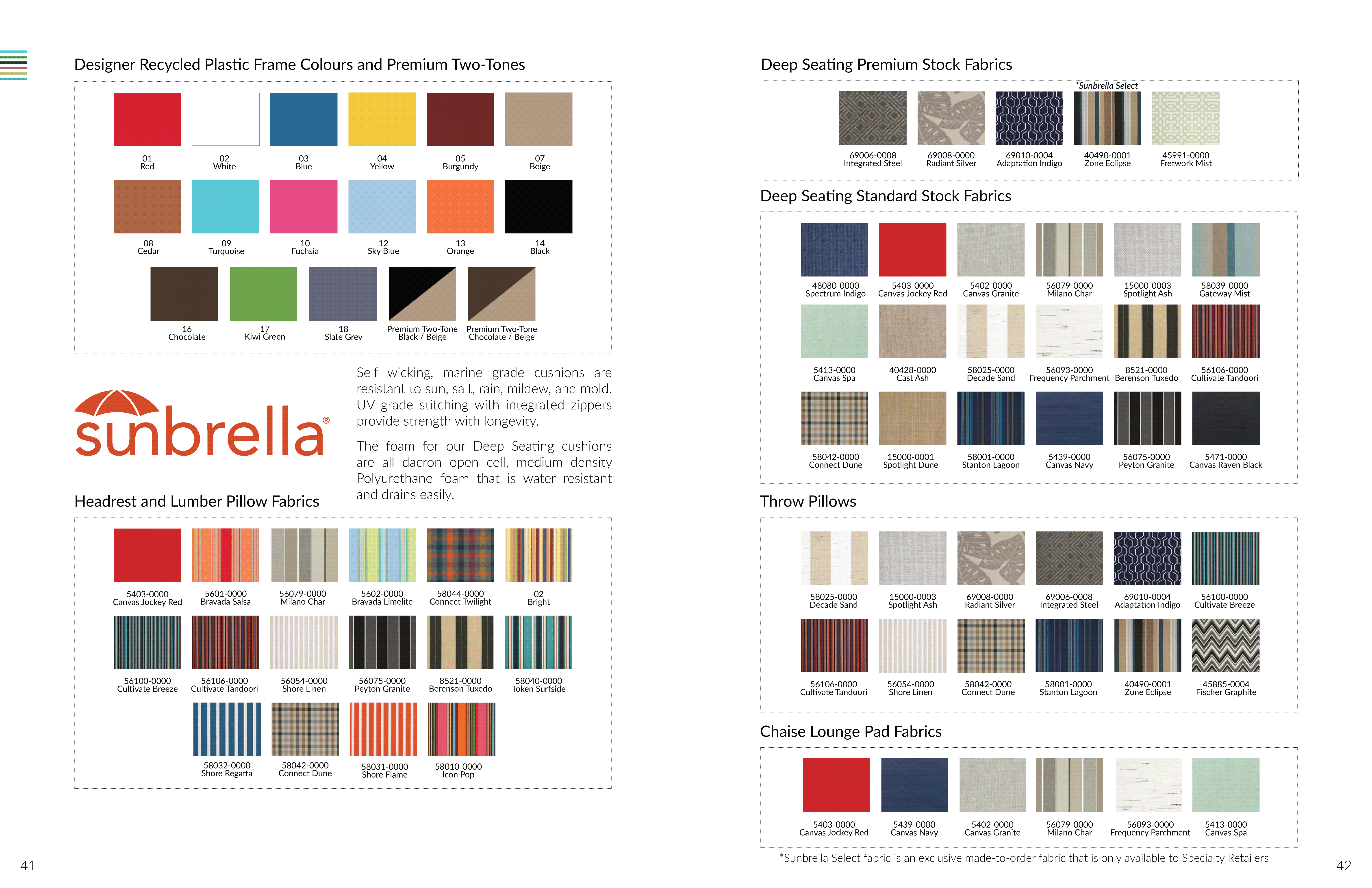
- Including possible colour options for each collection can reduce confusions later in the purchasing process
- A story about the company is especially relevant to its environmentally-conscious target market
OUTCOME
By designing my first draft based on what the other catalogues did well, I was able to decrease risks for my first catalogue by using proven designs from others in this specific industry.
Nonetheless, I still had to follow these constraints while developing my first draft:
- Display a minimum of three products per page
- Keep the final catalogue under 50 pages
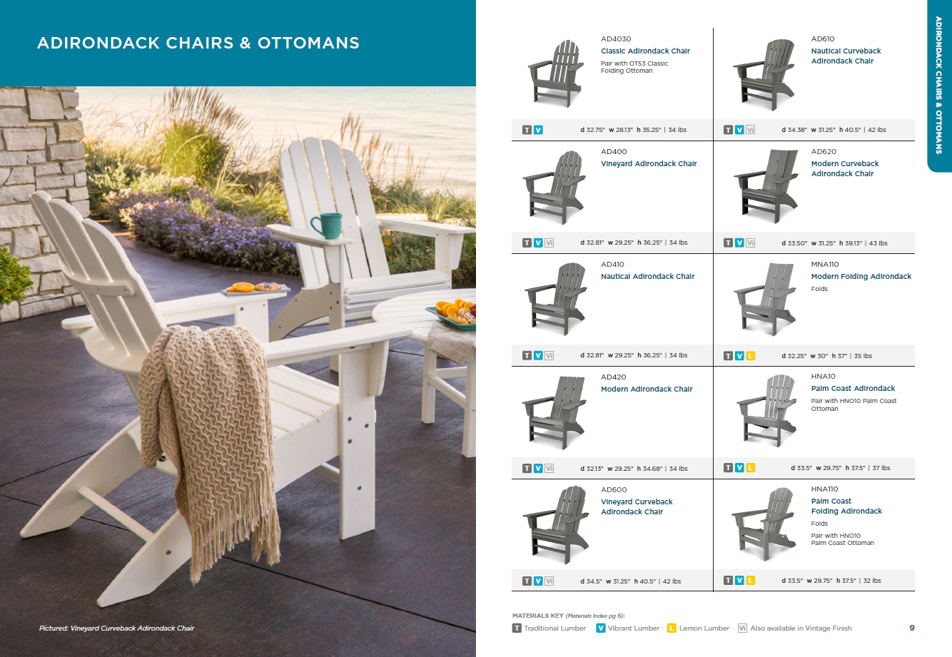
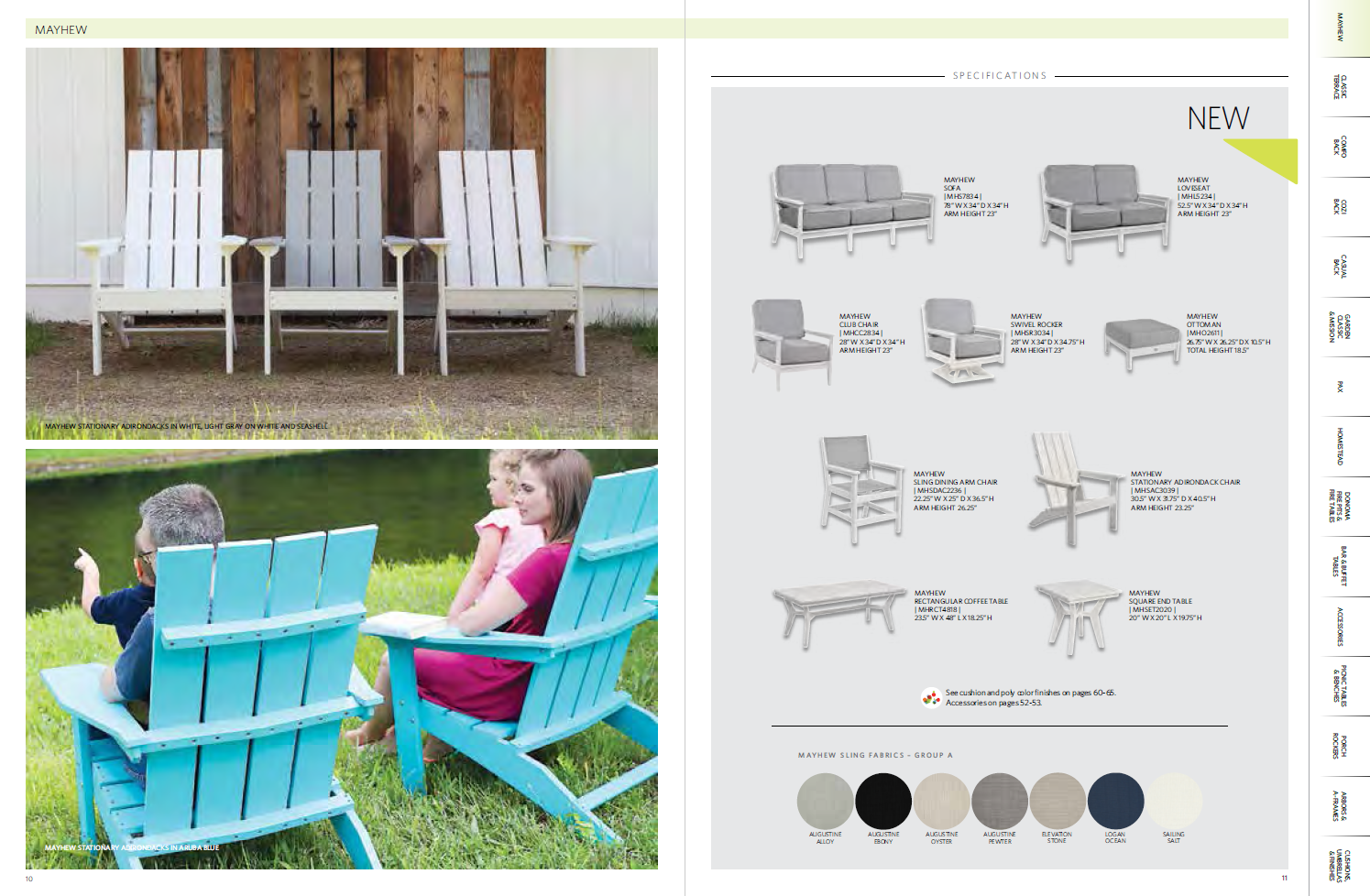
- Include dimensions for each product on the page
- Add corresponding lifestyle photos depicting each item
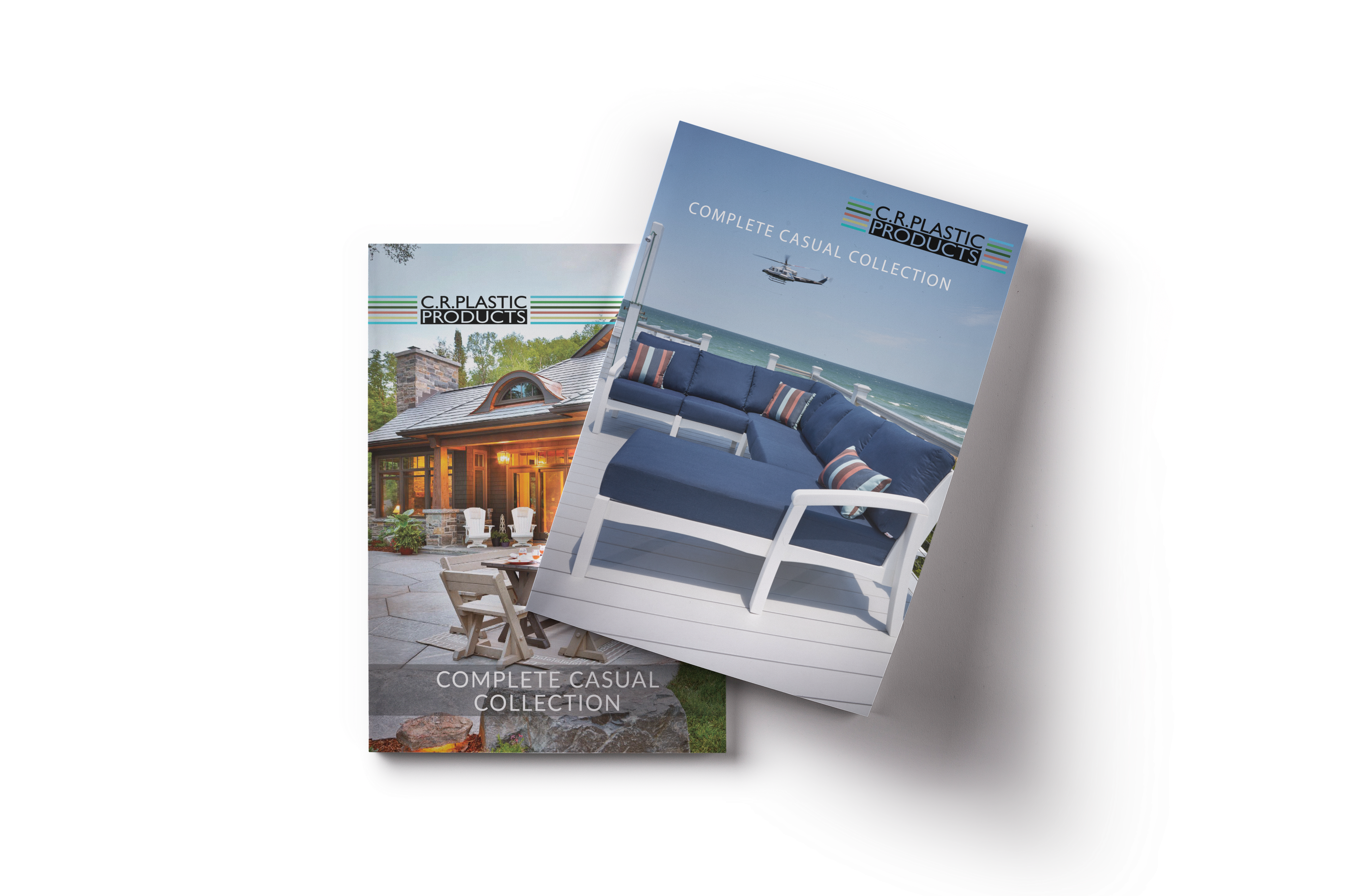
THE FIRST EDITION (2018)
Catalogue PDF:
Looking back at it now, there are a lot of things that I could have done to make this better. Although the design gave the company a framework for future iterations, the catalogue itself was uninspiring. In addition, it was restrictive since each page needed to have at least 3 items to fill it out. While the 2019 catalogue made improvements to the original, the same problems persisted.
CATALOGUE REFLECTIONS
Working on this project really helped me learn about the industry and target audience. It was a great experience traveling with the team, learning photography along the way while being surrounded by people who genuinely believe in their cause in helping the environment. Since the catalogues were distributed throughout the year to trade shows and clients, I gained valuable feedback that helped me make small, but meaningful changes to the 2019 edition.
Additional requirements:
- Include two new collections
- Maintain the 50-page limit (budget restrictions)
- Give the catalogue a 'coastal theme'
- Increase product image size
THE SECOND EDITION (2019)
Catalogue PDF:
IMPROVEMENTS
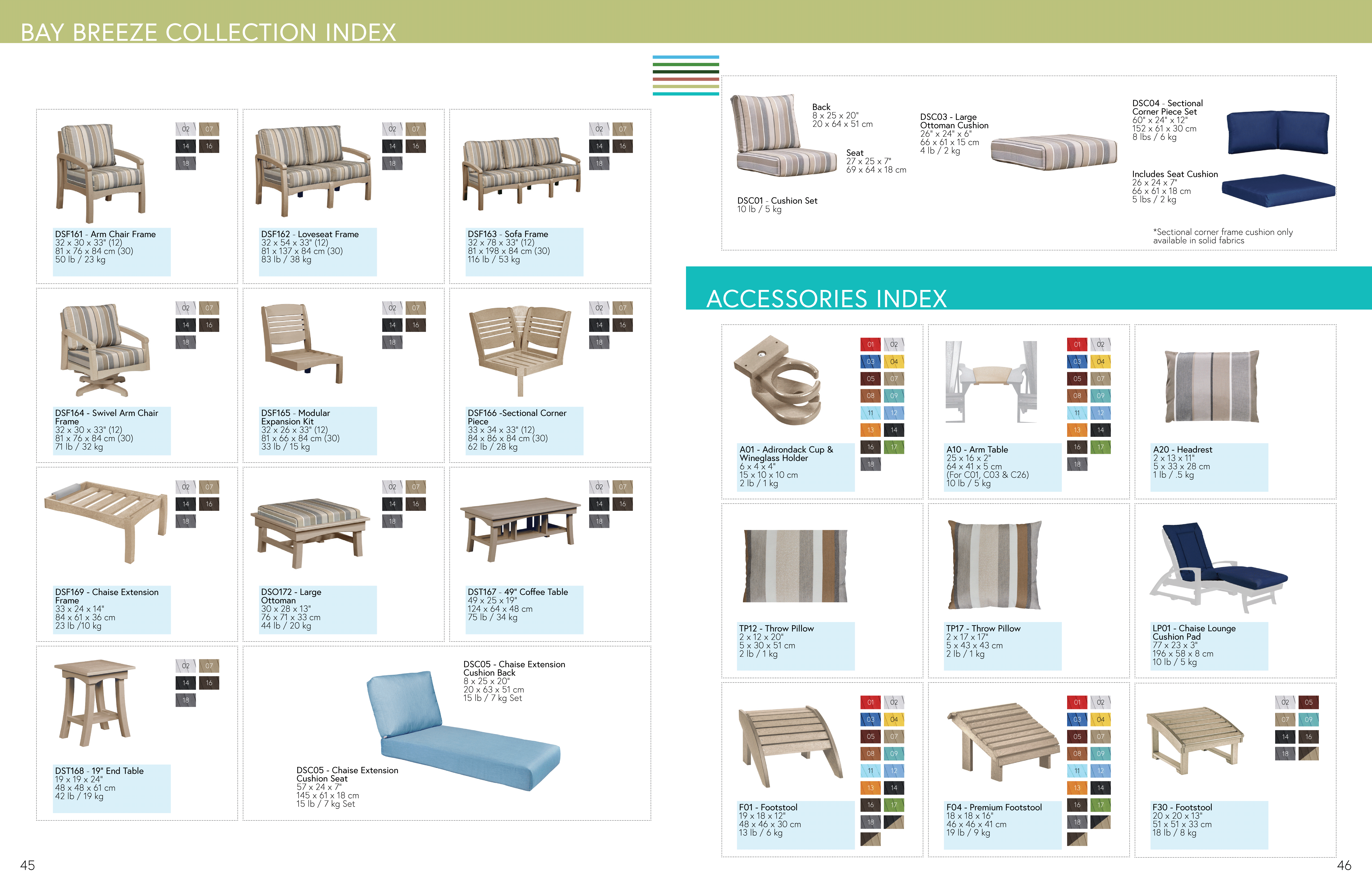
To improve how quickly our service representatives can navigate to each collection, a colour bar was added at the top of each page. This allowed them to skip to a collection based on colours that are unique to each collection. The product silos were also made larger by decreasing the space between the products and the photos. Colour blocks were also added to increase the clarity of the items shown, and all the colours in the index were replaced with a cropped portion of a product image. By doing this, it ensures that what the consumers see are "true to life."
OVERALL
From start to finish, the process consisted of a lot of trial and error. However, I like to believe that I learned something new after every iteration. Every major change or new addition affected the catalogue layout, and by pushing each product back a page or two, I understood its limitations.
The hardest part of this project was getting everyone on the same page. There are bound to be differences in opinion moving forward, and it showed me the importance of effectively communicating with everyone. I obtained a better grasp of their design language, and this helped me produce work that satisfied management while staying true to my beliefs as a designer. By creating meaningful relationships with the people I worked with on this project, we were able to produce something wonderful. And for that reason, I stay curious to see how the catalogues evolve in the coming years.
Selected Works

Sitejabber Landing PagesWeb Design
IllustrationsProject type
Vietnamese Student AssociationGraphic Design and Misc

Captiva Casual WebsiteUX / UI Design
PowerHub Website RedesignUX / UI Design
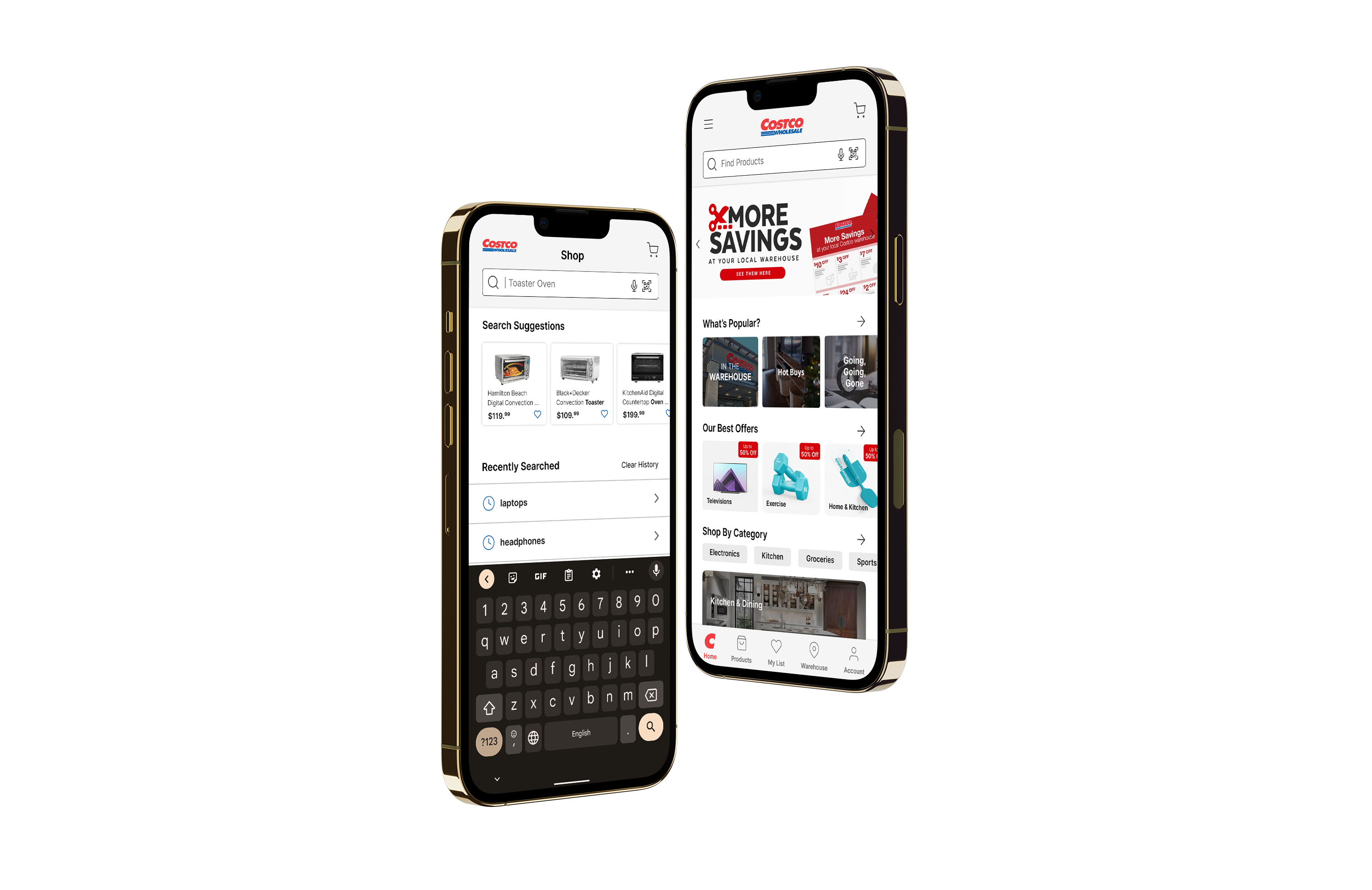
Costco App RedesignUX / UI Design
C.R. Plastics Catalogue RedesignPrint Design

Sitejabber Style GuideVisual Design Project
@ Gordon Lam 2021 - 2022
Let's create meaningful work together. - Glam517@gmail.com