ROLE
Designer
Researcher
TIMEFRAME
January 2022
TOOLS
Adobe CC
Figma
TEAM
Me
As a global retailer spanning eight countries, Costco is the world's largest membership warehouse club. However, its existing mobile app does not reflect that. With thousands of items spanning dozens of categories, the current app is cluttered and difficult to navigate. The scope of this project is to rectify this issue; to make it easier to search for what users want and really improve the overall shopping experience on the Costco app.
THE CHALLENGE
Costco's existing application felt like a web app. It was filled to the brim with promotions and item placements that did not make sense for a mobile app. I wanted to make the app less frustrating, and reduce the time it takes for users to find what they need to.
SOLUTION
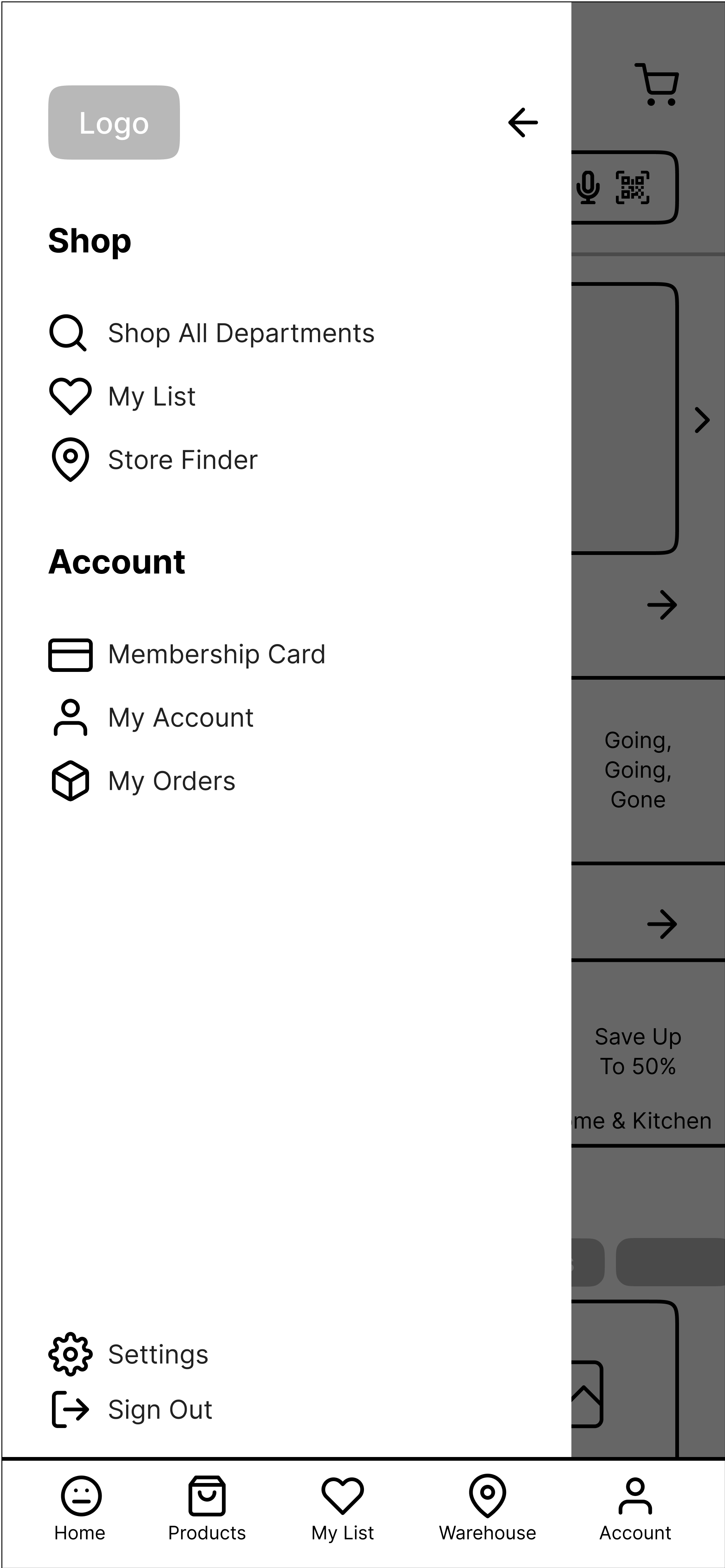
The new app offers a cleaner, less dated look. Tabs and buttons are placed where users expect them to be, and the department filter is now organized in a way that makes it easier to find what you're looking for. Additional functionality has been added to the menu, and lists are now easily accessible.
OBSERVATIONS
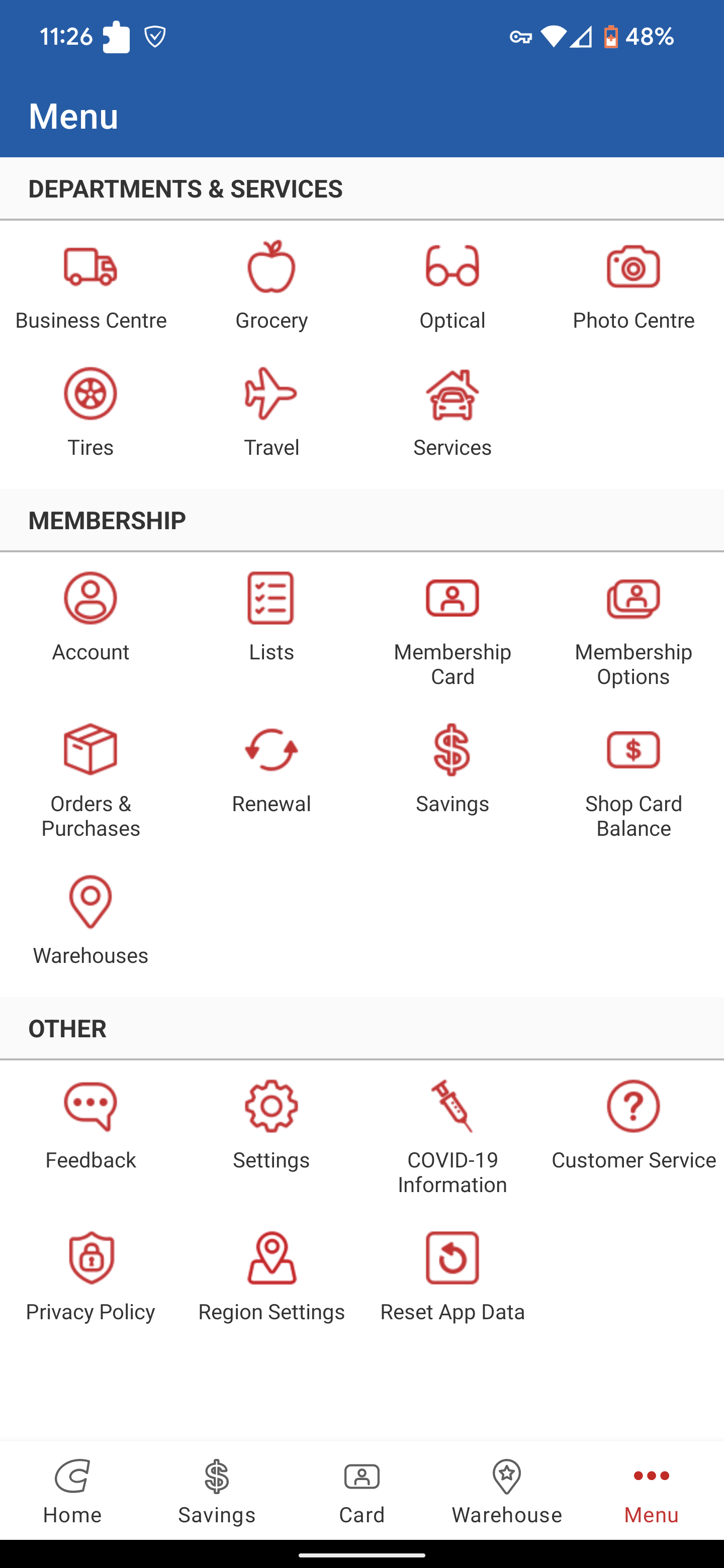
When I first downloaded the Costco app, it didn't take long for me to understand why the app was so universally disliked on the Google Play Store. Boasting a solid 2.3/5 stars from over 33,000 reviews, the app was bad. Entering the app took users directly to the home page, filled with dozens of ads and promotions to different product categories at Costco. Several functions of the app were locked behind a "Log In" screen, and there was no option to "Continue as Guest."
Despite having the option to purchase items without a membership on the website, that message was not conveyed on the app. To create a better understanding of the problem, I sifted through hundreds of reviews on the Play Store and gathered a few key complaints about the item navigation and selection as the basis for my redesign.
- It is difficult to navigate back to an item category once an item is selected
- There is no option to check if an item is available either online or in store
- Membership only items force you to log-in repeatedly while shopping
- Making shopping lists require you to log-in and are difficult to access once they are made
INITIAL PLANNING
At this point I had a general idea on "What?" the problem is, now I have to understand "Why?" I began by mapping out an interview format that would help me get answers. How do users navigate the app in addition to their insights using other shopping apps was imperative for creating my design later on.
Here are some of the questions I asked:
- How do you usually look for items on the Costco app?
- How do you feel about the search filter on the Costco app?
- How was your experience using the department filter on the Costco app?
- If you would like to purchase an item, what do you do on the Costco app?
RESEARCH
To elaborate on my research, I had my participants complete simple tasks using the app. Due to time constraints, there were four participants and the following parameters were applied.
- Users who have a Costco membership or have shopped at Costco through the app or online
- Male/Female
- Ontario Wide
- Age 18-65
USABILITY TESTING
The tests were carried out both online (through Discord) using screen recording, and in-person. Both Android and iOS devices were used for this test, and all users were given the same tasks.
- Search for gaming laptops
- Search for TVs that fit within your budget
- Add an item you want in your shopping list
- Add a membership required item into your shopping cart
- Search for Nespresso Coffee Machine using the department filter
- Open your shopping list and add the items to your cart
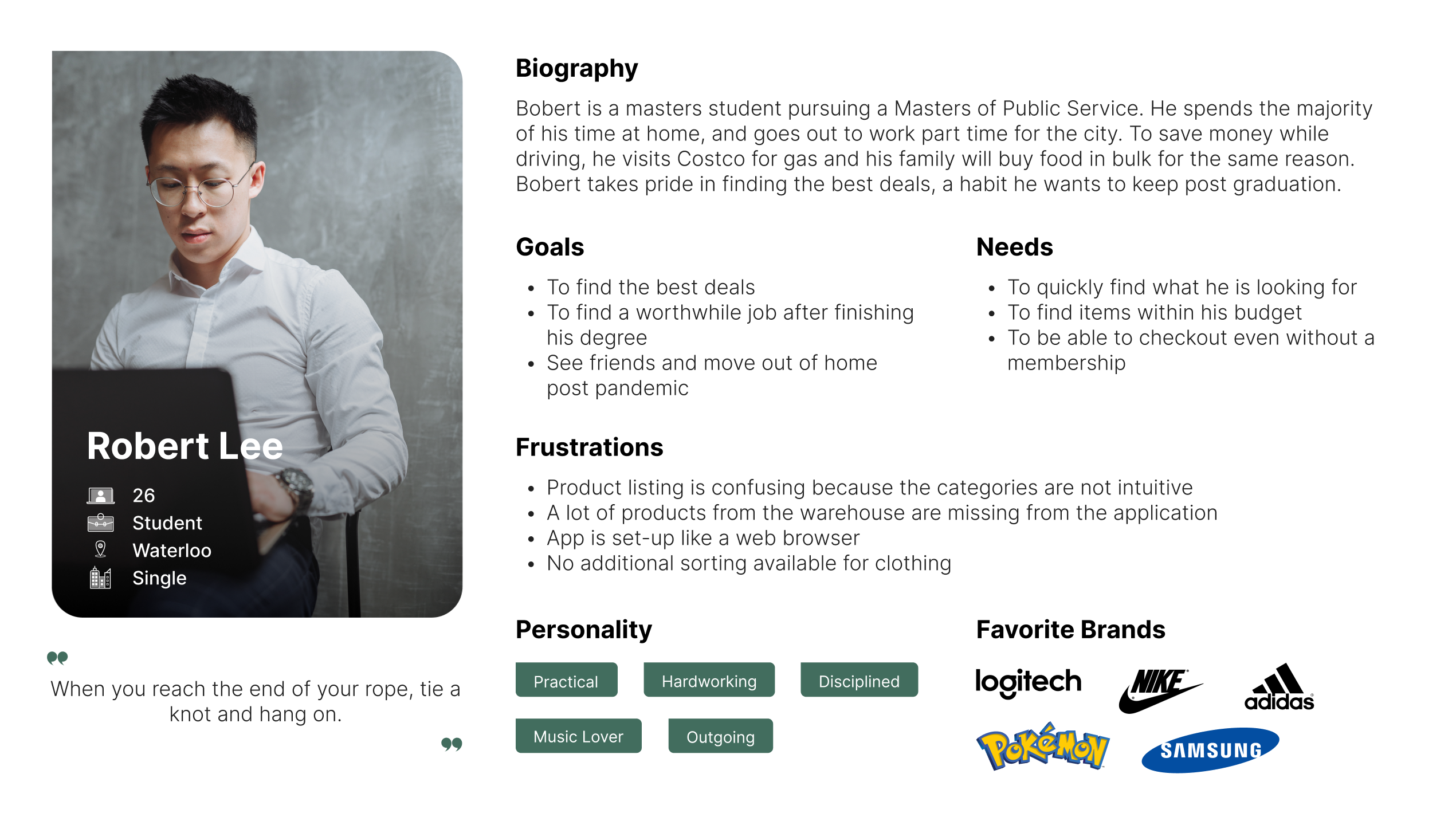
USER PERSONAS
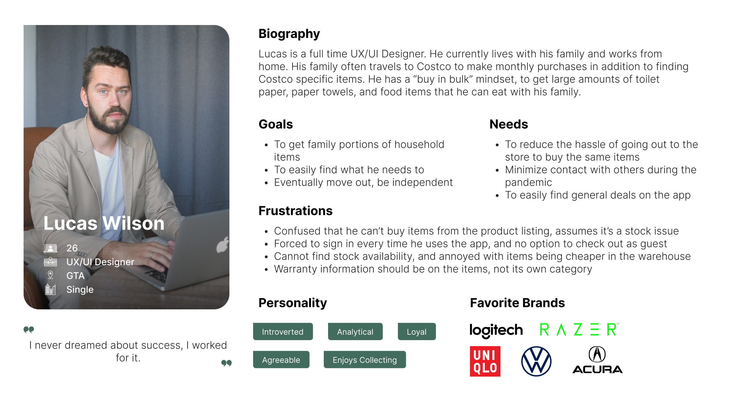
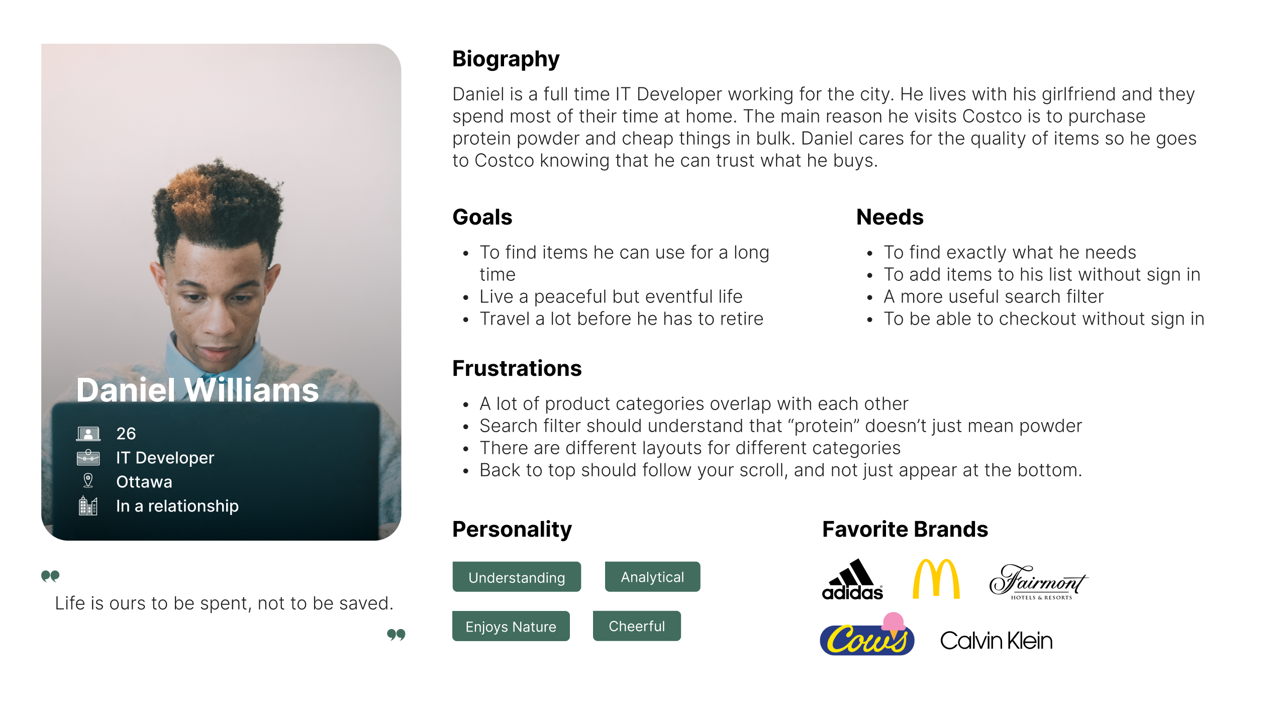
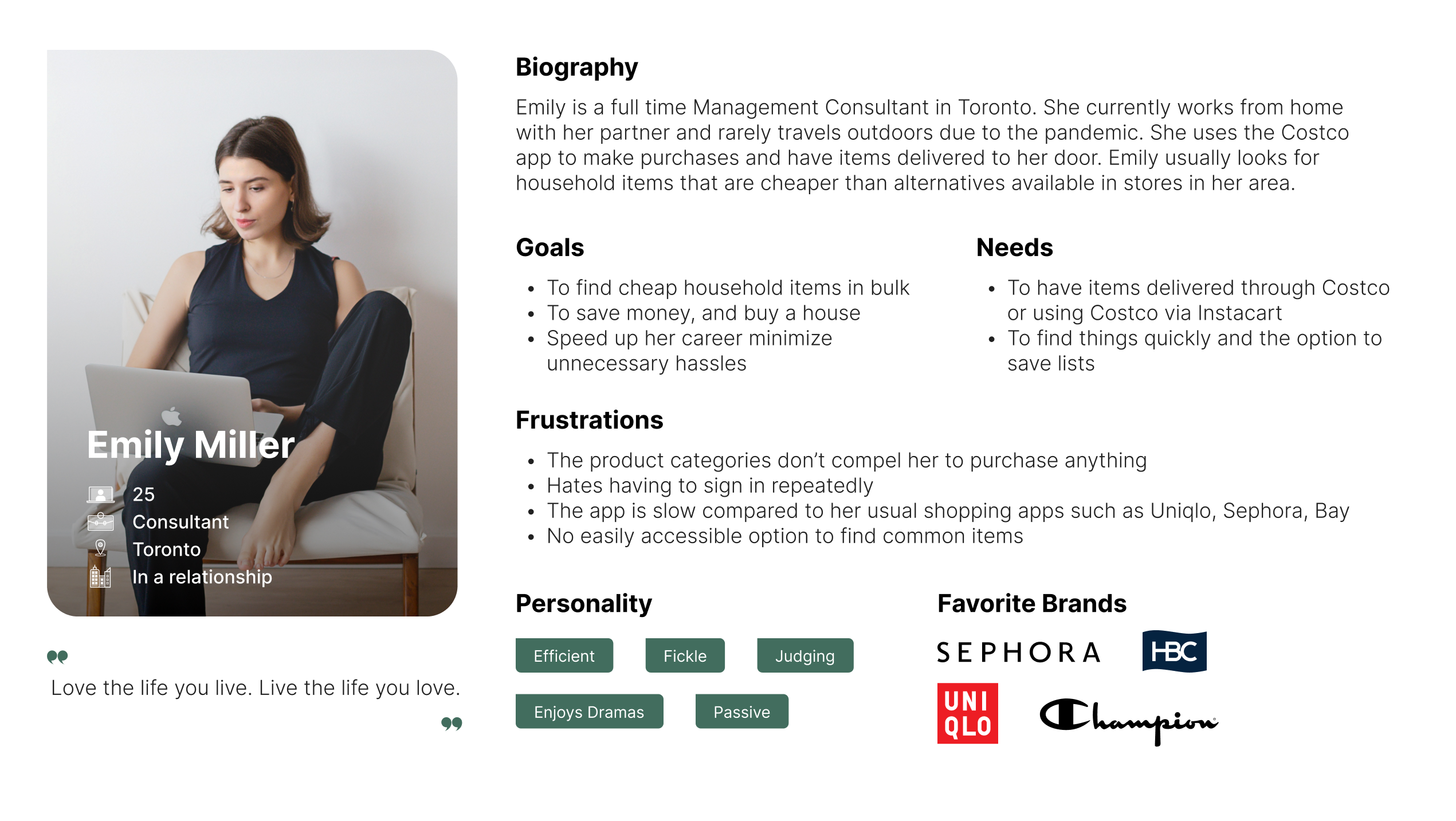
TEST RESULTS
While most tasks were relatively simple for my participants, there are a few points that are worth highlighting. All the participants were annoyed that each product filter had to be individually applied during the TV task. Almost all participants used the search bar first to look for an item, but more than once were errors returned for incorrect spelling. There was one task however, that all participants had trouble completing. This was the Nespresso Coffee Machine task.
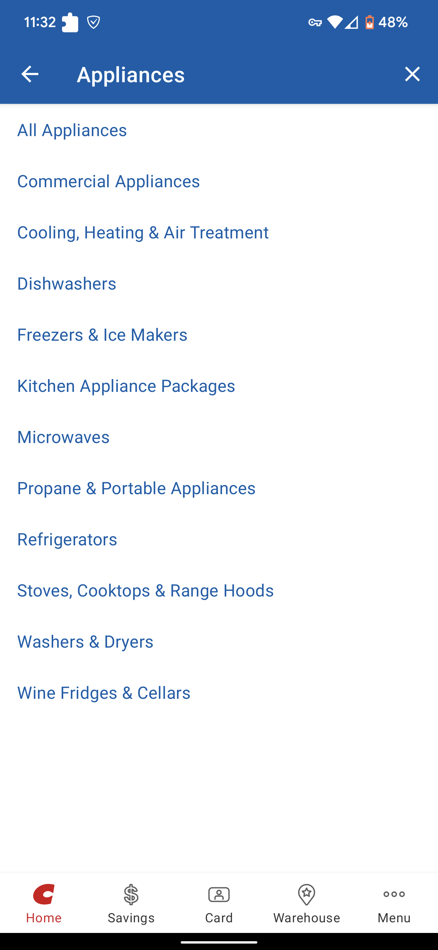
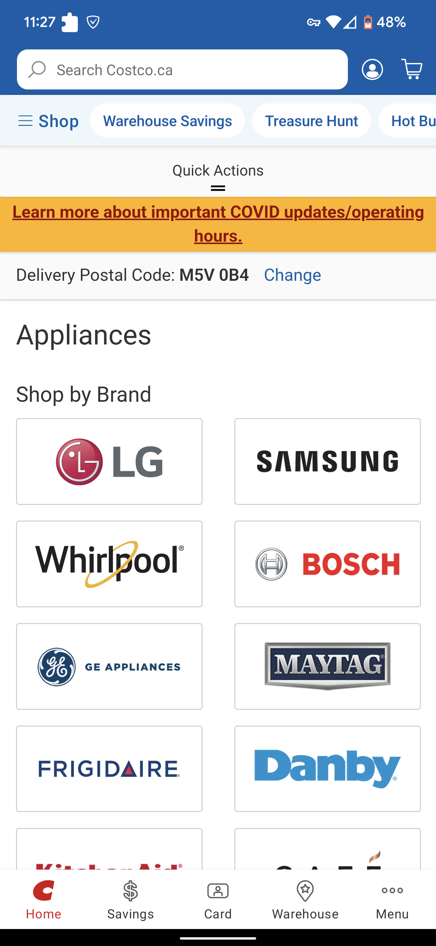
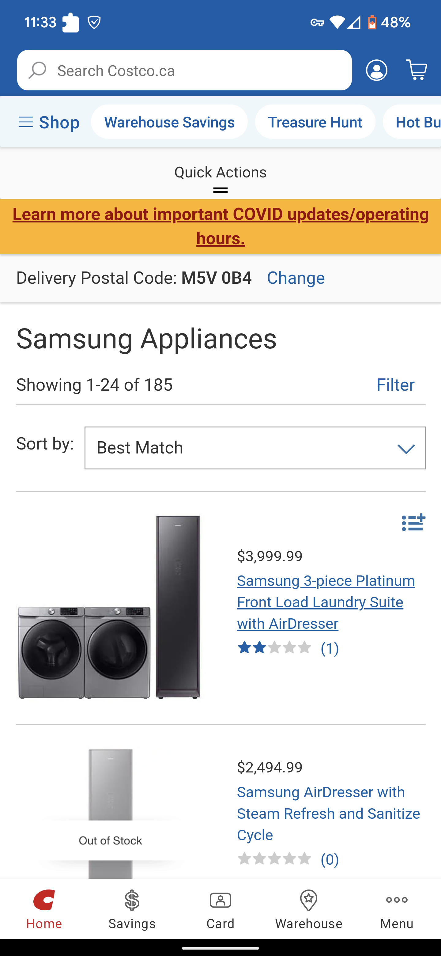
The problem lies in the department filter, where half of the users first went to the Appliance section, before getting lost and renavigating to Home & Kitchen. The department filter was too specific and often returned empty search results. Overlapping categories were segmented into specific categories that separated fundamentally similar items. One user noted that the department filter was hard to find, as it sat under the search bar on the home page.
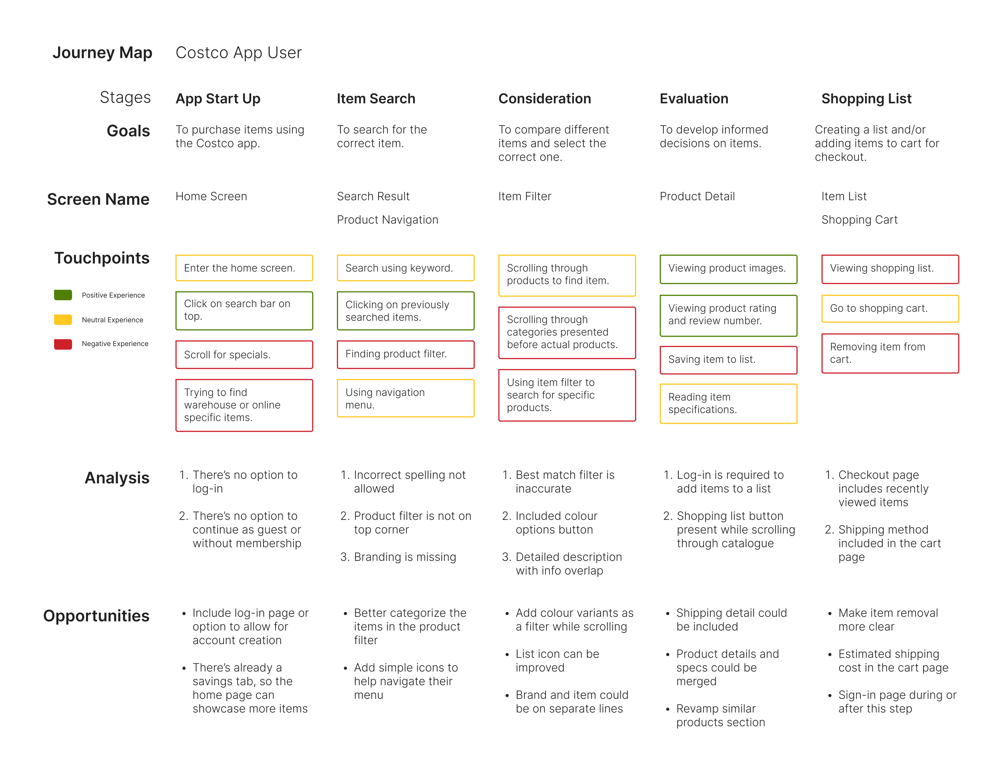
Using data acquired from the interviews, I made a journey map outlining their experiences stemming from opening the app until they begin their checkout process. I noted touchpoints throughout the entire process and used the negative experiences to develop potential opportunities for my redesign.
WHAT ARE THE REAL PROBLEMS?
Based on the testing results and analysis, there are four key problems experienced by users.
- The product category filter menu is poorly organized.
Users that want to search for product categories without using the search bar are having trouble understanding the Costco application's information architecture. Multiple departments overlap, sub-menus lack hierarchy, and many categories are better left as a filter.
This can be solved by introducing arrows to indicate nested menus and an overhaul on department category grouping. A search bar can be added to the department filter to help users search for items while they are inside a nested menu. Lastly, the product filter menu can be added as a tab in the app, making it easily accessible as it's a key function to a shopping app.
- Searching for items using the search filter is not intuitive.
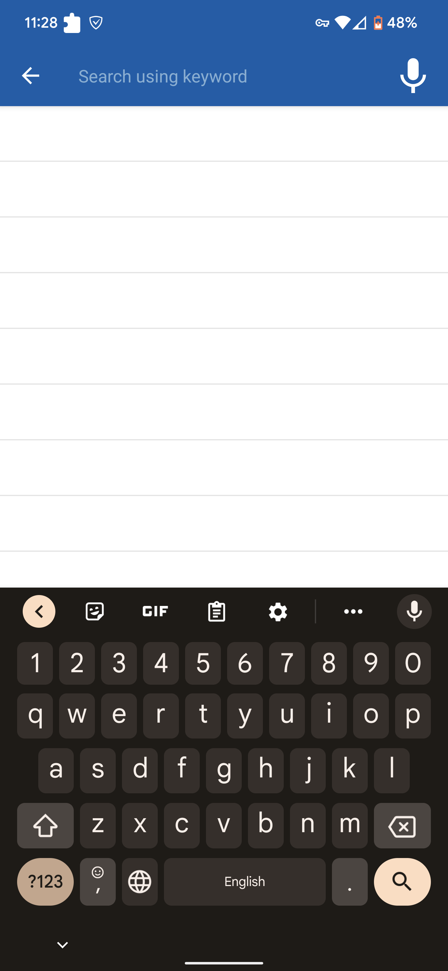
To search for a specific item, the full name must be typed before being taken to a product list. There are no item previews, auto-fills, nor suggestions to help the user navigate to what they want.
The solution to this can be to add category suggestions alongside items that correspond to what the user is typing, even before they enter a product list. The search filter should allow for user errors, and possibly provide word highlights that help them sift through different items in the same category.
- The product description does not show item availability on its page and makes it difficult to "save" items.
Finding out if an item is available at a warehouse or online is difficult since it is not information that is immediately visible to the user. In addition, they need to scroll past a lot of product detail information to save an item or to add that item to the cart. There is no easy way for users to find answers to any questions they may have about the product.
The solution could be to make the "Add to Cart" and "Add to List" buttons sticky. Availability information can be added to both the product listing and item description. A Q&A section could be added to resolve product-specific questions, and the "Specifications" and "Product Highlights" sections could be merged in some capacity.
- The product filter is not detailed enough.
A common complaint during testing was that the product filter was too generic. Users could not sort items by parameters specifically relevant to their chosen category. Price, brand, and category account for only a small amount of information that some users need to determine a fit. Appliance shoppers might have sizing and weight constraints while users shopping for clothing would need to know shoe type for example.
For this issue, we can add category-specific filters (made easier with better department filter organization) and just improve the product filter UI. It's a small problem, but its an important one.
NEXT STEPS
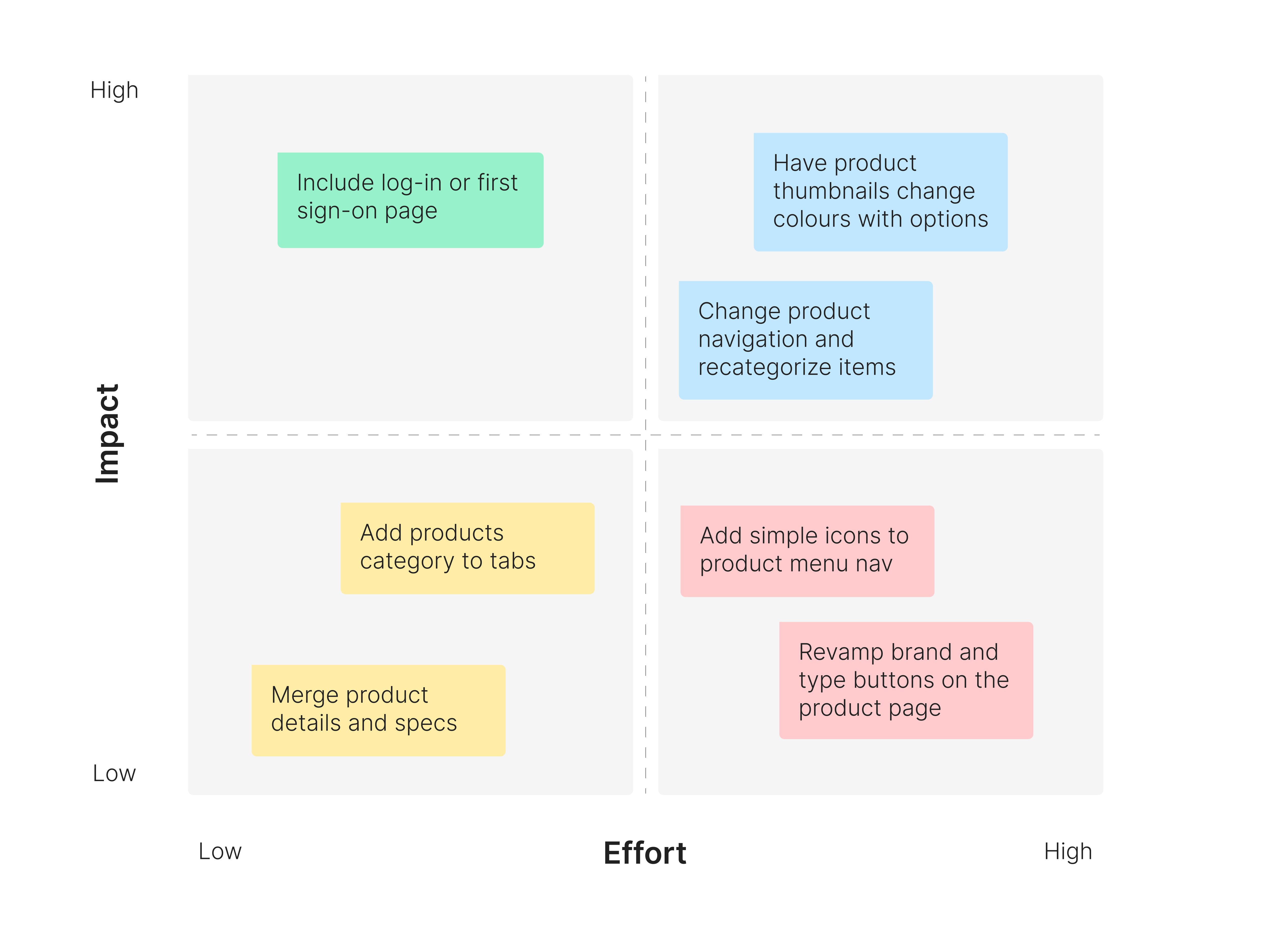
Although there are a lot of problems, it is not always feasible to fix all of them. Based on the opportunities present in the user journey map, a simple priority matrix was created to consider which user experience improvements should be implemented.
Only opportunities that exist within the scope of this study will be considered and I have narrowed it down to four actionable insights.
- Change product navigation and recategorize items.
- Add "Products" category to navigation menu/tabs.
- Add simple icons to the product menu navigation.
- Merge product details, highlights, and specifications.
PRIORITIZATION MATRIX
USER FLOW
I developed a user flow to show the steps that a typical user will take when using the Costco application. From home to payment confirmation, I needed to better discern how users would go from one page to the next. This is especially true for product navigation so users don't feel stuck on certain steps.

DEPARTMENT FILTER ARCHITECTURE
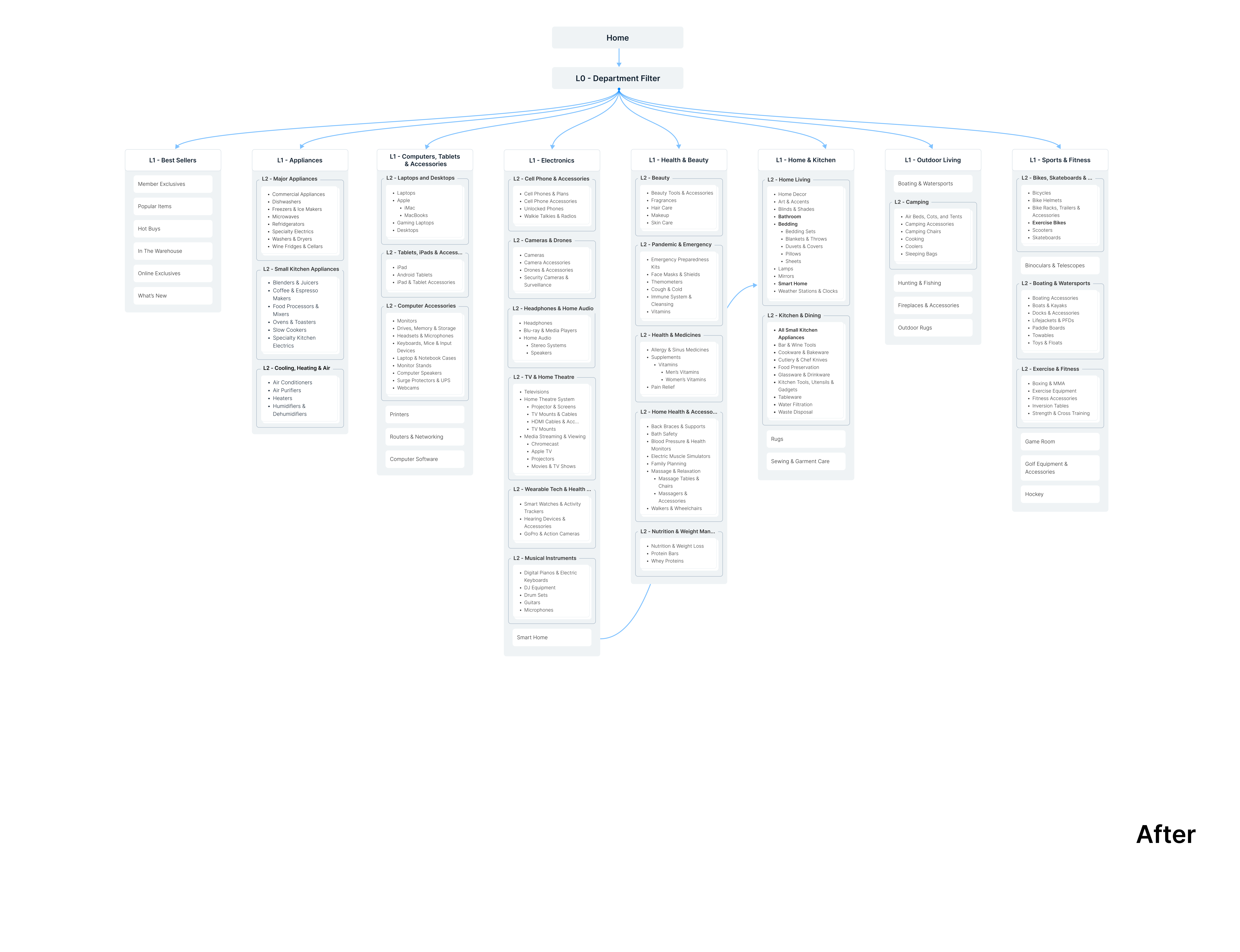
After seeing the myriad of departments and sub departments on the Costco app, I realized I underestimated the scale of my task. As a result, I focused on the six most popular categories. I mapped out the categories and gave them an "L" filter to represent each menu level.
I then looked at which categories were redundant, or was better off as a filter and started there. The subcategories were colour-coded to show what I wanted removed, categorized differently, or renamed. This helped with grouping similar categories, and give users the option to access the same department from different entry points.

LO FI WIREFRAMES
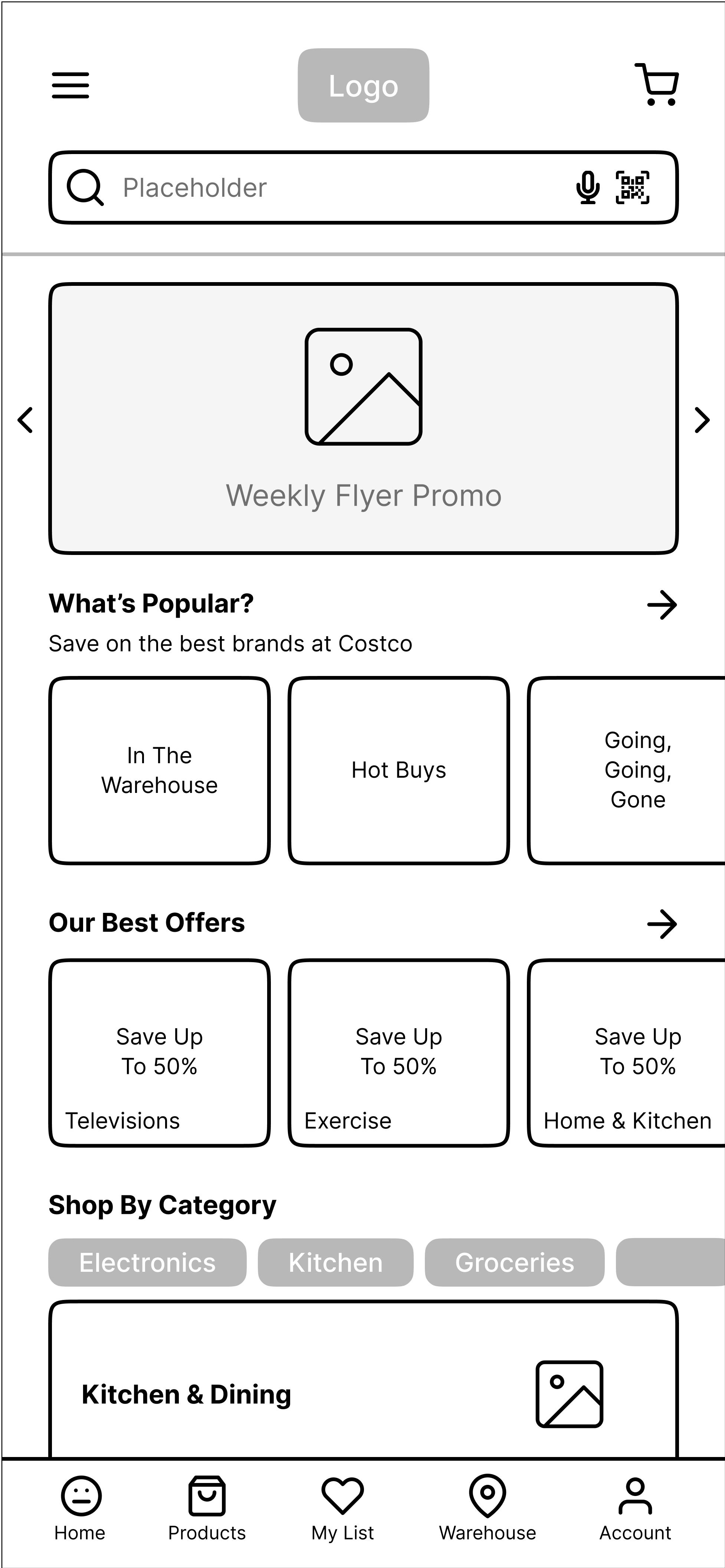
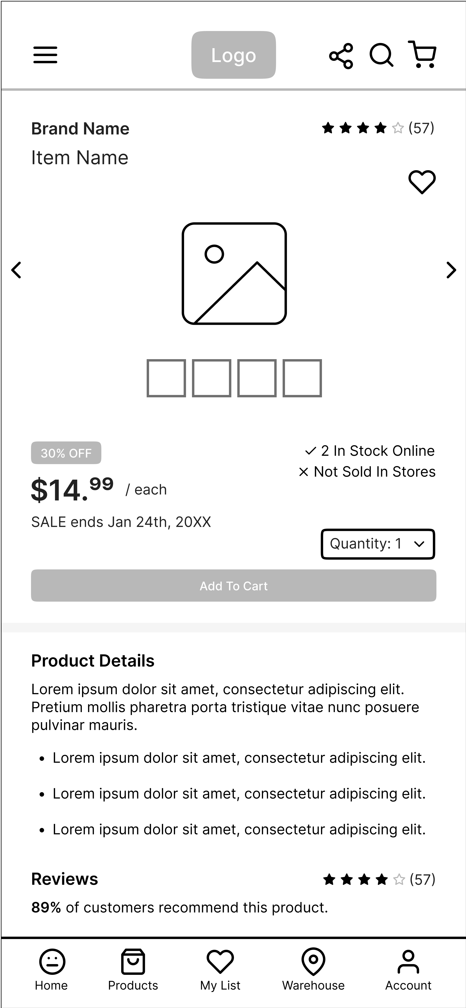
Using Figma, I developed some low fidelity wireframes based on the information that I have acquired. They are a little more detailed than necessary, but it really helped me in visualizing how the final product would look.
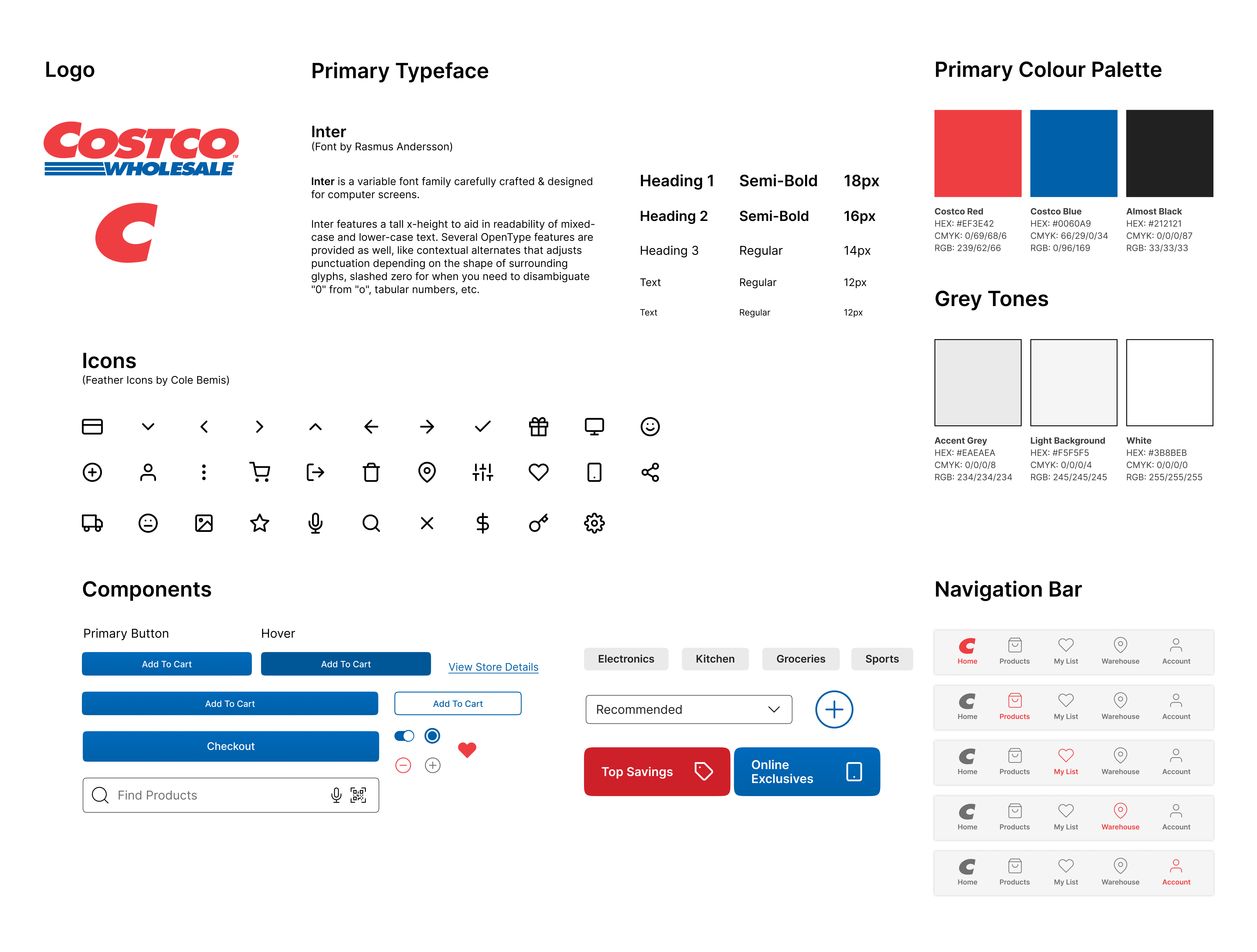
DESIGN GUIDE
Like an artist prepping his palette, I created a style guide to guide me through the final UI designs.
HOME PAGE
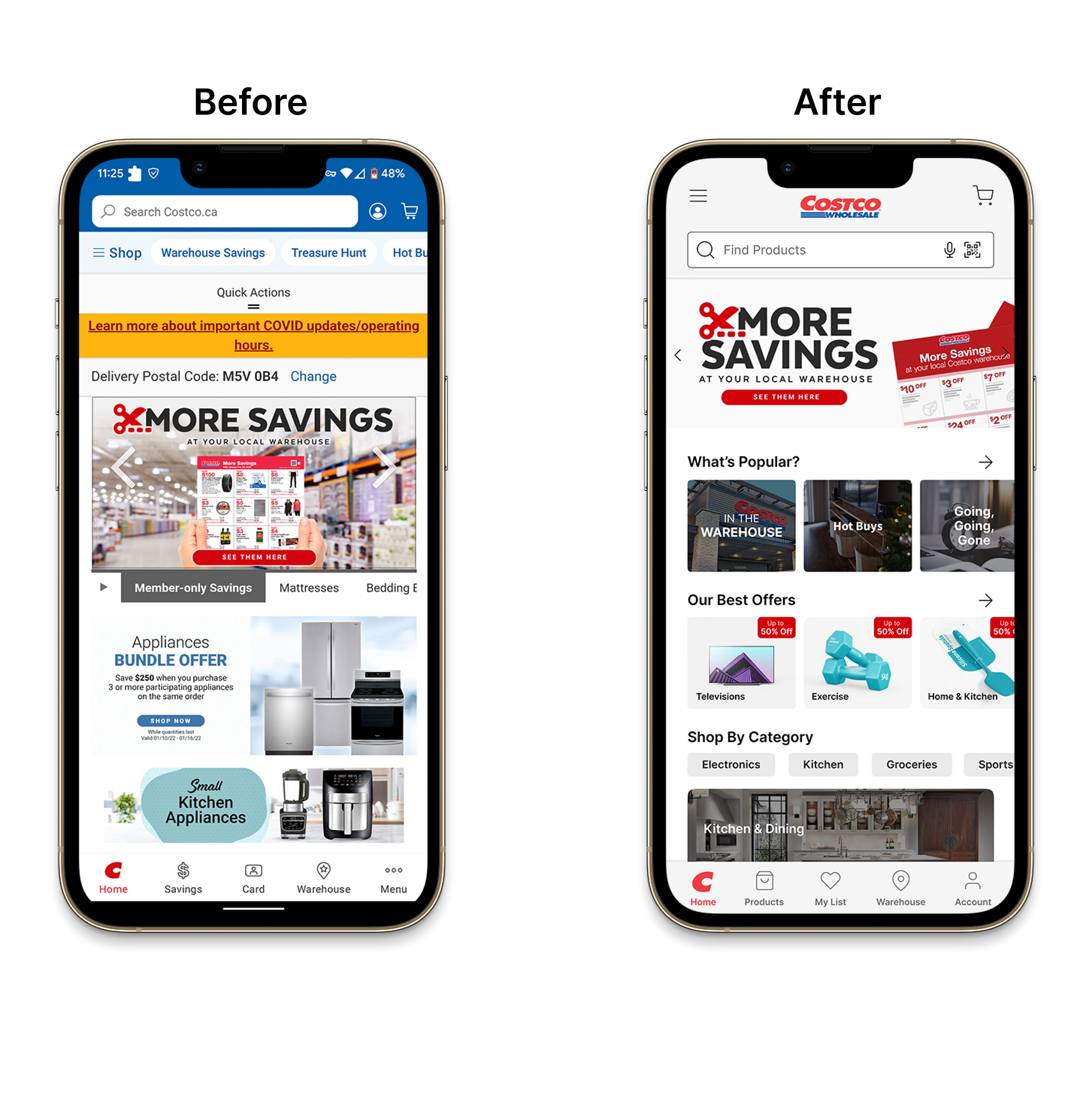
I debated between having users start with a sign-up flow, or go directly to the home page. In the end, I decided to push log-in towards the shopping cart page to minimize friction. This allows users to checkout as guests, and lessen the misconception that a membership is required to shop online at Costco.
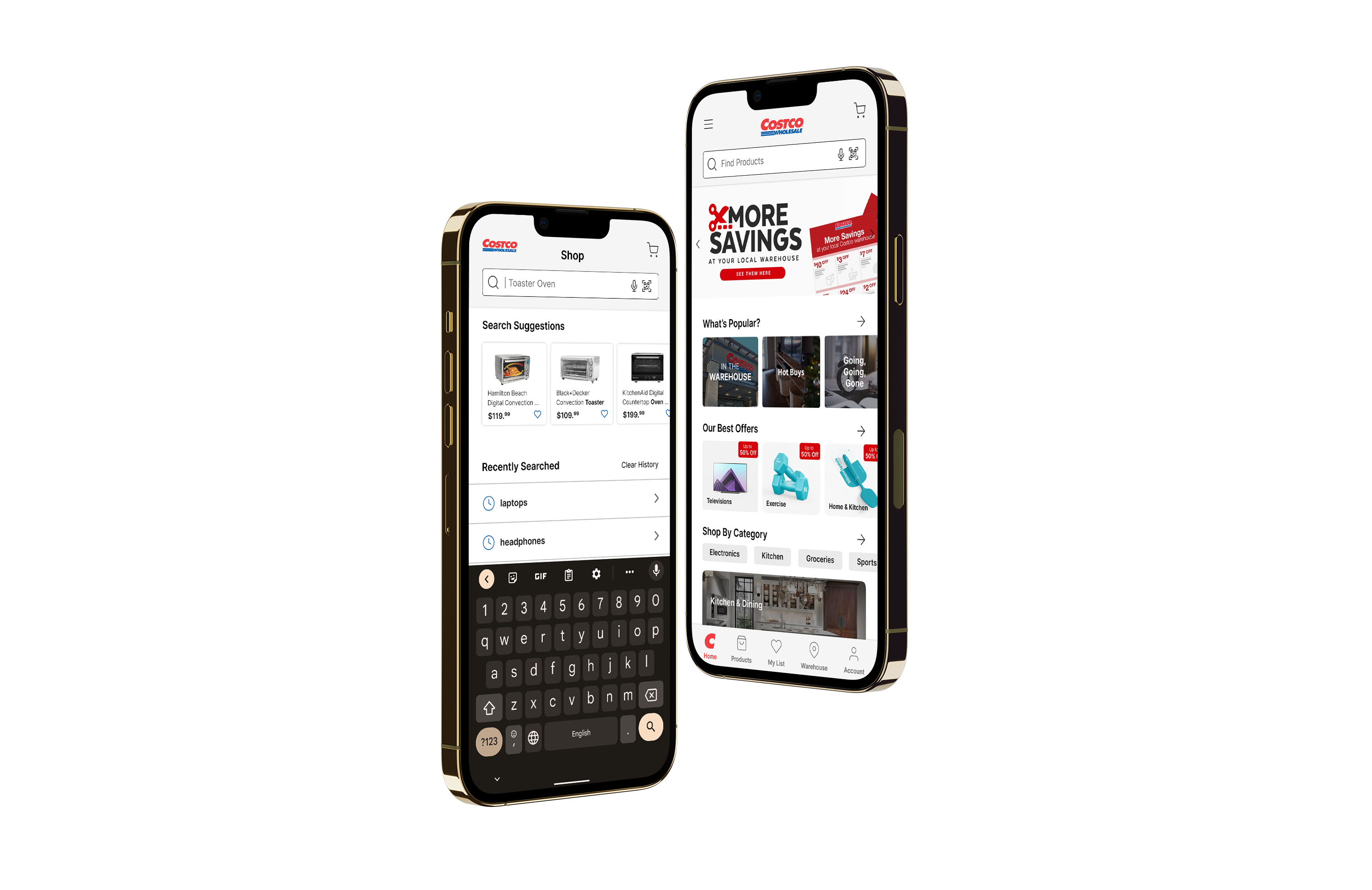
The changes in the home page include reducing clutter, and have key categories such as sales or popular items more accessible. The search bar has been given voice to type and QR code scanning functionality to aid accessibility and has been placed in a more central location.
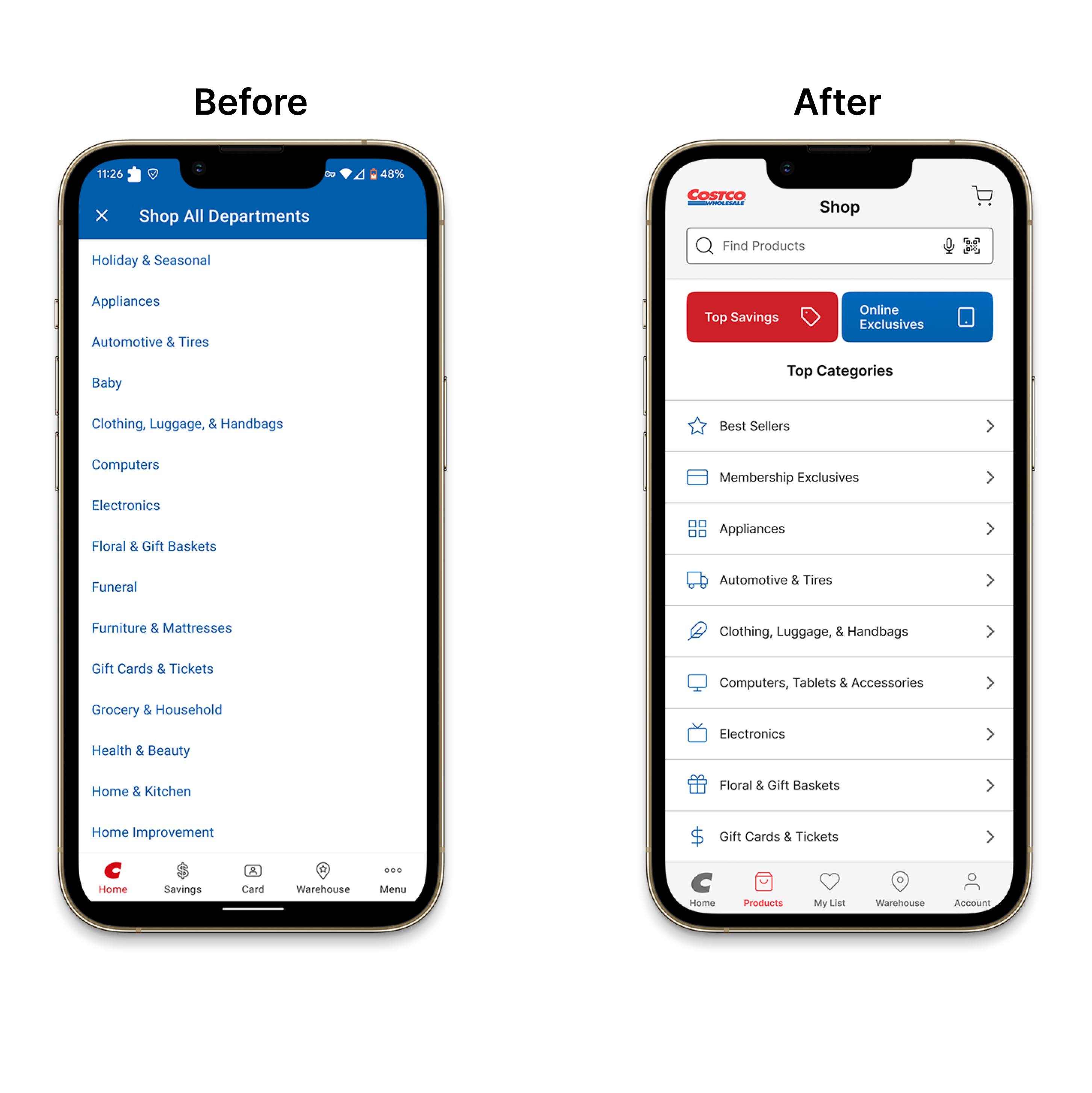
The account icon that used to be next to the search bar has been removed and added to the tab navigation. Categories have been added as a section, giving users more options to search for what they need.
DEPARTMENT/SHOP FILTER
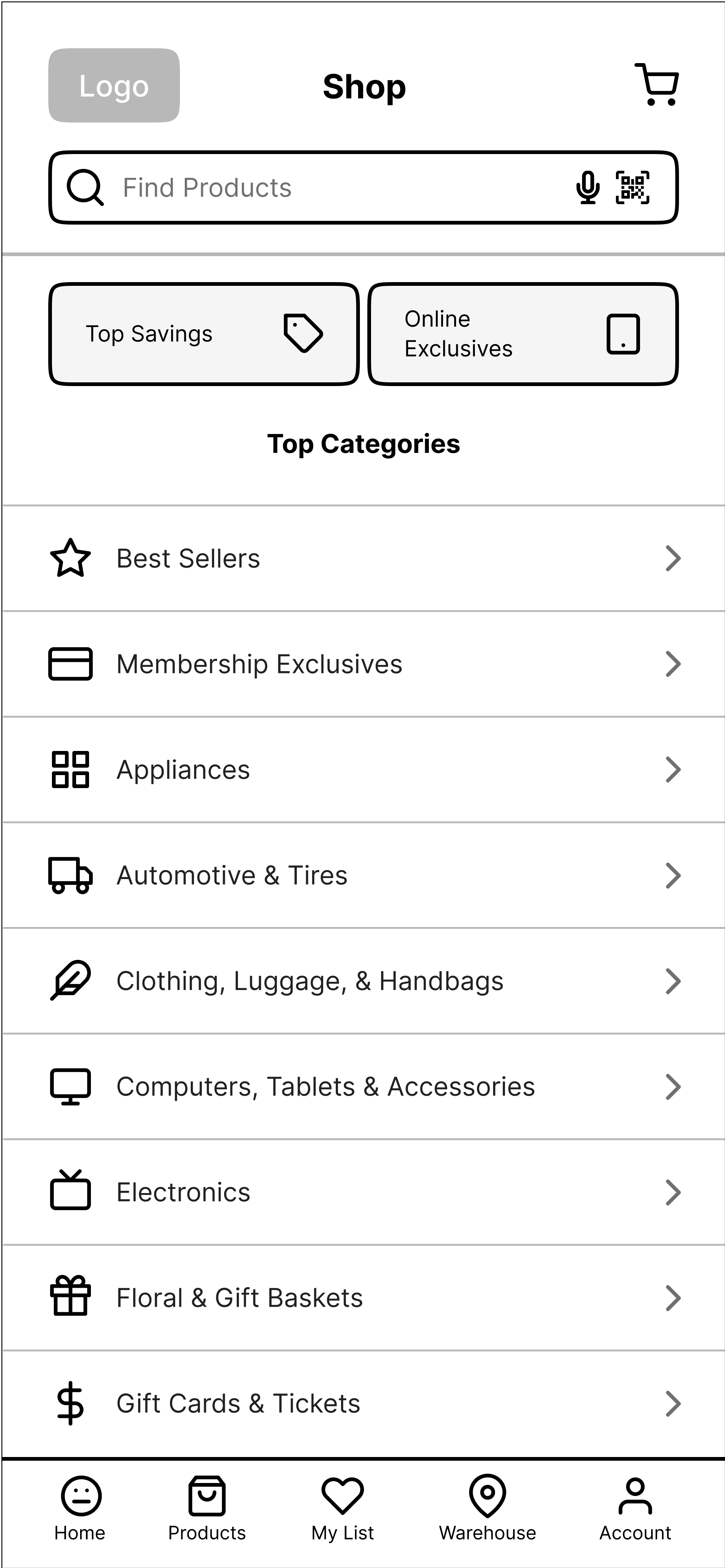
In addition to adding a search bar in the Products tab, two buttons were added for things that a consumer exclusively using the Costco app might care about; top savings, and online exclusives. The reason why I am placing significance on Online Exclusives is due to the vast amount of items that are rotated out or not available at local warehouses.
A single Costco warehouse typically carries 4,000 items, while a single Walmart can carry as many as 142,000 items.
I also added icons to differentiate departments alongside arrows and lines to improve visibility while navigating. The department categories have been changed to reflect the updated grouping mentioned earlier.
The Costco branding is now present in most pages and serves as an alternative method to return to the home screen.
PRODUCT PAGE
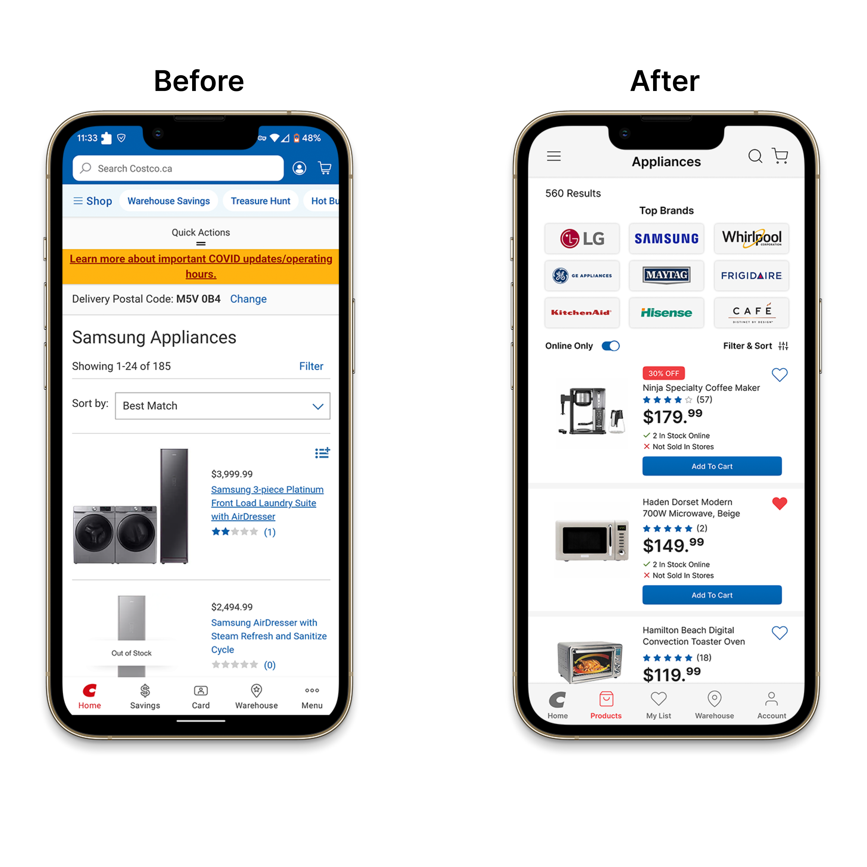
The old product page had a "Shop by brand" section at the top, and I didn't hate the idea but it took up way too much space. For some categories such as Appliances, Cell Phones or Computers; the brand matters. I changed it to "Top Brands" instead, and added a few QoL improvements to the page.
There's now an "Online Only" toggle, hearts that allow users to add items to a list, and an "Add to Cart" button below every item. While it may seem unnecessary for things like Appliances, users who shop for groceries or smaller items might find it useful.
The last change is the inclusion of stock information. Users can see stock information for both warehouse and online stock.
ITEM PAGE
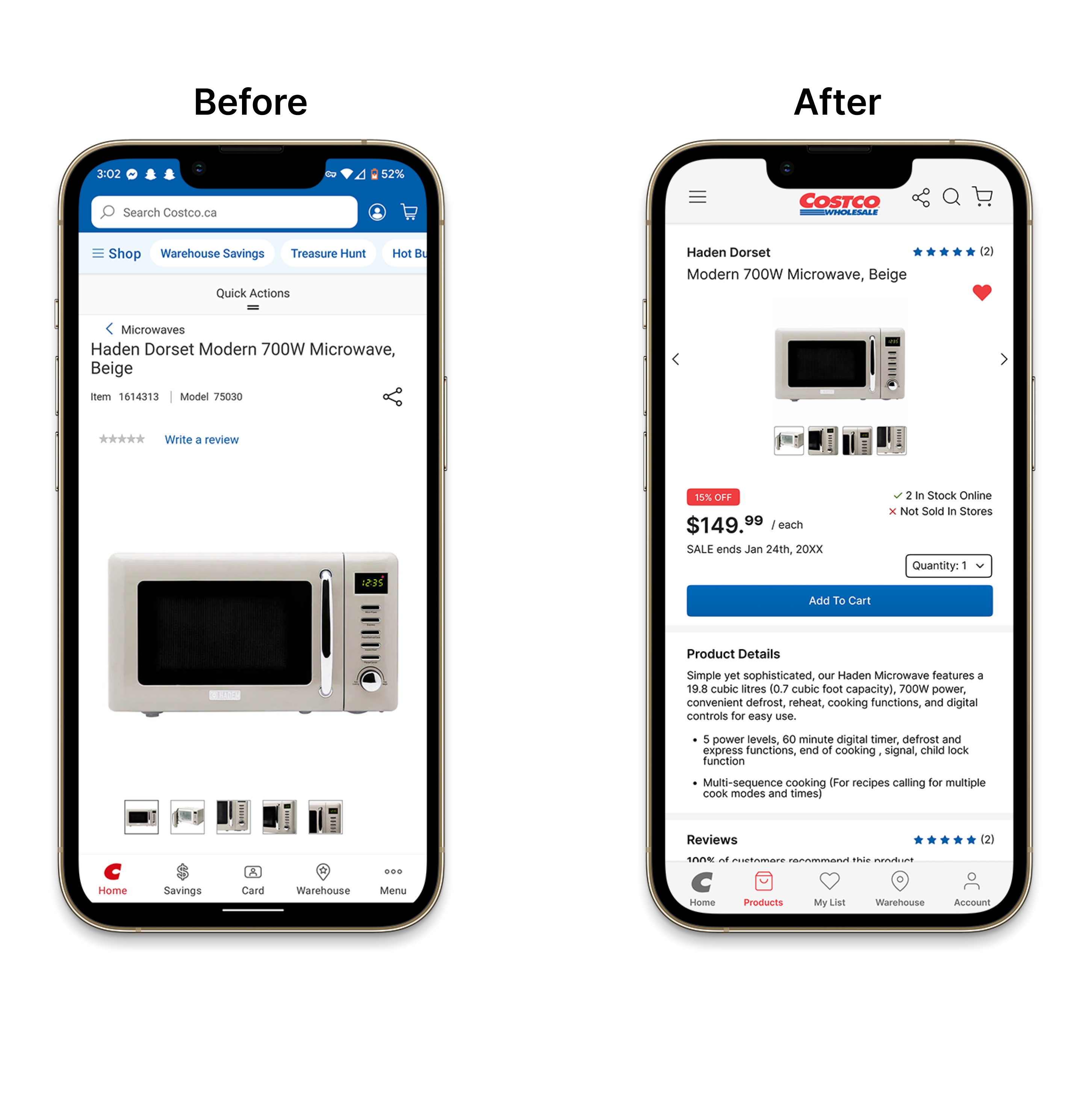
On the item page, users are able to quickly add items to their list, and the "Add to Cart" button has been moved up significantly. Product highlights and specifications are now "Product Details" with the goal of removing repetitive information.
Warranty information and reviews have switched places, and a Q&A section has been added to resolve any doubts users may have about an item. Stock information is present here as well, similar to the product page.
FILTER & SORT
The "Filter" button, now called "Filter & Sort" now has a "Sort By" drop-down at the top, being the filter that users will likely use the most. New filter categories have been added that better reflect the department.
Information such as room type, weight, and appliance type has been added in this case. The clear all button is now near the top right with added colour for visibility.
By not having the filter fill the screen, users can click outside the filter to leave the menu.

SEARCH FILTER
The virtually empty search filter has been replaced with popular search categories. The search bar is more visible, and the goal is to have recommended items and autofill be available while the user is typing.
The "Recently Searched" section now has icons for visibility and an indicator arrow to show that it's clickable.

MY LIST
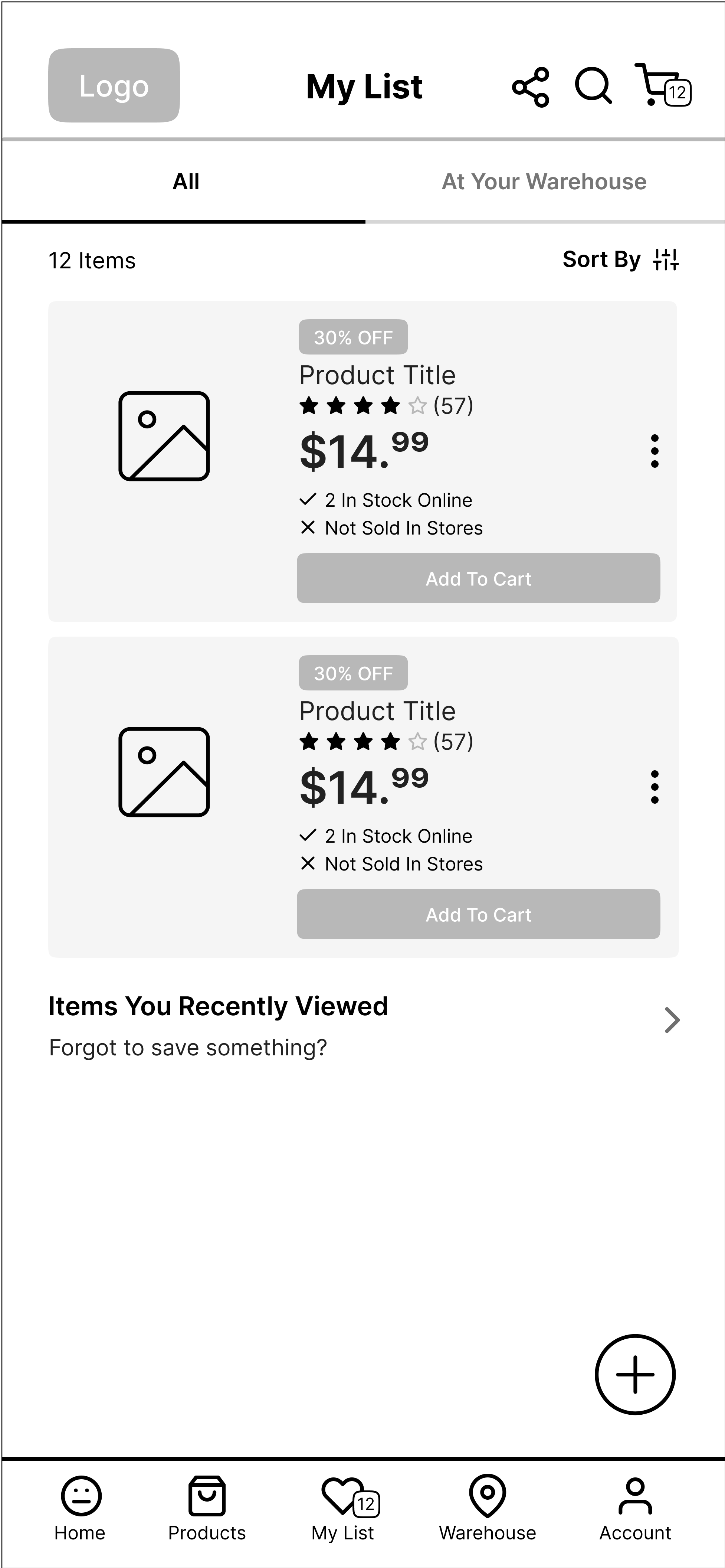
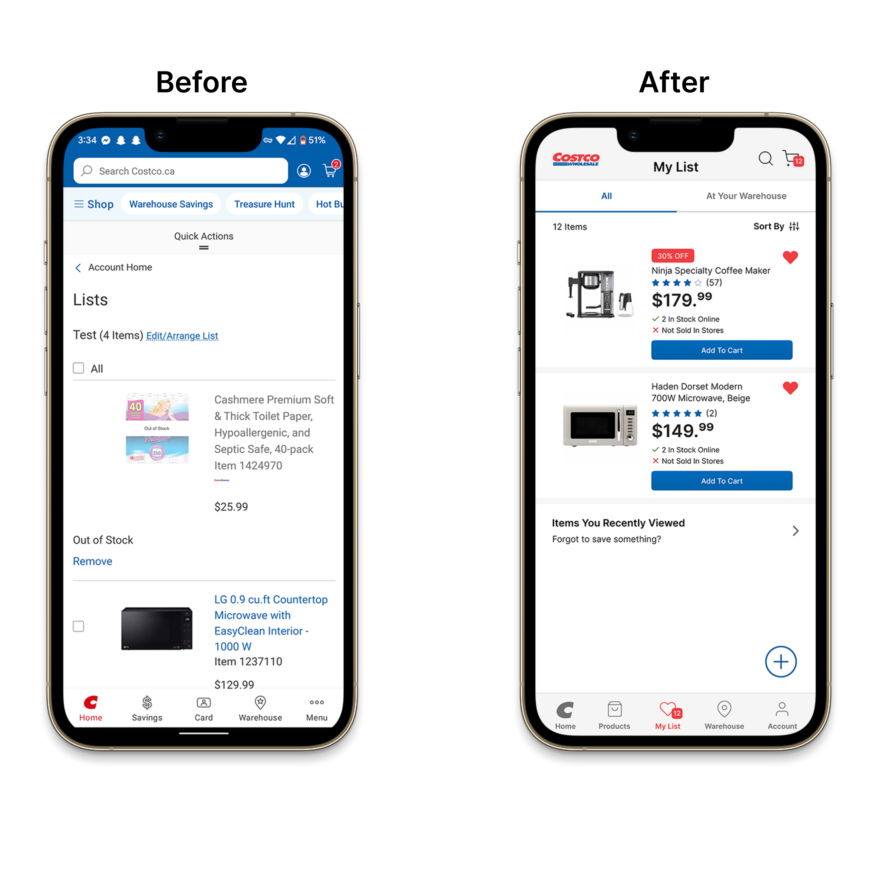
Lists now occupy the space where the "Membership Card" used to be in the navigation. Items will be saved the same way they are seen when searching for products.
Users will now also be able to look at items that are available at a warehouse near them shown through a tab at the top. The "Cart" icon alongside the "My List" icon now has a number notification to show users how many items are being held at all times.
The last change added is the "Items You Recently Viewed" section, helping users look for items they might have missed while reviewing their list.
SHOPPING CART
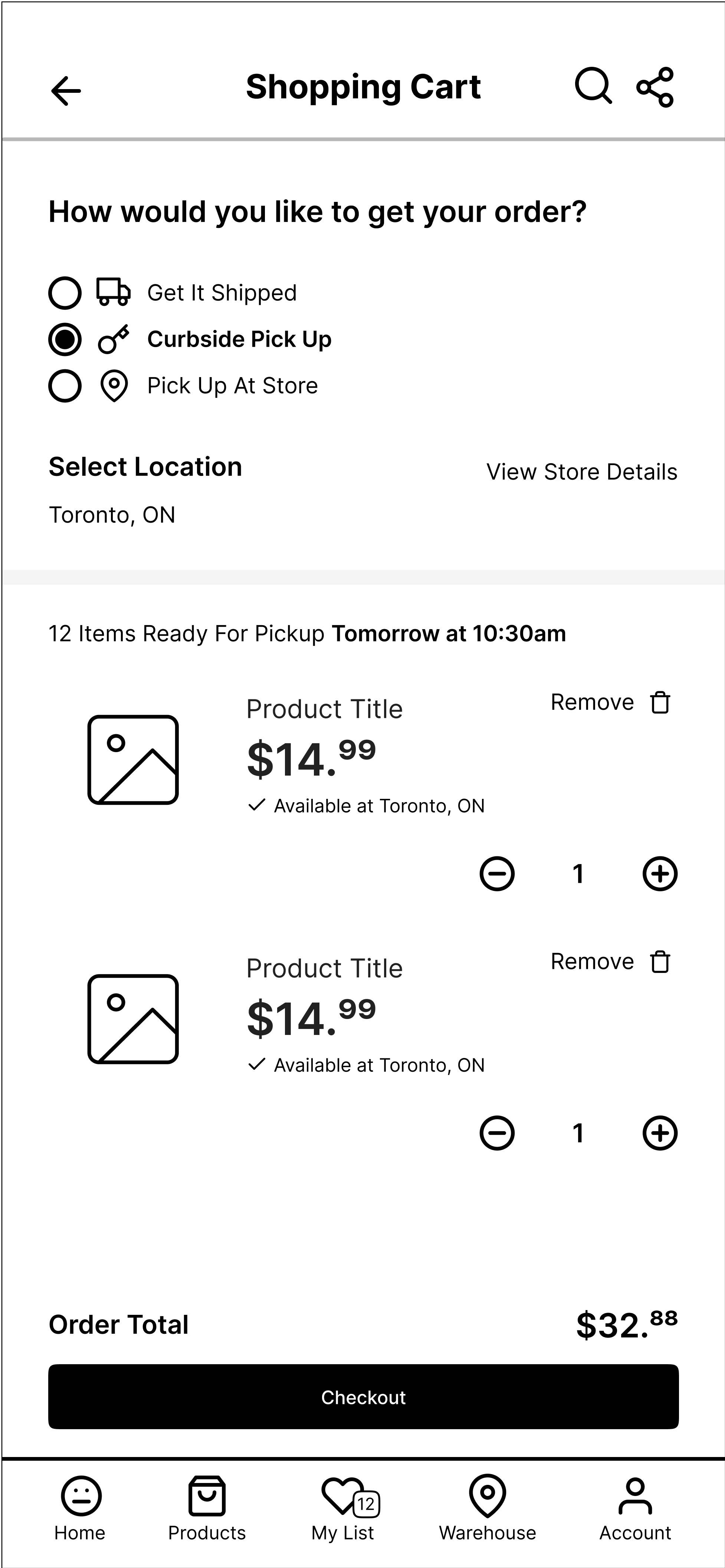
To emulate the current global climate, the option to do curbside pick-ups has been added. Users can pick where they want to retrieve their items, and a timestamp has been added to inform them when their item will be ready.
Items now show whether they are available at the warehouse of choice, with an option for users to save the item for later. Since the shopping cart can be accessed from nearly every page, a back arrow has been placed up top to allow users to return to any page should they need to.
The order total now shows the final price with the inclusion of tax, with the full price breakdown being shown on the checkout page. This is to minimize friction when checking out, in case the total is higher than initially anticipated.

NEW DESIGN FLOW
A small showcase of how users search for items with the new UI.
Searching for items through the department filter

Searching for items using the search bar
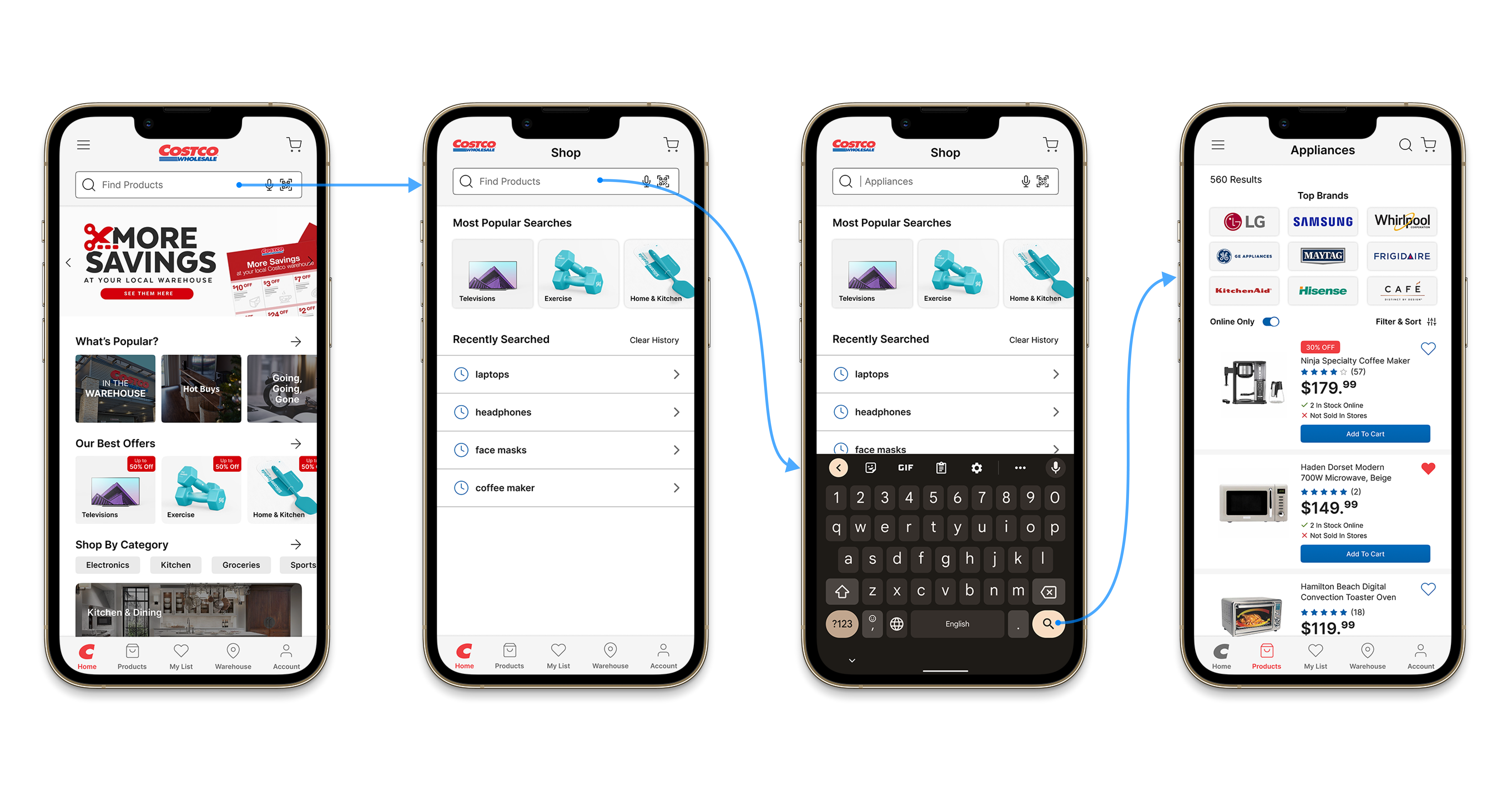
Searching for items using the search pop up suggestions

CLOSURE (FOR NOW)
This case study was built with the intent of showcasing my knowledge in user experience design. That being said, I did learn a lot in regards to how applications are used in contrast to websites. Although it took a lot out of me to complete this in a one-week time frame, it was fun. Being able to interview others and receive feedback throughout the design process helped me look at this project from different perspectives.
Things that are intuitive to one may not be to another, and designers will often unintentionally design with their mindset as a designer. Testing helps us understand how typical users would behave, much better than if we were to just try and guess. However, completing this case study helped me realize that as a designer, at my current level I am merely adapting what is given to me. I am building off existing methodologies and have yet to offer anything new. There's still a lot for me to learn, and I hope that one day I can create something new.
Selected Works

Sitejabber Landing PagesWeb Design
IllustrationsProject type
Vietnamese Student AssociationGraphic Design and Misc

Captiva Casual WebsiteUX / UI Design

PowerHub Website RedesignUX / UI Design
Costco App RedesignUX / UI Design
C.R. Plastics Catalogue RedesignPrint Design

Sitejabber Style GuideVisual Design Project
@ Gordon Lam 2021 - 2022
Let's create meaningful work together. - Glam517@gmail.com
