
ROLE
Designer
Researcher
TIMEFRAME
Mar. 2020 - Dec. 2020
Sept. 2021 - Nov. 2021
TOOLS
Adobe CC
Figma
Visual Studio Code
Github
TEAM
Web Designer (Me)
Marketing
Sid Lee (1st Developer)
Peter Z. (2nd Developer)
The current renewable energy ecosystem is mostly running on Excel. PowerHub is changing that by offering a simple and powerful asset management software to help companies break up with spreadsheets. By providing personalized platforms, PowerHub aims to help asset managers do more, without doing more.
PROBLEM
PowerHub's existing website was simply dated and lacked visual appeal compared to their competition. With the use of stock graphics and poor optimization, PowerHub needed a website redesign to solidify its branding and match the aesthetic of its upcoming software release.
SOLUTION
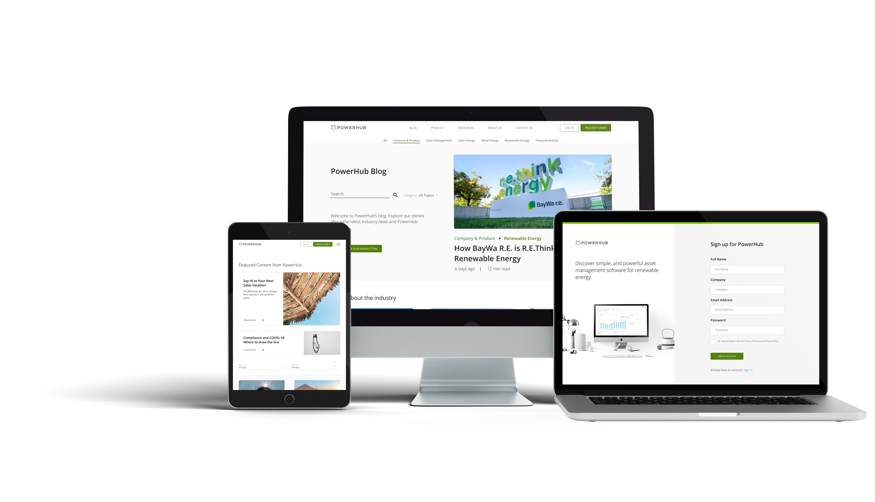
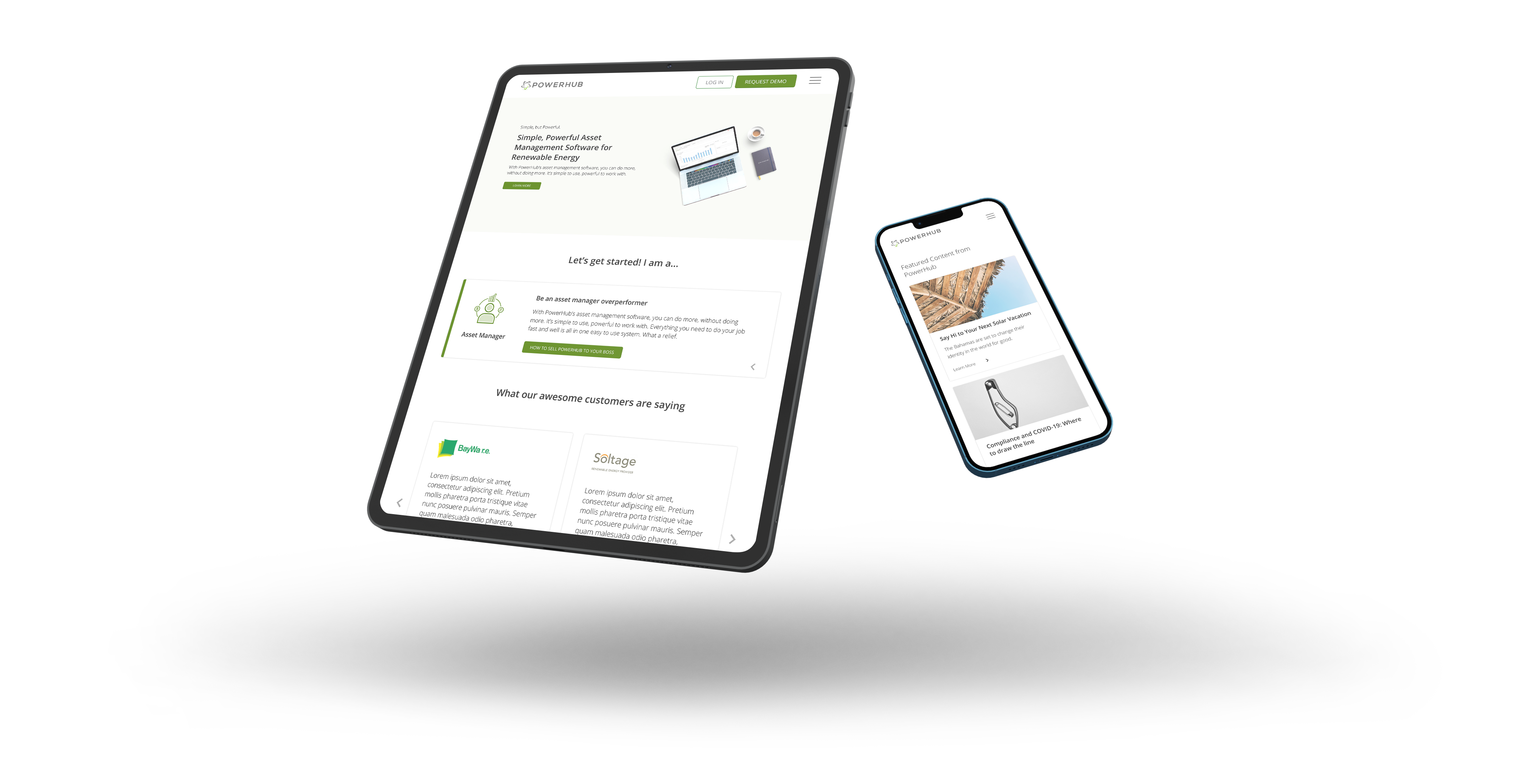
The new website resolves the UI inconsistencies of the existing website by providing a cleaner, and simpler experience that matches its new identity of being simple, but powerful. Site flow is streamlined and blog navigation is given additional functionality in hopes of reducing bounce rate.
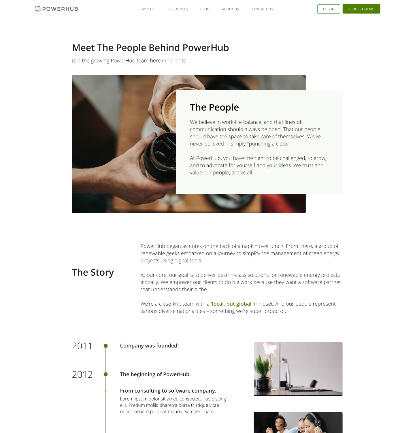
BUILDING AN IDENTITY
I started by laying the foundations of PowerHub's brand and choosing a direction. The existing website felt as if it was created to supplement its product. It explained PowerHub's features, benefits, and provide resources for users. Although unaesthetic, the website was adequate for what it was created for.
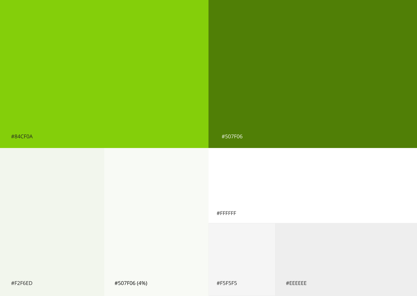
For the new website, my objective was to visitors into prospects. The focus shifted from explaining "What is PowerHub?" to "Why choose PowerHub?" In addition, colours were mirrored between the new software and the website to maintain a cohesive identity. In addition, each page was made in accordance with WCAG standards for accessible colour, contrast, and text.
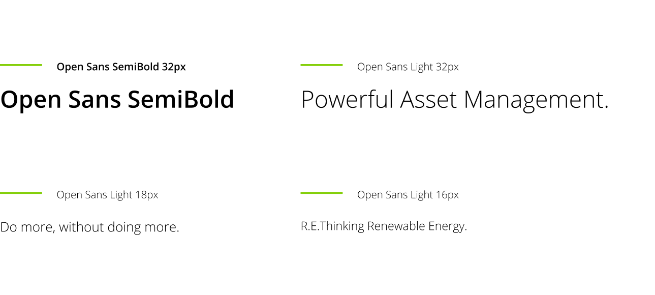
Subtle, muted colours, a humanist typeface, with a pop of green to symbolize our commitment to renewable energy.
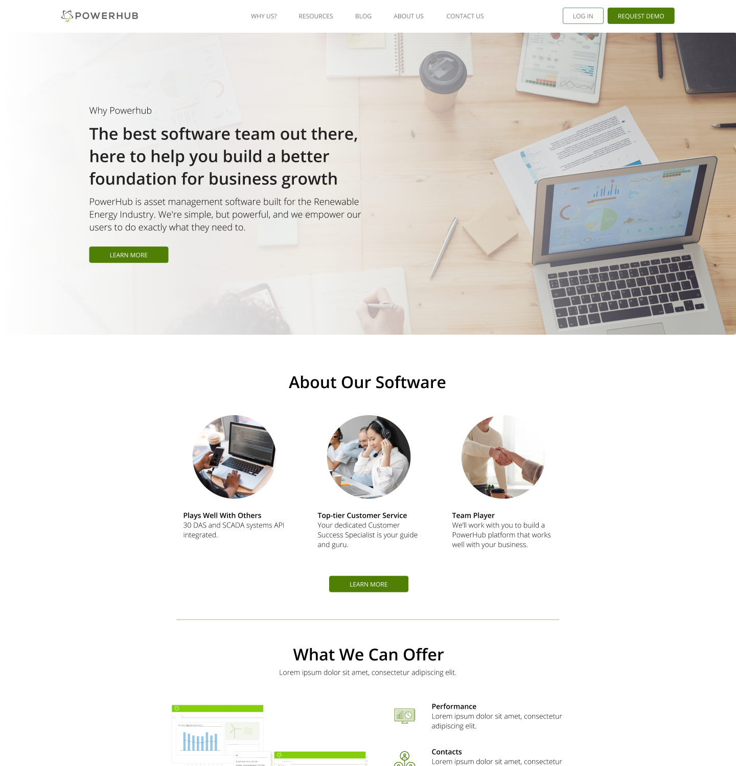
NEW MESSAGE, NEW POWERHUB
Part of the website redesign included the introduction of a new message alongside the next generation of the PowerHub software. Just like its existing website, the software was considered by some to be too complicated, and don't immediately add value to the user.
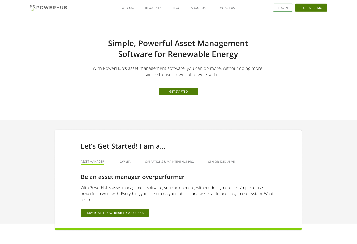
The new website had one objective, to be Simple, but Powerful. (just like the new tagline)
Each page's hero section became more actionable and provided visitors with immediate value. It showed visitors exactly what the page is about, and how it can help them.
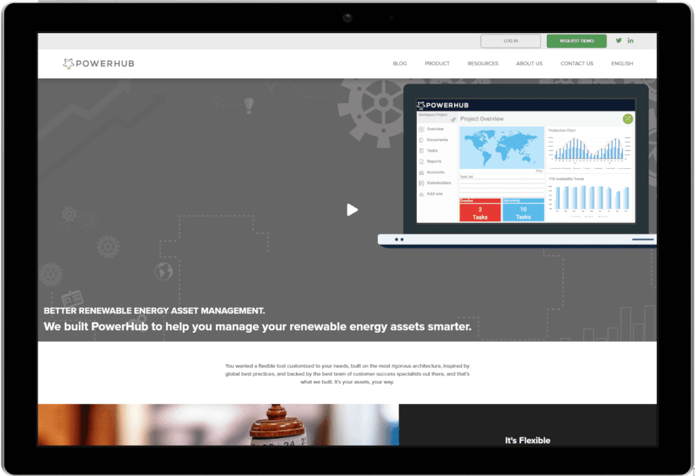
The home page of the old (existing) website.
MY ROLE
First and foremost, I want to talk about the state of the project. As an ongoing development during my time at PowerHub, the team worked hard in bringing my vision to fruition. While the initial development of the new website was completed in late 2020, the launch was postponed as the next version of PowerHub was not yet ready. As time passed, the website was put on hold and design updates were added to keep up with design trends. At the time of writing, the website remains in staging but is not yet launched. (Dec. 2021)
Though initially hired as a Web Designer, I was able to develop my visual and UX design skills through the support of my managers Darcy Brooks and James Pagonis. By diversifying the type of projects I had at PowerHub, I was able to continuously improve on the website to turn it into what it is today.
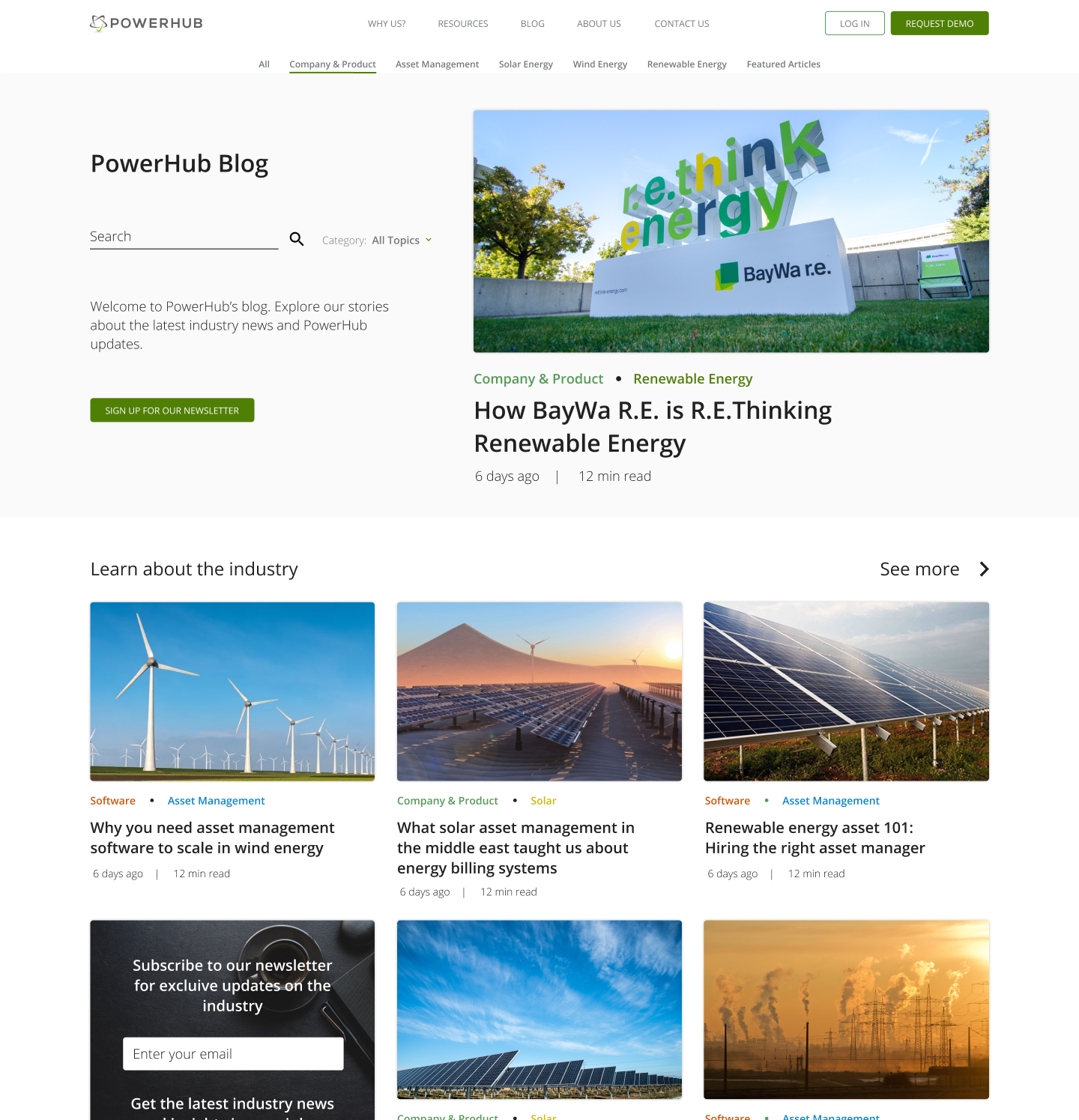
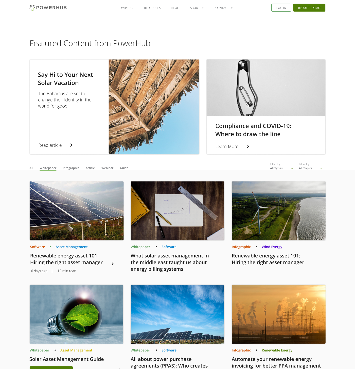
KEEPING THEM ON THE PAGE
Working alongside an SEO Specialist, we focused on what we could do to both decrease bounce rate and improve retention. By increasing content readability on every page and including a CTA in the hero section, we reduced the friction towards a sign-up.
DECISION PARALYSIS
Simplifying the website meant more than a UI update; the pages were restructured so that each page was focused on one topic. Features, customizations, and team pages were no longer laid out as options on the home page but instead given their own tabs on the header.
As a result, the home page could live as a standalone introduction to PowerHub as both the company and the software it provides.
CONSIDERATIONS
On the first version of the home page, I opted for a simple title, subtitle, and CTA button in the first section. This approach was used in many of the other pages going forward. However, what I did not account for was the length of text or absence of subtitle or CTA button. This caused some pages to look empty or incomplete, even with a corresponding image.
I ended up going for a banner-type background for pages that have this issue to level out the sections. By having smaller text areas and changing alignment, titles are more evenly distributed and are less likely to be affected by breakpoints.
DEVELOPMENT
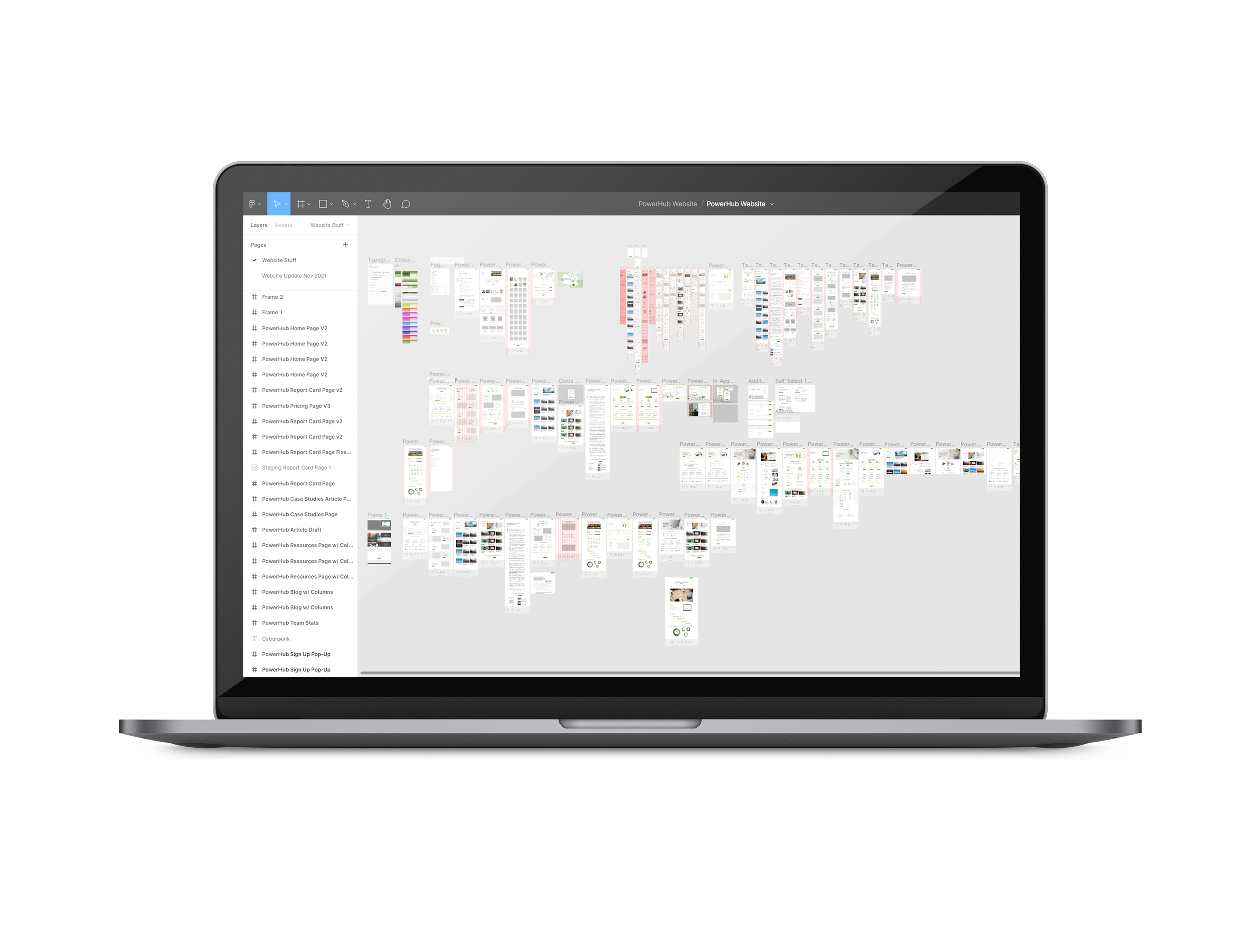
Under Sid Lee's guidance, we moved the website from WordPress to Craft CMS. It was a lot more flexible to work with, but made it significantly more complicated to make changes. By hiring another developer to assist with continuous changes, it gave me a chance to learn how to make changes in the website's framework. Using GitHub and Visual Studio, I was able to test the website and push changes to the site's CSS.
REFLECTION
Throughout my almost two years at PowerHub, I've worked on several projects with an amazing team. I chose this project to showcase because it helped me realize my own shortcomings and gave me a ton of insight into the industry.
If there's one takeaway, it's to embrace change. Working throughout the pandemic taught me the importance of being adaptable, and that design trends can change as fast as the circumstances around us. The website redesign has been a project that's been going on for so long that I can keep looking at it and find things that I want to improve on. Having a team that can critically analyze the website from a marketing or SEO perspective taught me that how a site looks and interacts with users is just a small part of the overall experience.
Selected Works

Sitejabber Landing PagesWeb Design
IllustrationsProject type
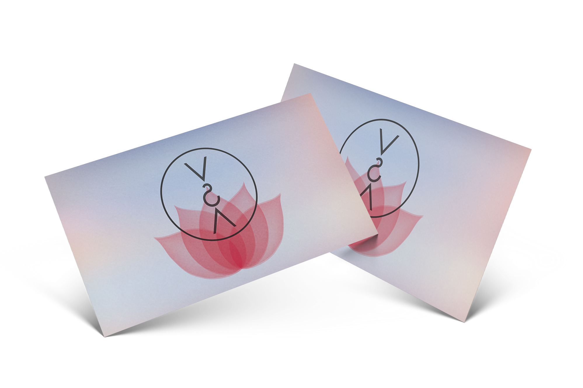
Vietnamese Student AssociationGraphic Design and Misc

Captiva Casual WebsiteUX / UI Design
PowerHub Website RedesignUX / UI Design
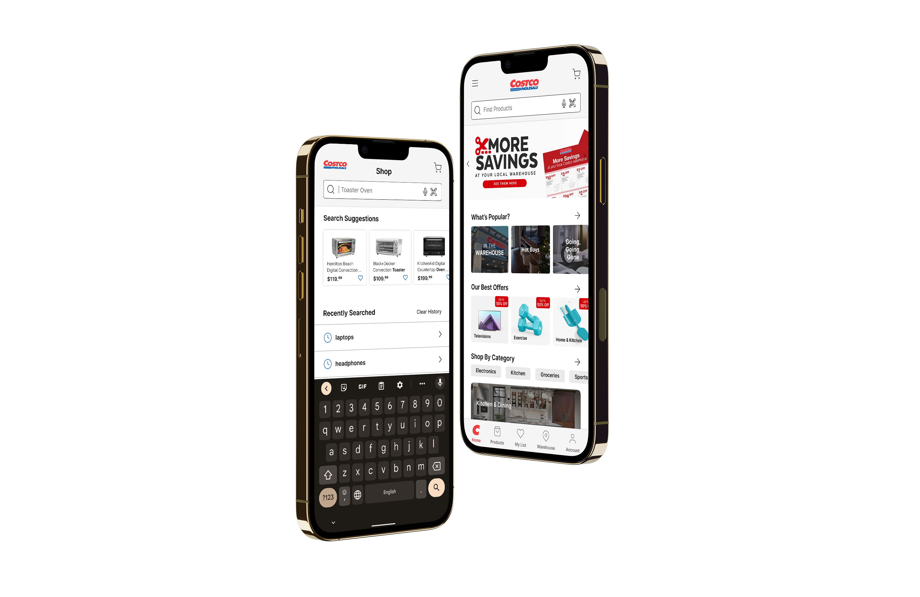
Costco App RedesignUX / UI Design
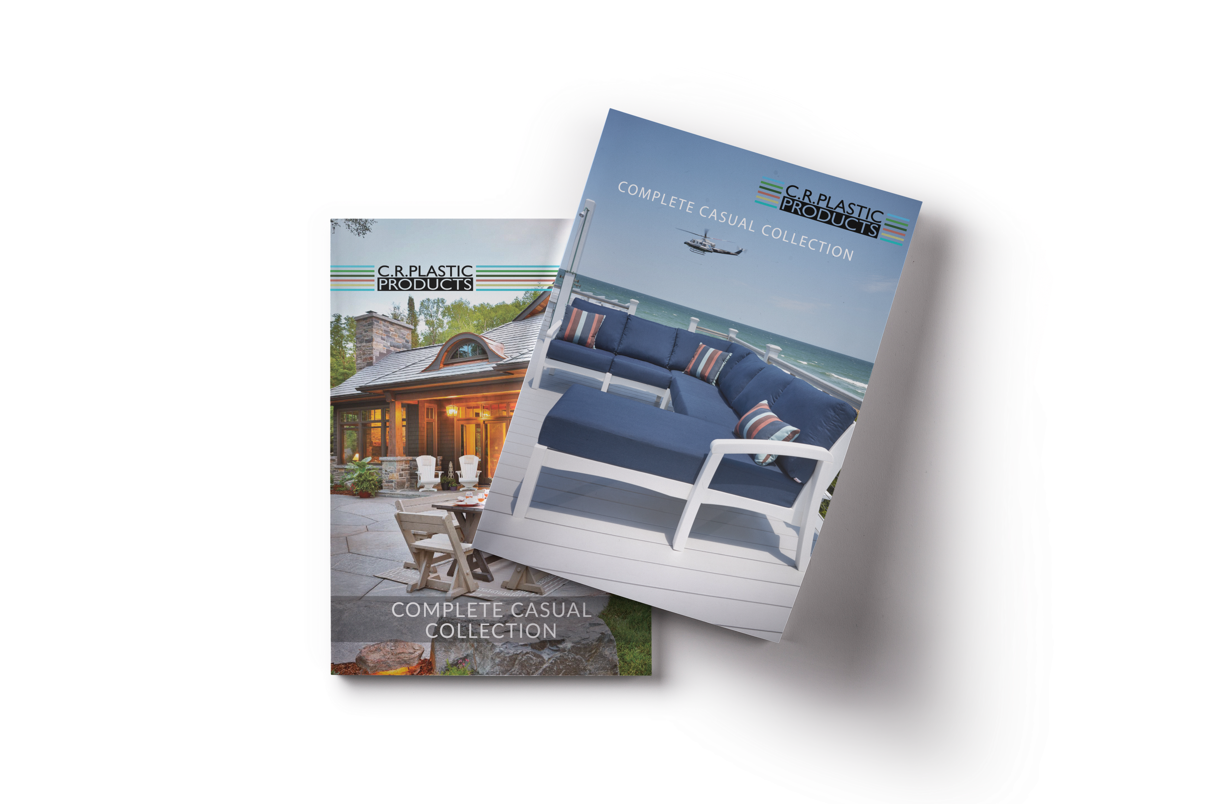
C.R. Plastics Catalogue RedesignPrint Design

Sitejabber Style GuideVisual Design Project
@ Gordon Lam 2021 - 2022
Let's create meaningful work together. - Glam517@gmail.com