
ROLE
Designer
Researcher
TIMEFRAME
Mar. 2018 - Aug. 2018
TOOLS
Illustrator
InDesign
Premiere Pro
XD
TEAM
One Designer (Me)
Marketing Team
Redding Designs Inc.
Captiva Casual is a sister brand of C.R. Plastics. Marketed towards a different audience than C.R. Plastics, Captiva Casual creates all its furniture exclusively from recycled water bottle caps. Known for its Adirondack chairs, Captiva sells its chairs primarily in big box stores and online. As such, the website was developed to help consumers learn more about the products and be more informed about its cause; to displace millions of bottle caps found in oceans and landfills.
PROBLEM
As a brand under C.R. Plastics, Captiva Casual lacked a platform for consumers to research while making their purchasing decision. Most people could not identify with the brand and had difficulty justifying the price tag set on recycled plastic furniture.
SOLUTION
By having a website attached to the Captiva Casual brand, consumers would have a starting point in learning what goes into each chair. In addition, the website can provide a sense of legitimacy to the brand. The goal was to make consumers feel that they are supporting a cause to make the world a better place, one chair at a time.
REBRANDING ATTEMPT
Since Captiva Casual is a relatively new line, the company wanted to give it a new identity. The tasks included changing the logo, improving its Canadian Tire packaging and to build a website. However, we needed to know where Captiva Casual stood as a brand relative to C.R. Plastics before we began. Here is what we concluded:
Captiva Casual is to be a cheaper, entry-level addition to the recycled furniture
market that is separate from C.R. Plastic Products.
DESIGNING THE LOGO
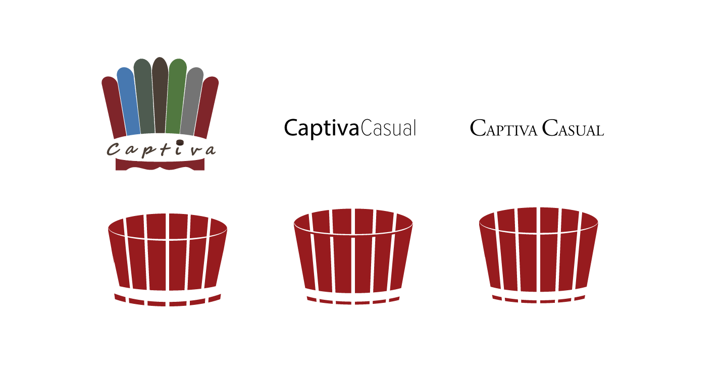
Captiva Casual's existing logo had one problem; it had 6 different colours. This made the logo inflexible and severely limited the types of backgrounds that could be used with it. Based on that problem, I reduced the logo to one or two colours. The original Captiva Casual logo was created to resemble an Adirondack chair, using the six colours that were available for purchase at the time.
My goal was to maintain that identity of an Adirondack chair, but also add something that is distinctly Captiva, which are the bottle caps that lay the foundation of every piece of furniture. For colours, I used Bordeaux and Greystone, the two best selling colours in the Captiva Casual furniture line. Moving forward, I tried incorporating the shape of a bottle cap into the logo while using different fonts for the wordmark. And despite the original logo being kept, I wanted to share this experience as it ultimately helped me in creating this website.
LOGO VARIATIONS
RESEARCH
To gain a better understanding of Captiva Casual's market, I looked into the websites of other outdoor furniture companies. I hoped to gain insight into how they engage their customers, and I learned that even though they sell the same products, they all send a different message.
COMPETITOR HOMEPAGE SAMPLES
IDEATION DEVELOPMENT
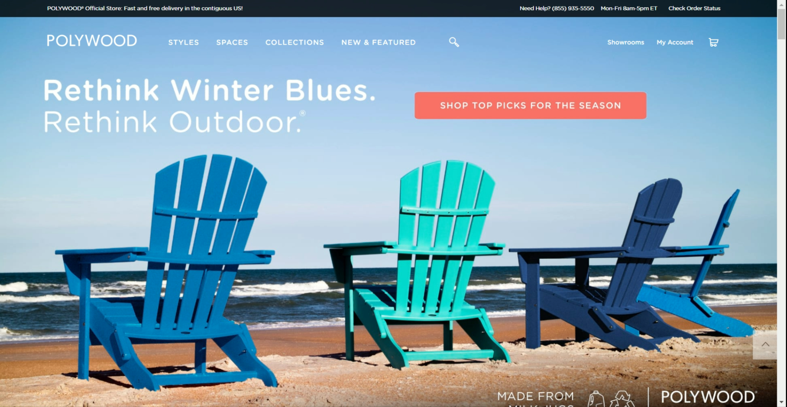
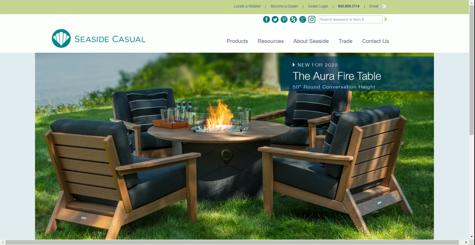
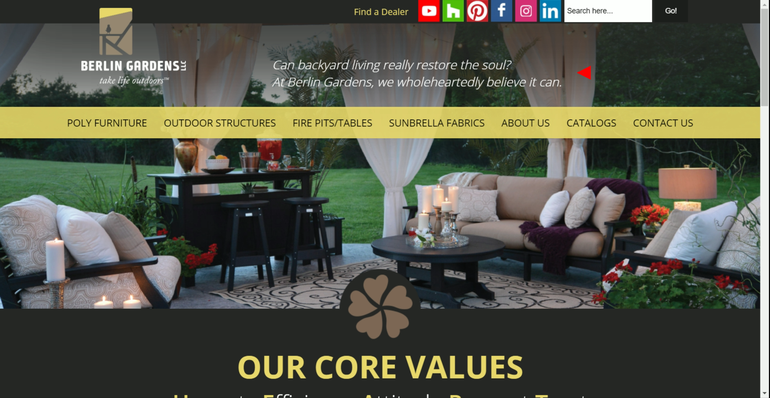
Using Polywood, Seaside Casual and Berlin Gardens as examples, we can see how their homepage embodies their values. For Polywood, they focus on promoting an experience, and a lot of their images are lifestyle images. Seaside Casual is more product-focused, and their images give off a more coastal tone because they are based in Rhode Island. In addition, their products are geared towards those that live in warm weather, all year round, and close to water. Lastly, since Berlin Gardens is based in an Amish country, its homepage emphasizes religious values.
What I understood was that even though each company's products were the same, their target audiences were different. This process formed two questions:
What do I want to emphasize on the Captiva Casual website?
What is the first thing that I want my audience to see?
Based on the values that Captiva Casual was built upon, I decided that the best approach would be to emphasize our commitment to the environment. It is the most compelling part of Captiva Casual that separates it from the rest. I want it to be the primary selling point of the furniture, and also for the website to be a platform for consumers to learn about its story.
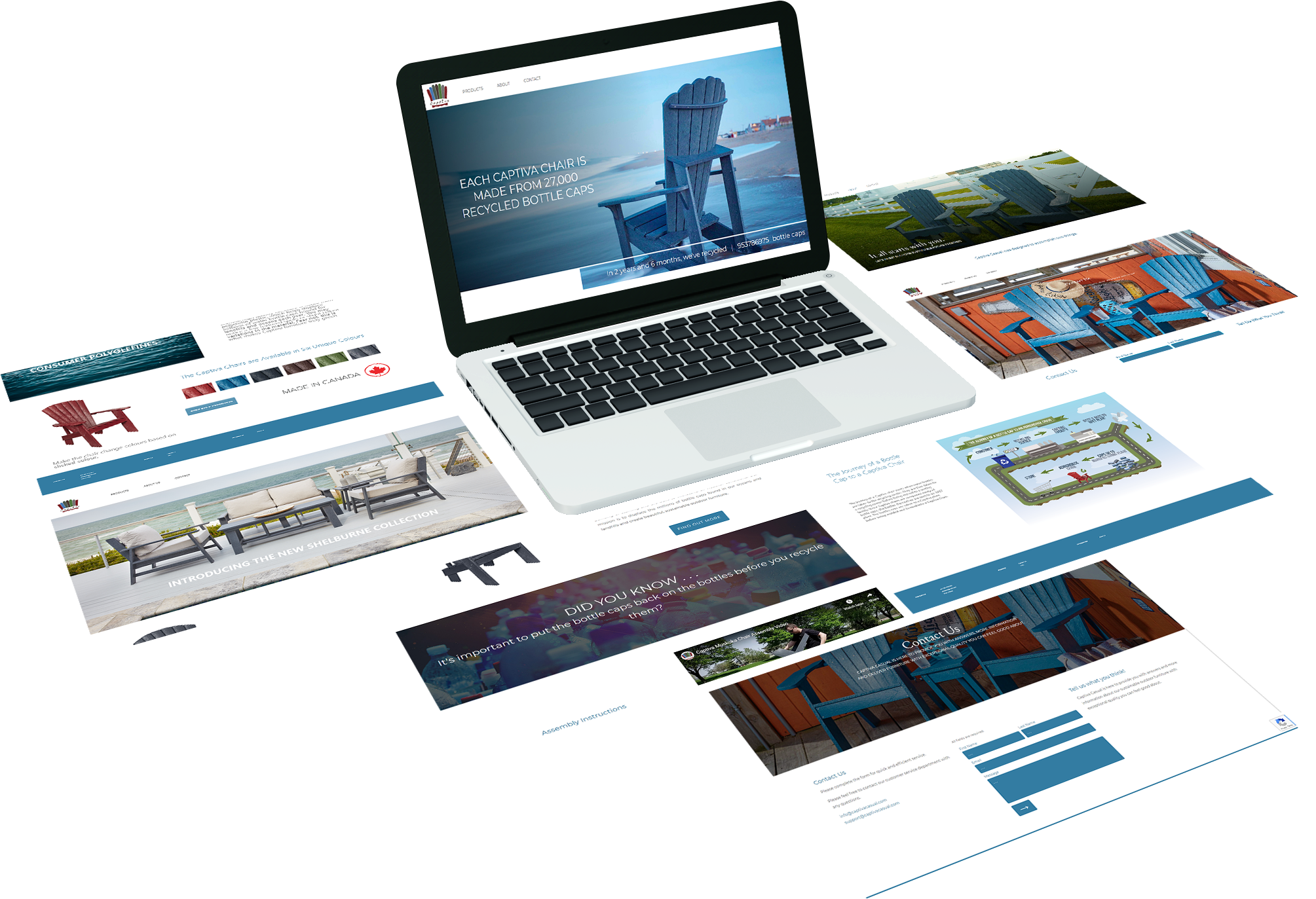
OUTCOME
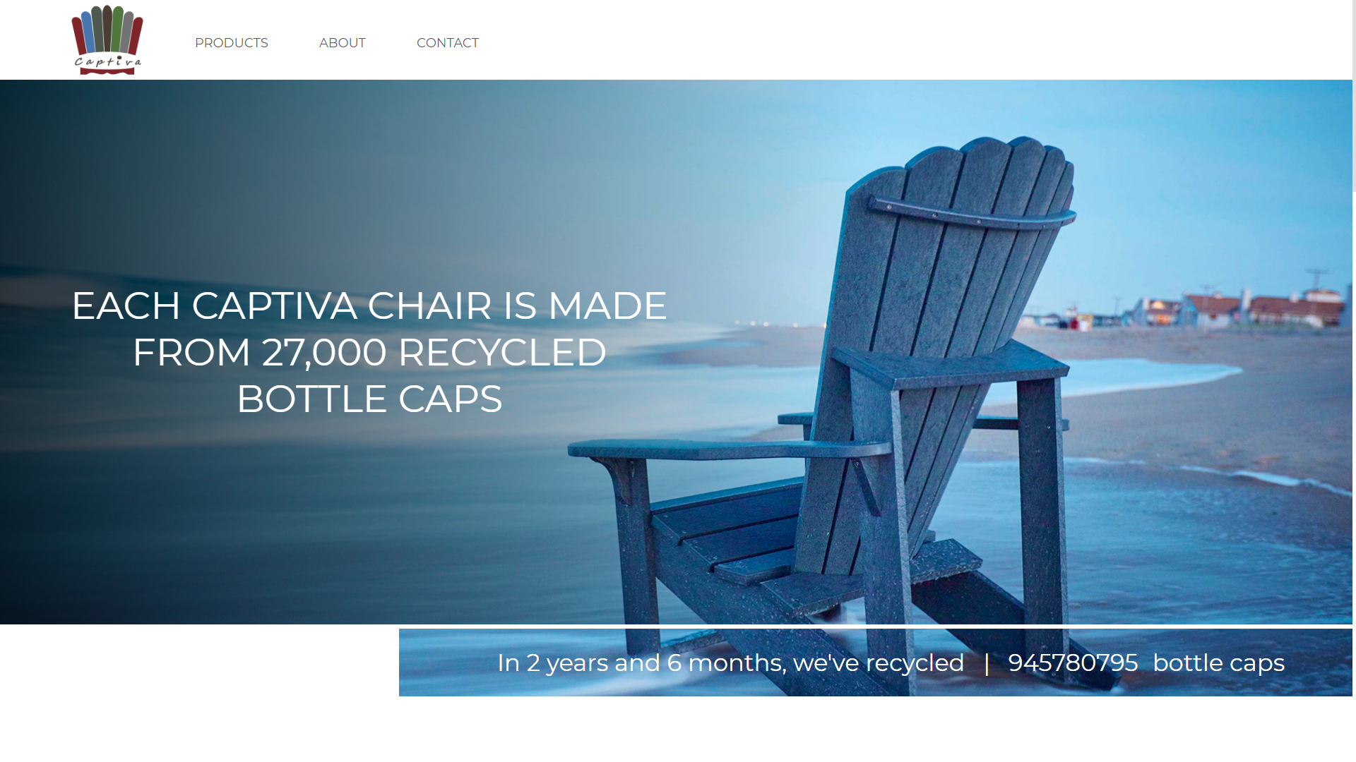
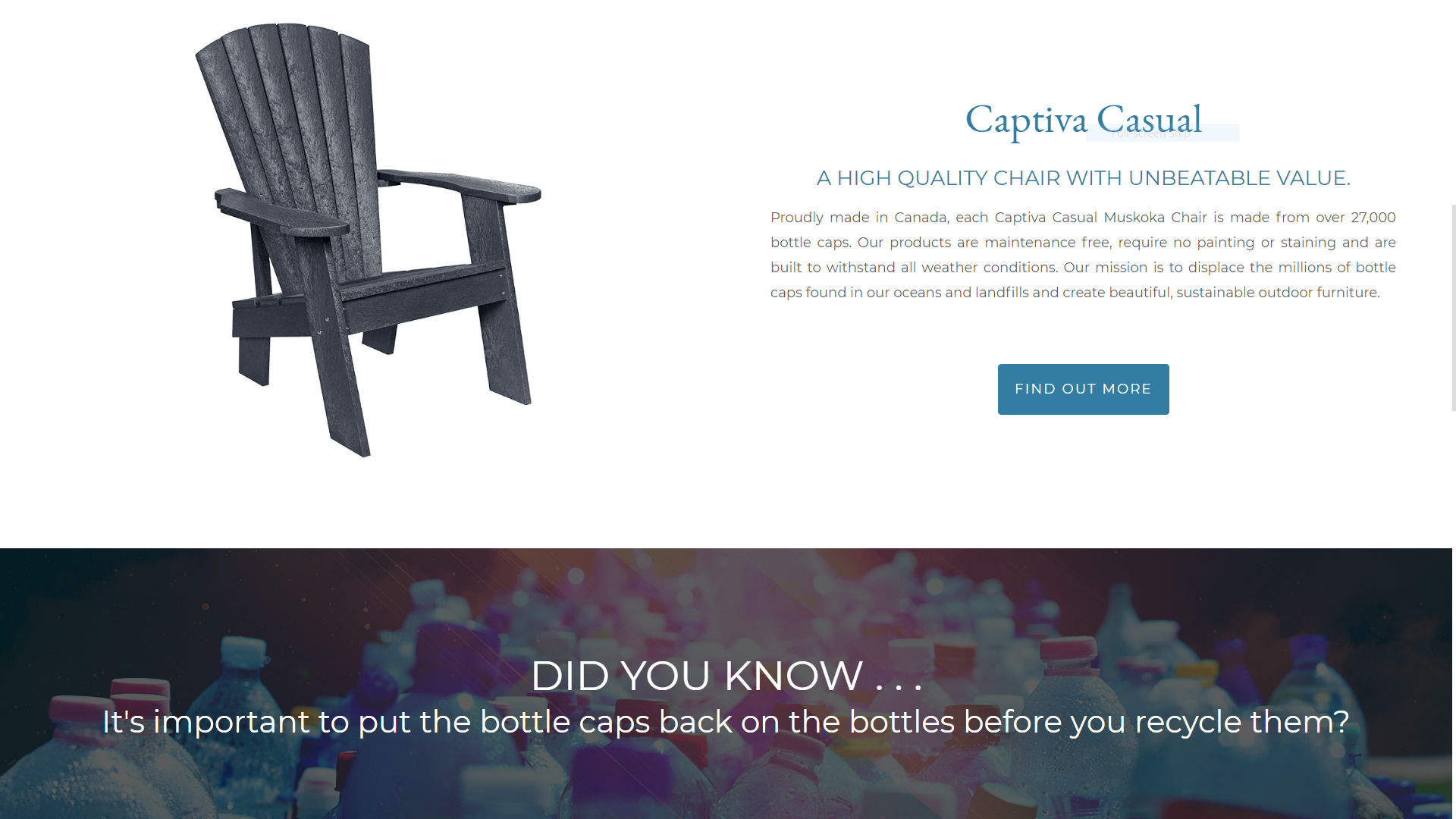
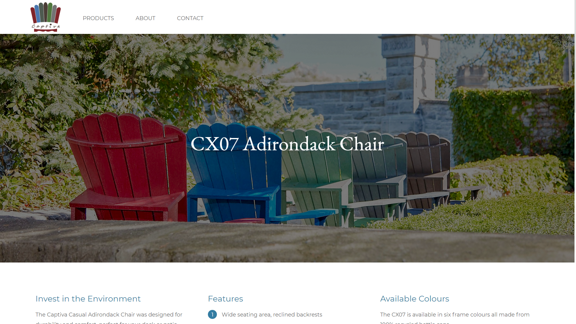
The outcome was a simple website that accomplishes what it was set out to do. The website presents the chairs starting with a compelling fact; each Captiva chair is made from 27,000 recycled bottle caps. The website also includes the two available products at the time, their respective benefits along with a story of how purchasing Captiva Casual furniture can help the environment.
REFLECTION
This project gave me a glimpse of what it means to emphasize with the users. Every project is meant to appeal to audiences differently and the content should reflect that. At first, I was so focused on providing consumers with knowledge of Captiva Casual and eventually lost track of the original goal of the website. Instead of explaining what or how the chairs are made, the site should be a stage to tell our consumers why they are made.
The Captiva Casual website reminded me again that I am not designing for myself nor the company, but my target audience. Is it the most compelling website? Not at all, but it gave me a foundation and understanding of what is necessary to create a website and for that, I am proud of it.
Selected Works

Sitejabber Landing PagesWeb Design
IllustrationsProject type
Vietnamese Student AssociationGraphic Design and Misc

Captiva Casual WebsiteUX / UI Design
PowerHub Website RedesignUX / UI Design
Costco App RedesignUX / UI Design
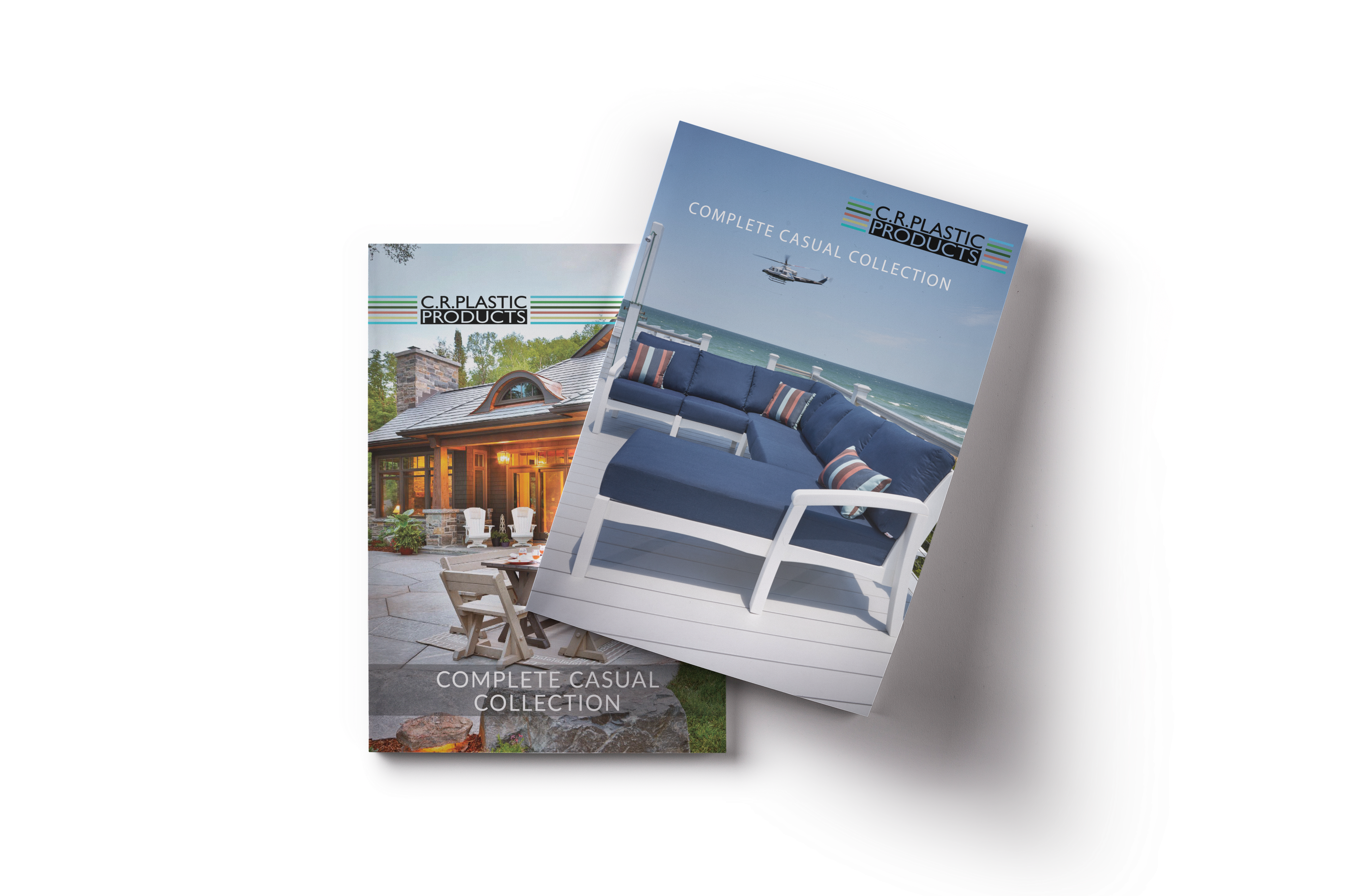
C.R. Plastics Catalogue RedesignPrint Design

Sitejabber Style GuideVisual Design Project
@ Gordon Lam 2021 - 2022
Let's create meaningful work together. - Glam517@gmail.com