
Product Design
TD Easy Trade
Reimagining retail investing through a simplified, mobile-first trading experience.
ROLE
Product Designer
TOOLS
Figma
TIMEFRAME
October 2025 - April 2026
TEAM
Design Lead
Product (UI/UX)
Content Designer
Development Team
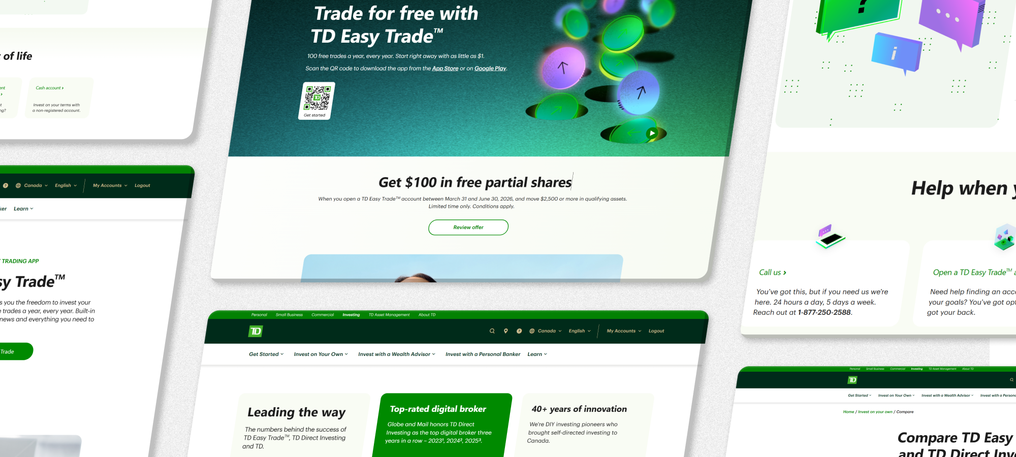
Easy Trade is a self-directed investing platform created to provide a simpler and more approachable entry point into investing. Built with everyday users in mind, the platform offers commission-free trading and a mobile-first experience that aims to make investing more accessible. By reducing barriers (like trade fees) and creating a more streamlined experience, Easy Trade can help users explore financial opportunities and make informed decisions with greater confidence.
This project reimagined key parts of the existing platform and leveraged new components, designs, and direction that TD could use going forward. I served as the Product Designer for the web and responsive portion of the project. Worked closely with cross-functional teams to design prototypes, develop reusable components, and support quality assurance across the project lifecycle.
Link to TD Easy Trade
OVERVIEW
The TD Easy Trade project was created to level the playing field with popular trading platforms in Canada. By removing trading fees, having partial shares, and a mobile-first approach, we wanted that platform to appeal to a younger audience while maintaining the prestige and security of a big 5 bank.
MY ROLE
For this project, my contributions included designing new components, leveraging new icons and illustrations, and developing extensive interaction and requirements documents for developer hand-off. In addition, I created page designs, prototypes, and remained part of QA for both the UX and VD portions throughout the project.
CHALLENGE
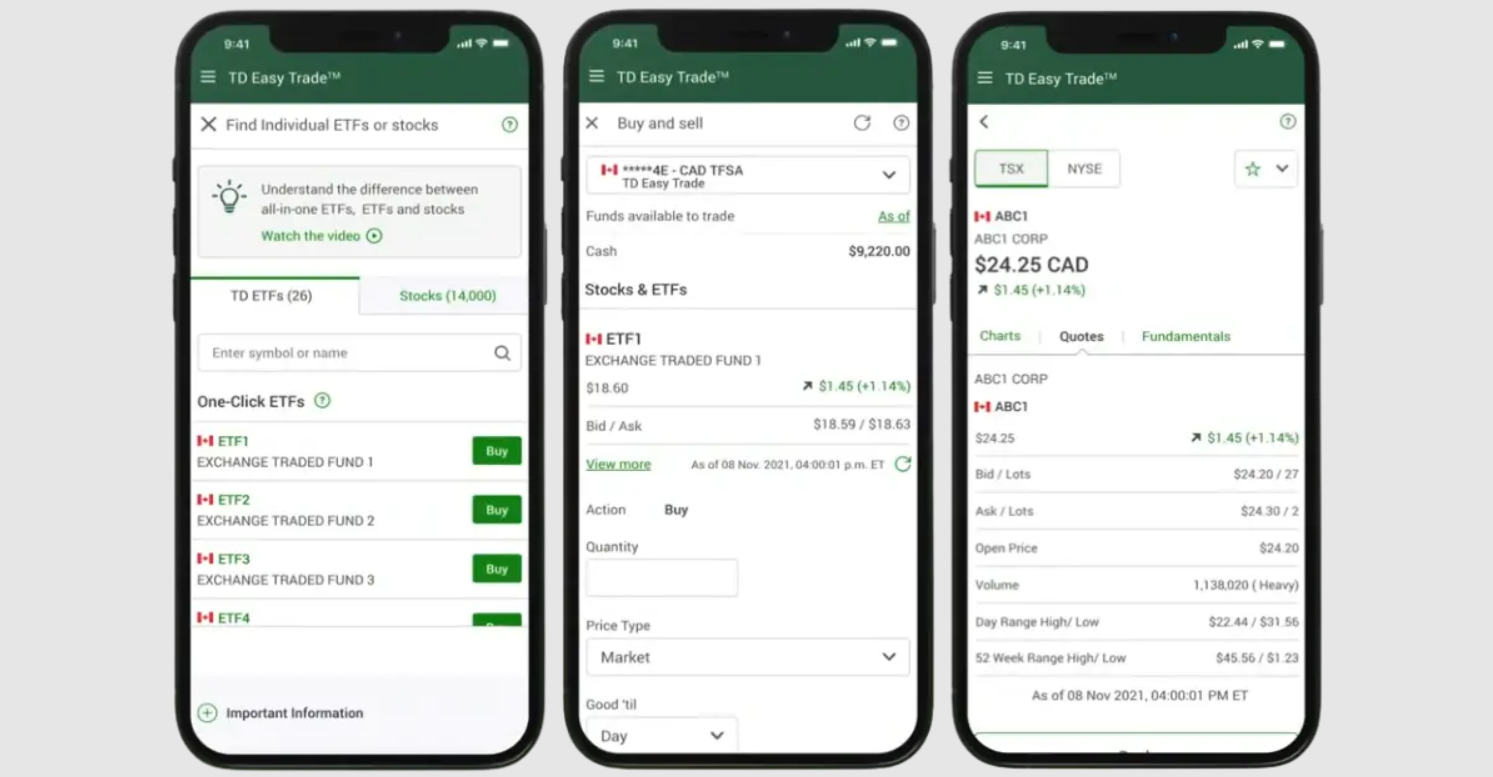
The previous version of TD Easy Trade was positioned more as an extension of the TD Bank ecosystem rather than a standalone investing product, which made it feel less accessible and less competitive compared to modern mobile investing platforms. Restricted to only TD ETFs, 50 free trades (instead of 100), and the absence of fractional shares further reduced flexibility for newer investors.
The experience created confusion between TD Easy Trade and other TD investing platforms, making it difficult for Easy Trade to establish a distinct identity within TD’s investing ecosystem. The redesign aimed to address these gaps by clarifying product positioning and creating a more modern and intuitive experience across both mobile and web platforms.
Existing TD Easy Trade Platform
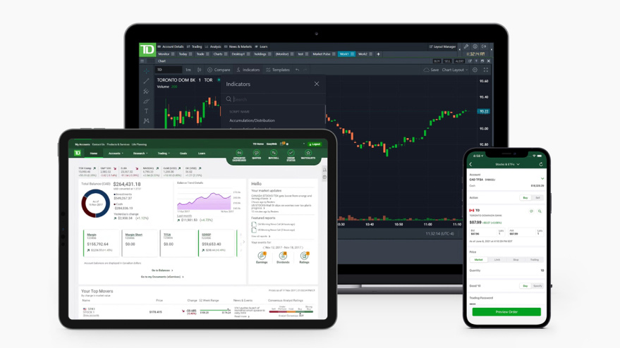
TD Active Trader, WebBroker, and TD App
SIDE NOTE (RESEARCH)
The Harris Poll conducted a TD survey in late 2025 among 2,164 Canadian adults regarding direct investing platforms. The survey shows that Gen Z leads all age groups in using direct investing platforms, with 71 percent already onboard, compared to 52 percent in the general population.
- 33 percent of test takers say they don't feel confident in their level of investing knowledge
- 81 percent say they wish financial institutions would speak more directly to "people like me"
- 78 percent would be more confident investing if the language used were simpler and more relatable
- 31 percent of Gen Z say access to a real person still matters
FOCUS AREAS
Research shows that confidence is still lacking among new investors, and Easy Trade is hoping to bridge that gap. The redesign focused on improving accessibility, strengthening product identity, and simplifying the investing experience for a new generation of users. To list it out:
- Product differentiation
- Scalable design systems
- Accessibility and approachability
- Modernizing the experience
CONSTRAINTS
The team was tasked with developing new reusable components while remaining aligned with TD’s existing brand guidelines and design system. The project began with an initial set of 12 foundational components designed to support future product experiences and reduce long-term development costs.
NEW COMPONENTS
One of the key focus areas was to design new components that target newer investors and provide a tonal shift to the "usual" TD. The following section highlights some of the key components used in the redesign.
JUMBO BANNER
The Jumbo Banner is a large full length banner to allow for more visual prominence.
- It features a breadcrumb component for navigation above the header
- New illustration style animation on the side
- Link or QR code CTA to direct users to download
ILLUSTRATIVE STEPS
Illustrative Steps consists of three sequential banners with an image that spans across all three steps.
- It allows for images or QR codes to be placed in front of each banner, supporting the description
- Features a 20px corner radius that spans across the new design system
SIDESHEET
The Sidesheet component provides details to different items on the page without leaving the page.
- Slides out from the right side of the screen (bottom for mobile)
- Can embed different components within the sidesheet for additional functionality
- Sidesheet itself is scrollable, allowing for more content
QUILT
The Quilt is used to showcase similar types of content and can flip, link out, or open the Sidesheet.
- Features 5 different card types including images, illustrations, and title cards
- Has 3 button functions, and allows for the card to flip to reveal additional content or open a link/Sidesheet
- It can have up to 10 cards, showcasing a variety of content in one go
DESIGN GUIDE
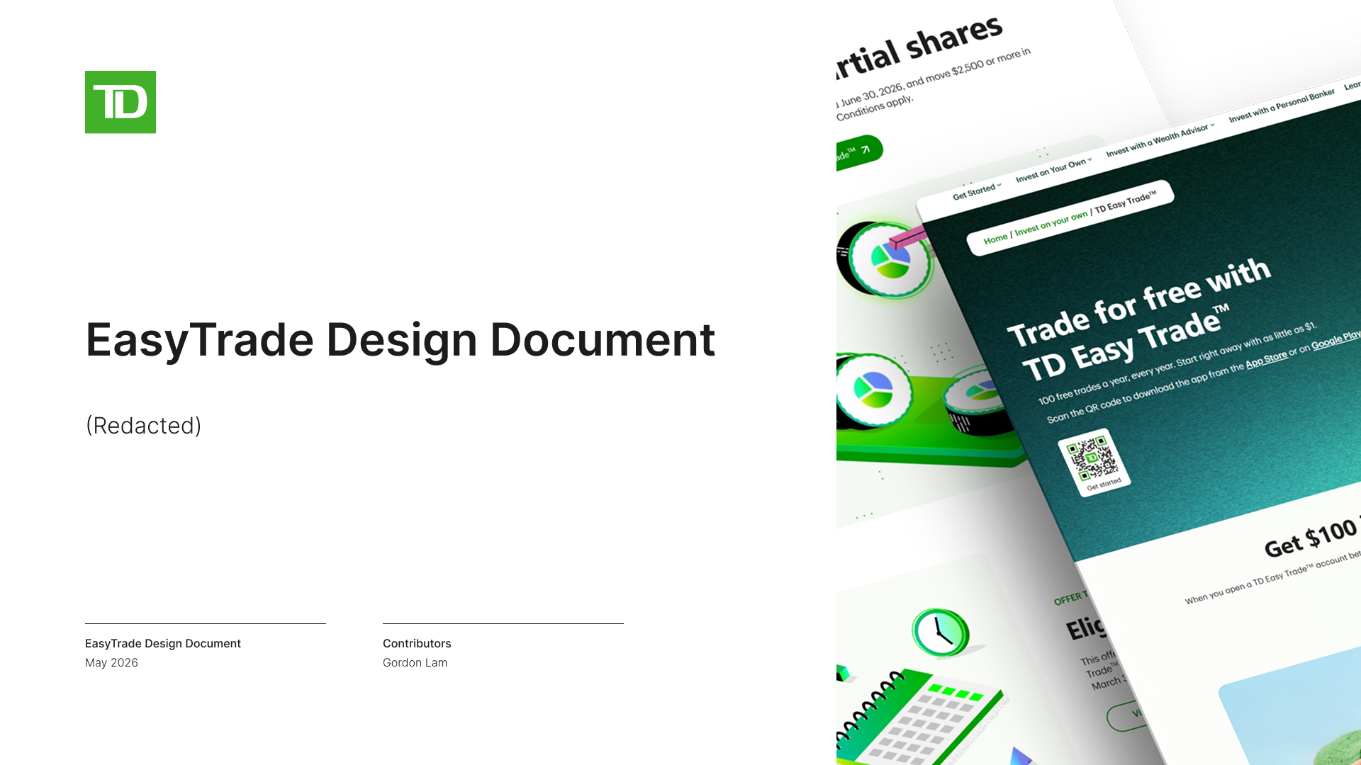
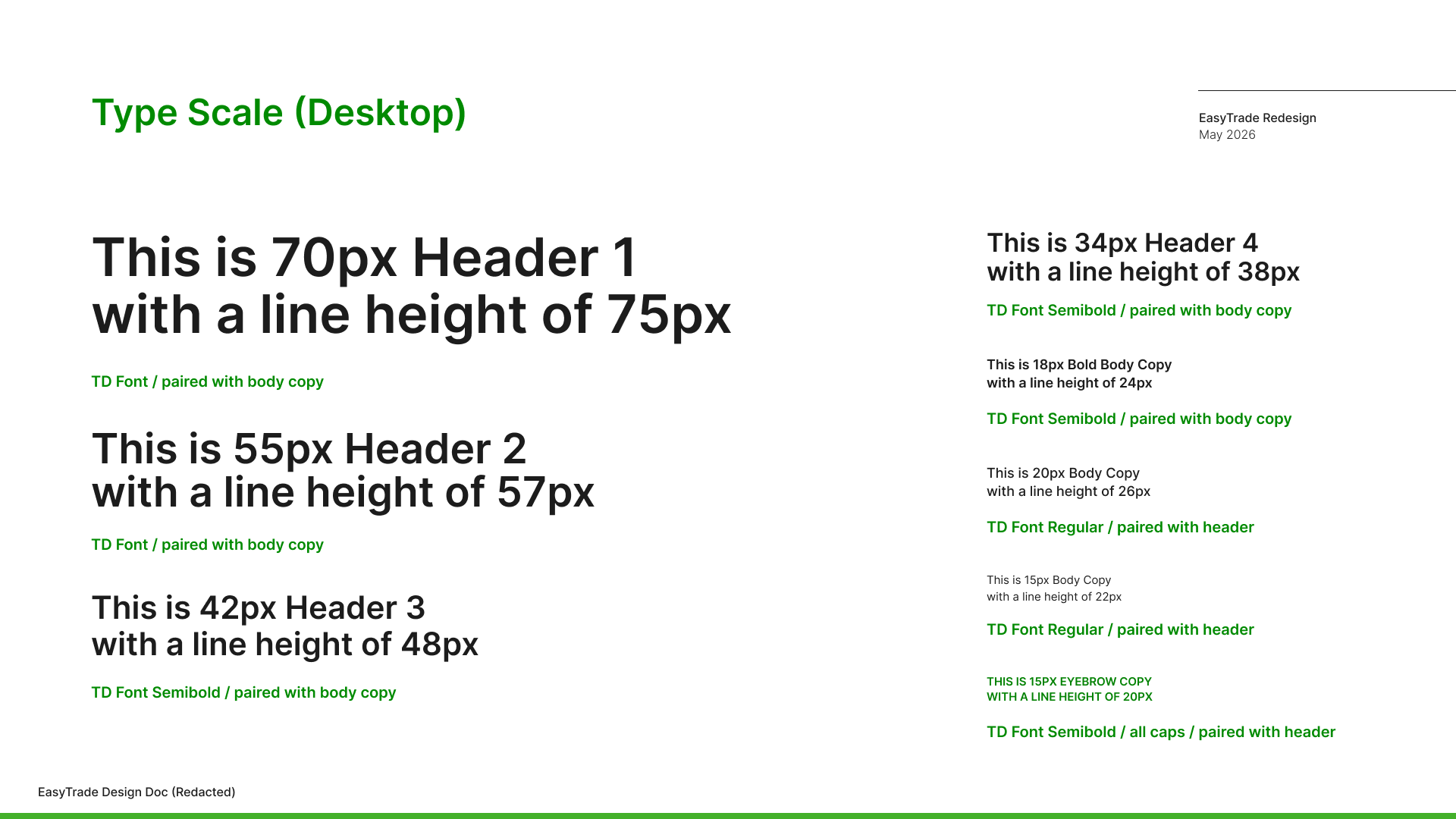
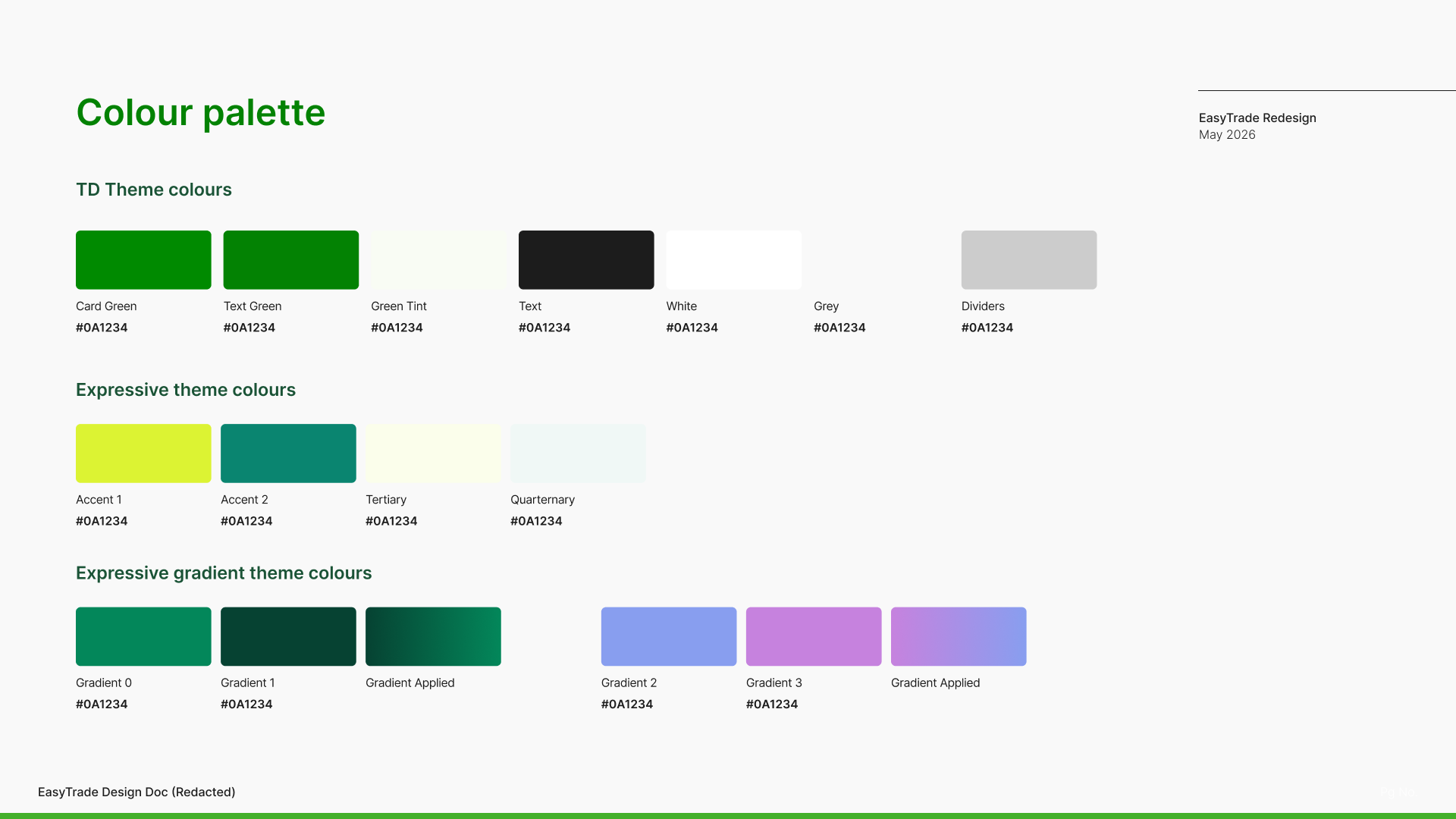
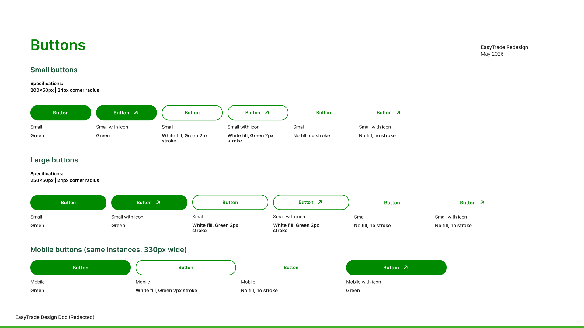
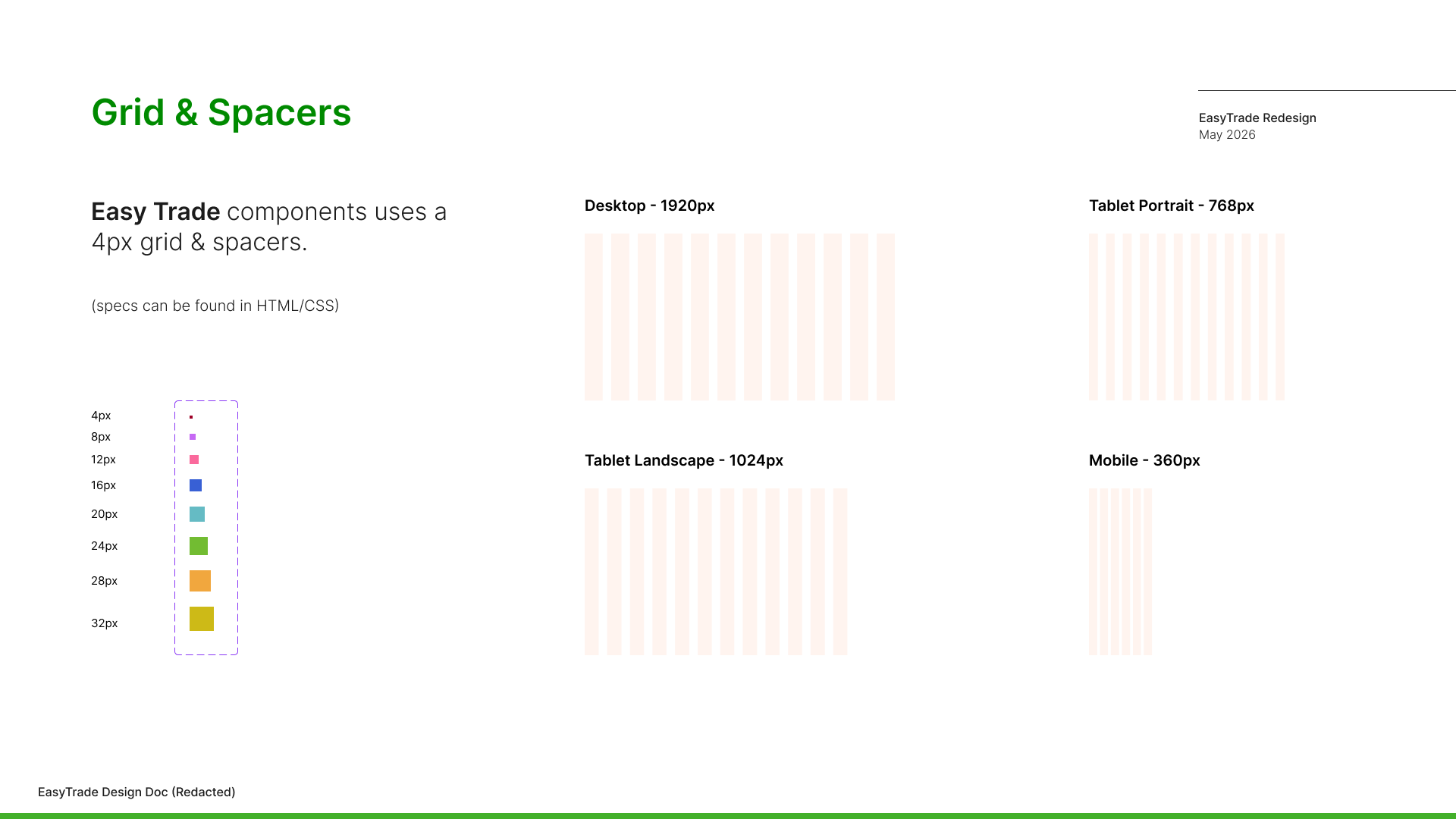
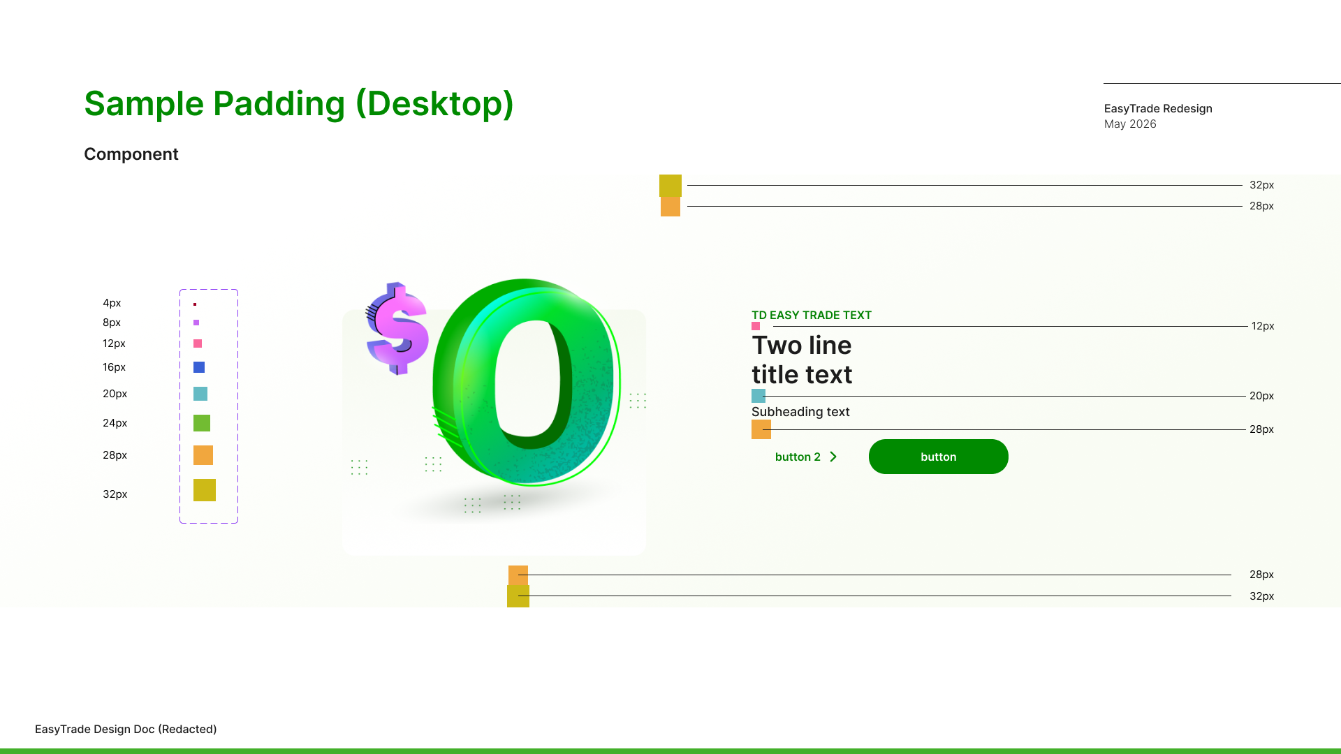
To support scalability and consistency across the redesigned experience, the project introduced a design guide that established reusable UI patterns, interaction standards, and visual principles across both mobile and web platforms. (Designs and data have been recreated/edited to protect intellectual property)
The guide helped align components, spacing, typography, and navigation behaviors to create a more cohesive user experience while maintaining consistency with TD’s broader brand and design system. It also supported cross-functional collaboration by providing a shared foundation for design, development, and quality assurance throughout the project.
WHAT DID WE FIX?
This section highlights the key UX improvements introduced in the redesign, focused on improving clarity, reducing friction, and creating a more intuitive investing experience.
Stronger Product Identity
Easy Trade lacked clear differentiation from TD Direct Investing and felt like part of a larger ecosystem rather than a standalone product. The redesign offered a cohesive and modern visual system that is unique to Easy Trade.
Increased Accessibility and Clarity
By reducing bank terminology and generic UI elements, we made Easy Trade more accessible to newer investors. It's simpler, more spaced-out, and more approachable. Questions were answered directly on the page, and pages were condensed and simplified.
Streamlined Onboarding
Outlining steps and expectations while providing direct access to the download page made it easy for potential users to create an account and reduced cognitive load.
Product Incentives
Highlighting 100 free trades, timed offers, and partial shares made the platform more competitive with other offerings. We also leveraged TD's stats and presence over the years to give confidence to newer investors.
TAKEAWAYS
The Easy Trade redesign showed me how much thought and collaboration go into even the smallest parts of a large digital product. From page structure to illustrations and interactions, everything was shaped through close work between design, development, and business teams. Working with the team reinforced how important cross-functional alignment is when building complex products. Even with technical limitations from legacy systems, there was a clear shared effort to move the experience forward in a thoughtful way
One key takeaway for me was realizing that within a large organization like TD Bank, different teams are often improving different parts of the ecosystem at the same time. While this allows for innovation, it can also lead to inconsistencies, meaning the overall experience can feel slightly fragmented depending on where users interact with the product.
TD's "More Human" initiative introduced new fonts and a new library of images, while Easy Trade is built almost entirely with illustrations in mind. It's like we're all branching out of the same tree, one product at a time.
@ Gordon Lam 2025-2026
Let's create meaningful work together. - Glam517@gmail.com